Daily Fresh
Between One Day and the Next — A Story of Time and Flow
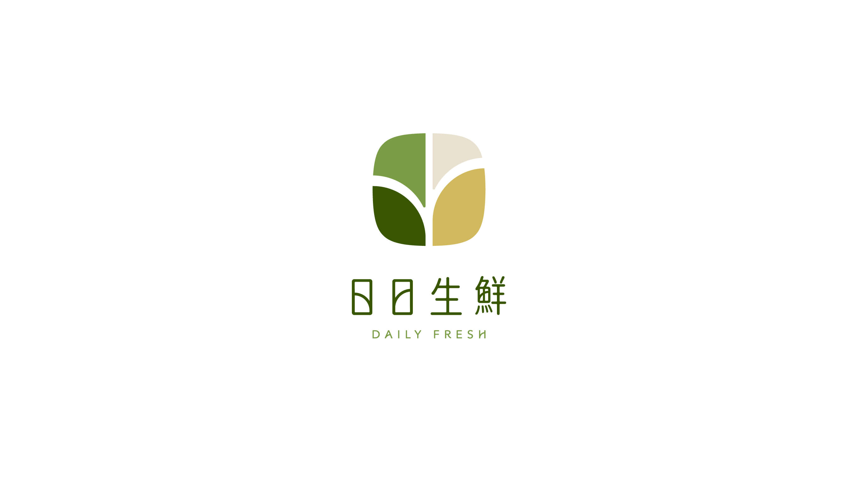
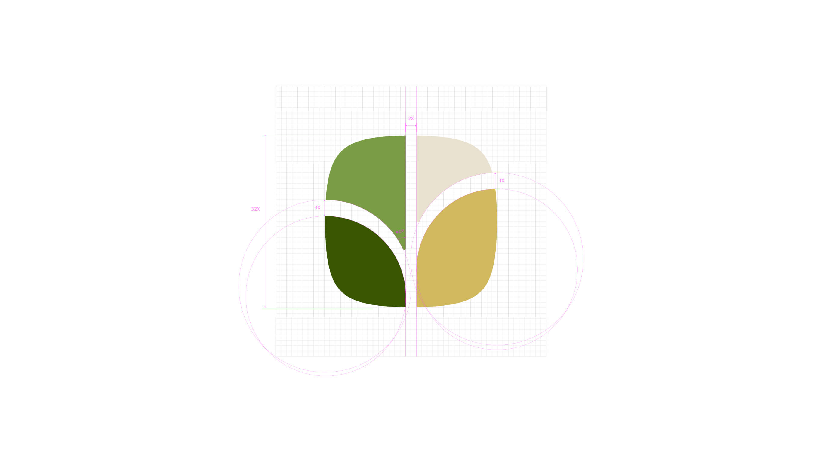
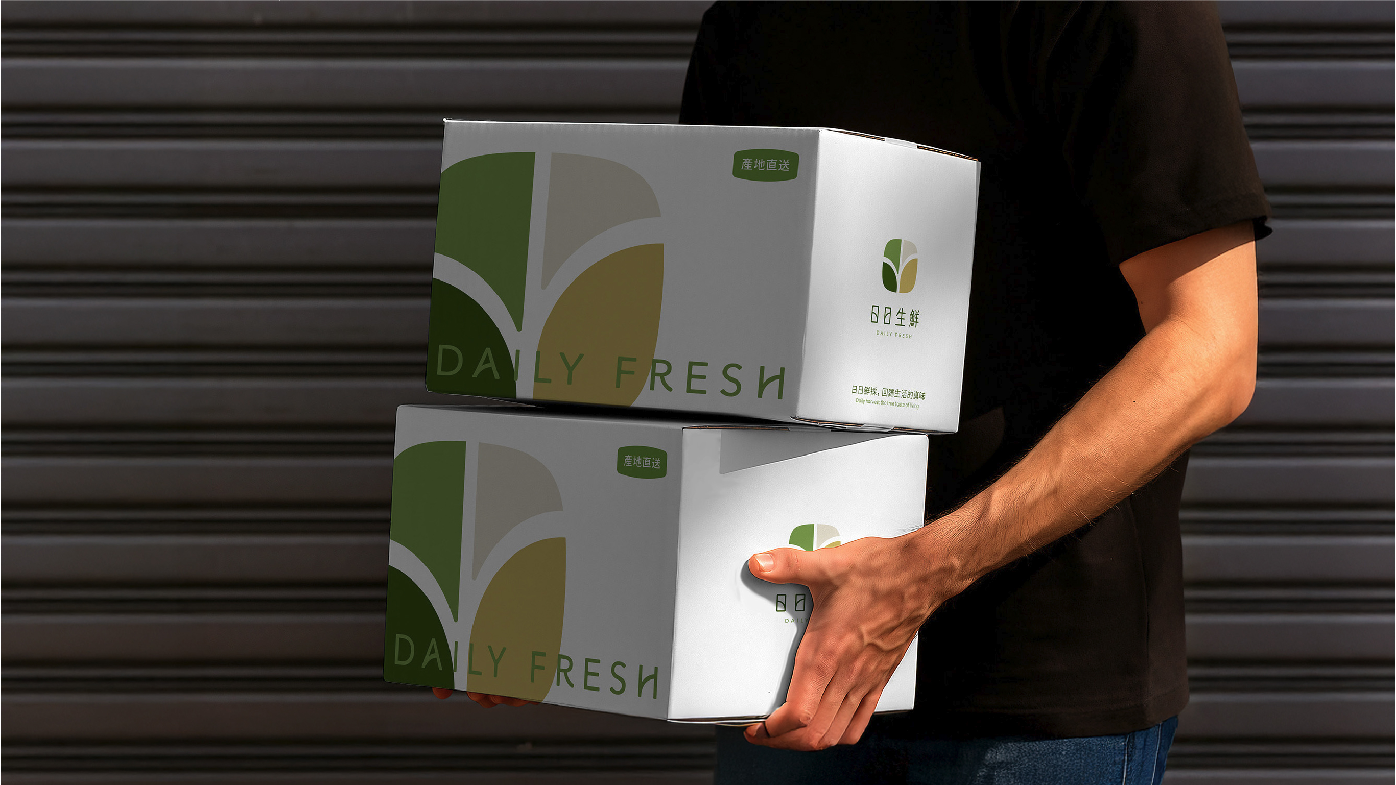
We deconstructed the characters in "Daily Fresh" into two overlapping 「日」 (sun/day) symbols — the green on the left represents the day of the land, symbolizing the lush vitality of crops as they grow; the golden yellow on the right represents the day of the harvest, capturing the ripened joy of a fruit filled with sunlight. The passage between them is like a road delivering freshness straight to the table, giving the whole mark a stable yet continuously forward-moving dynamism — echoing the brand's daily, unceasing promise of freshness.
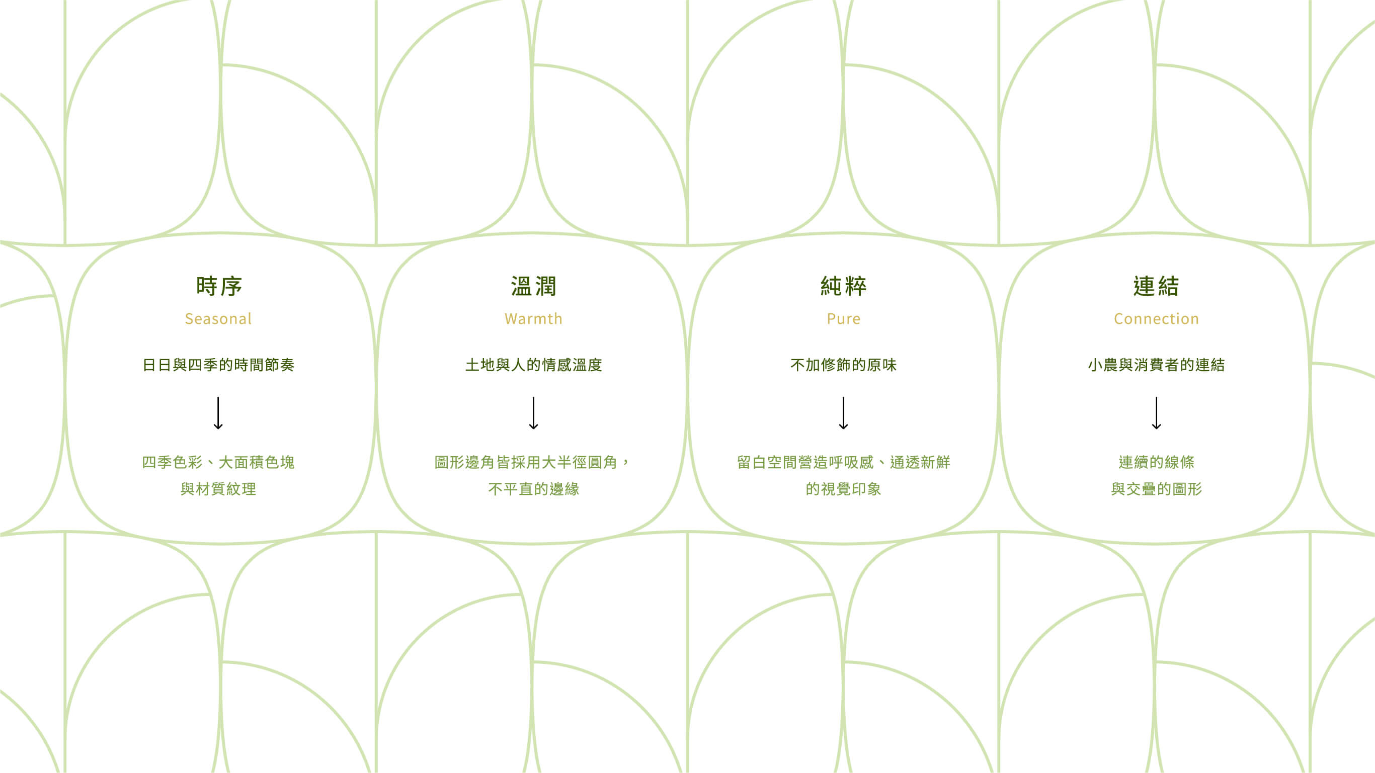
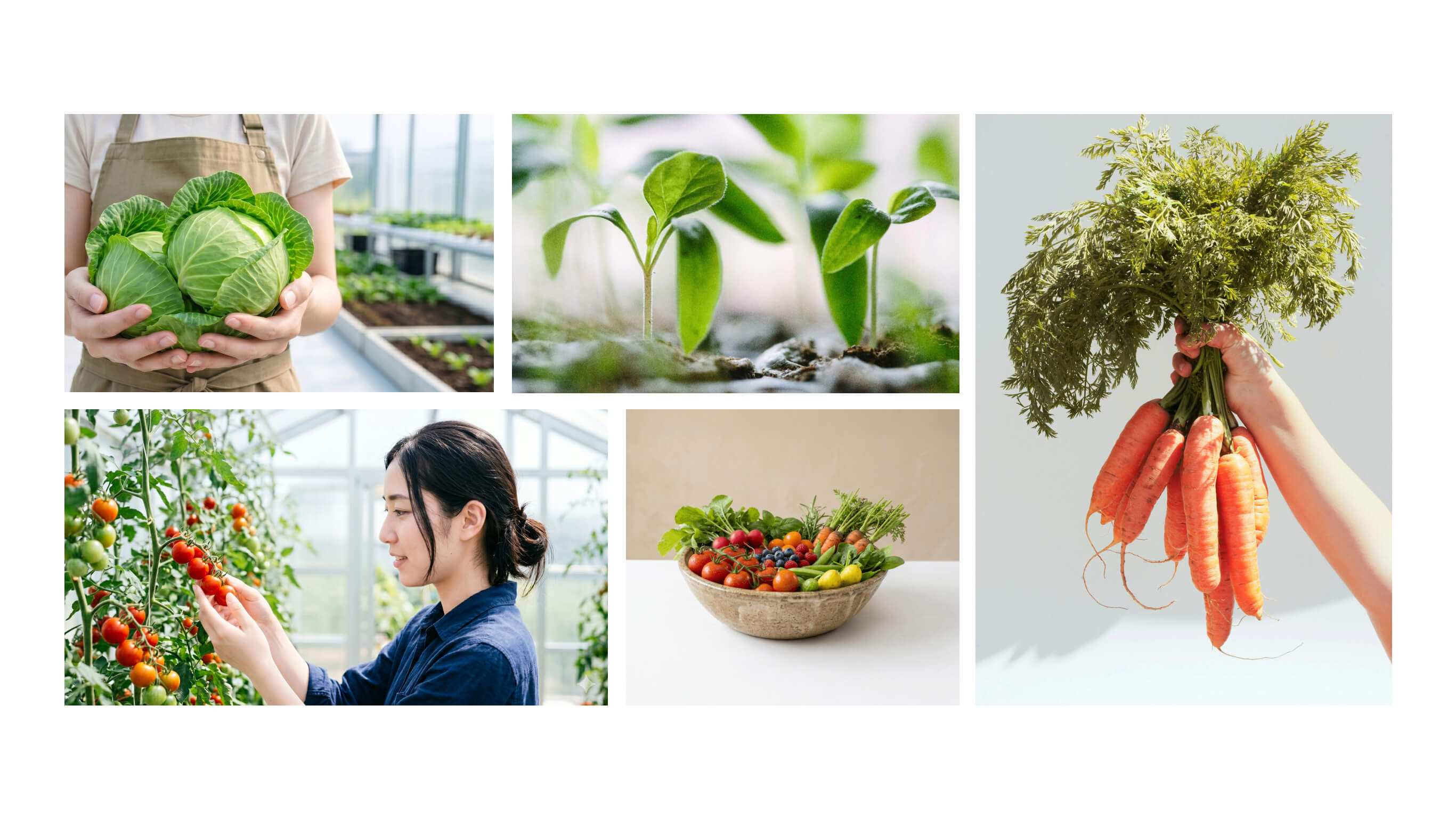
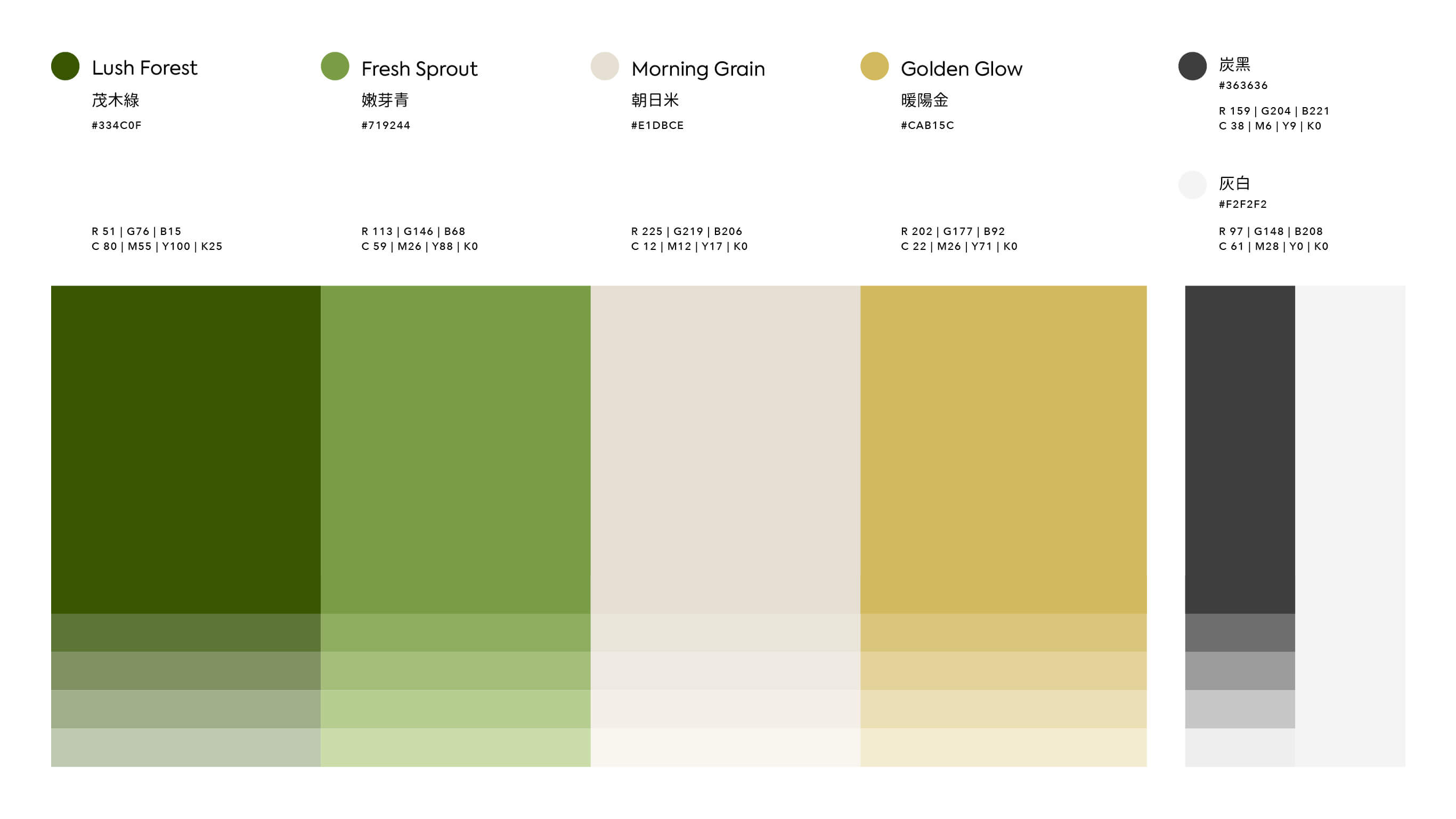
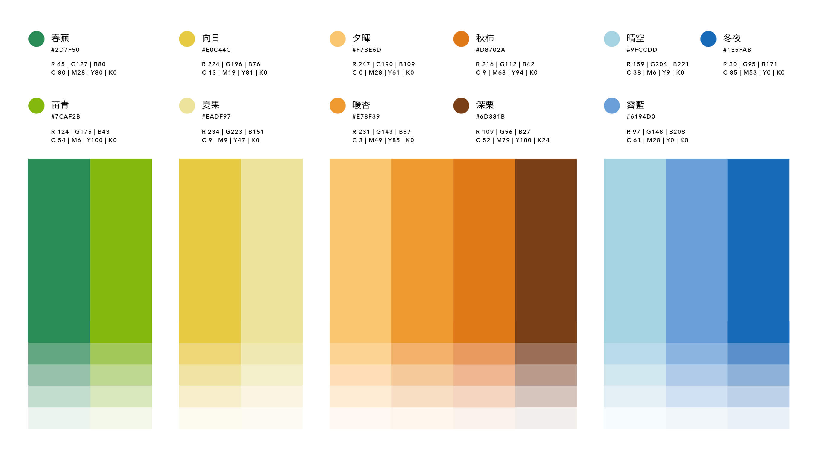
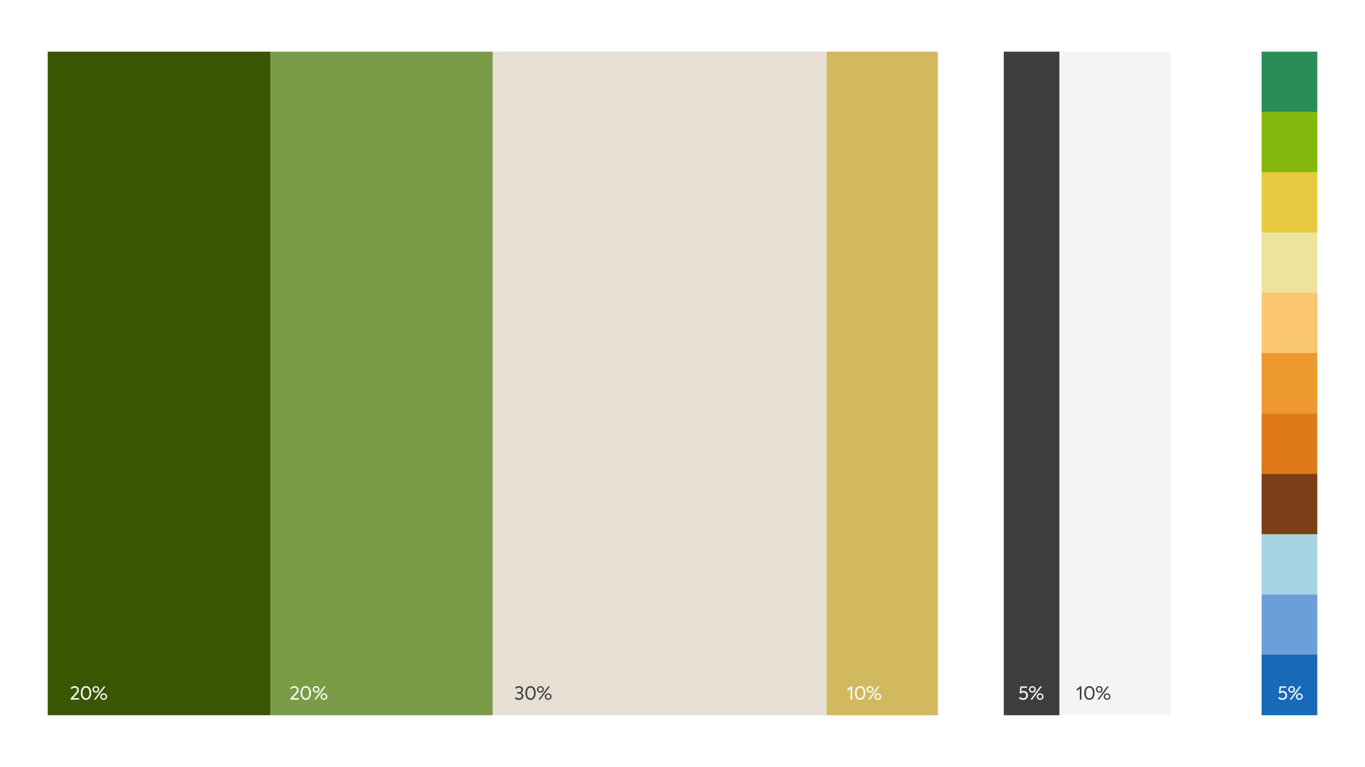
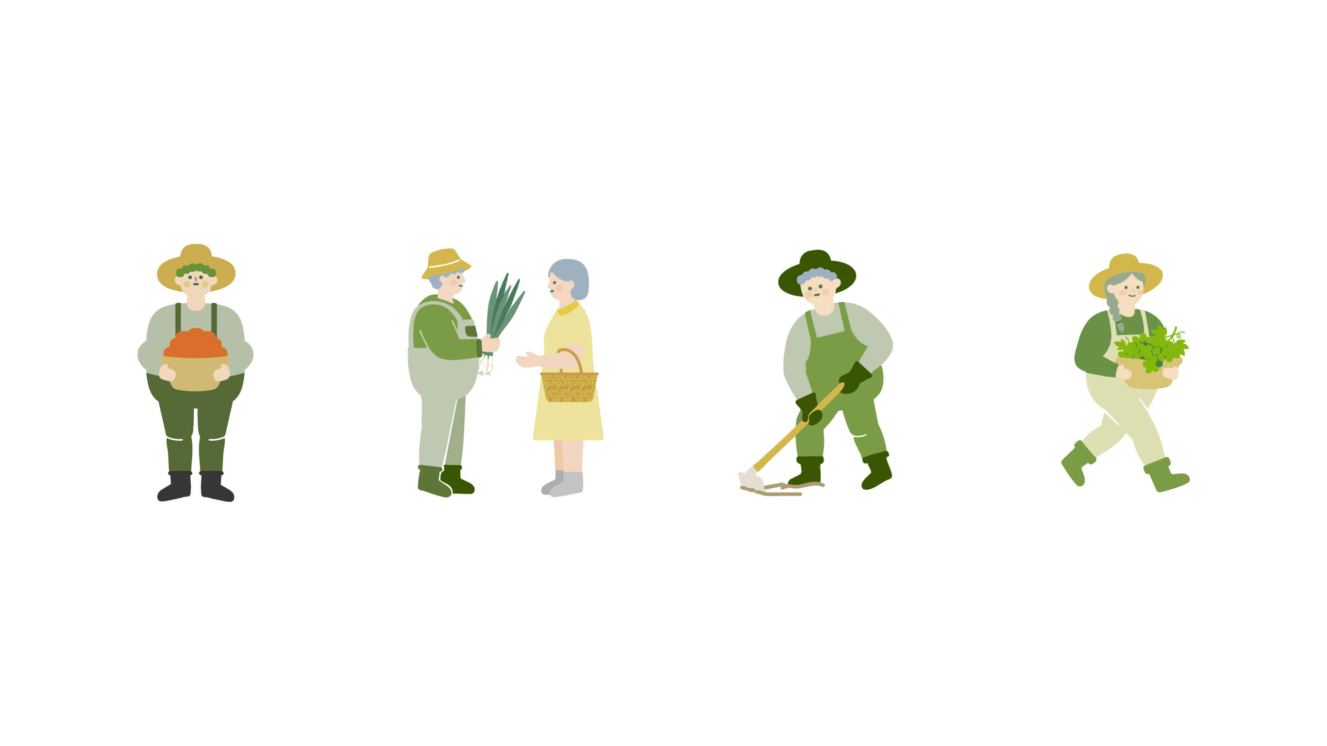
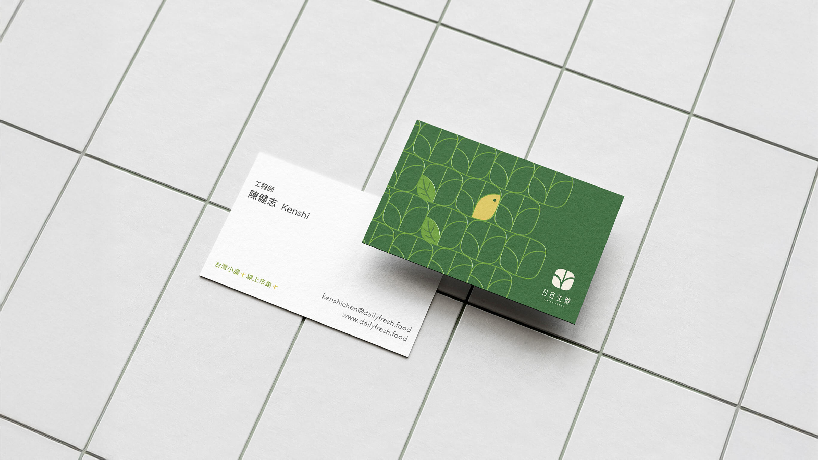
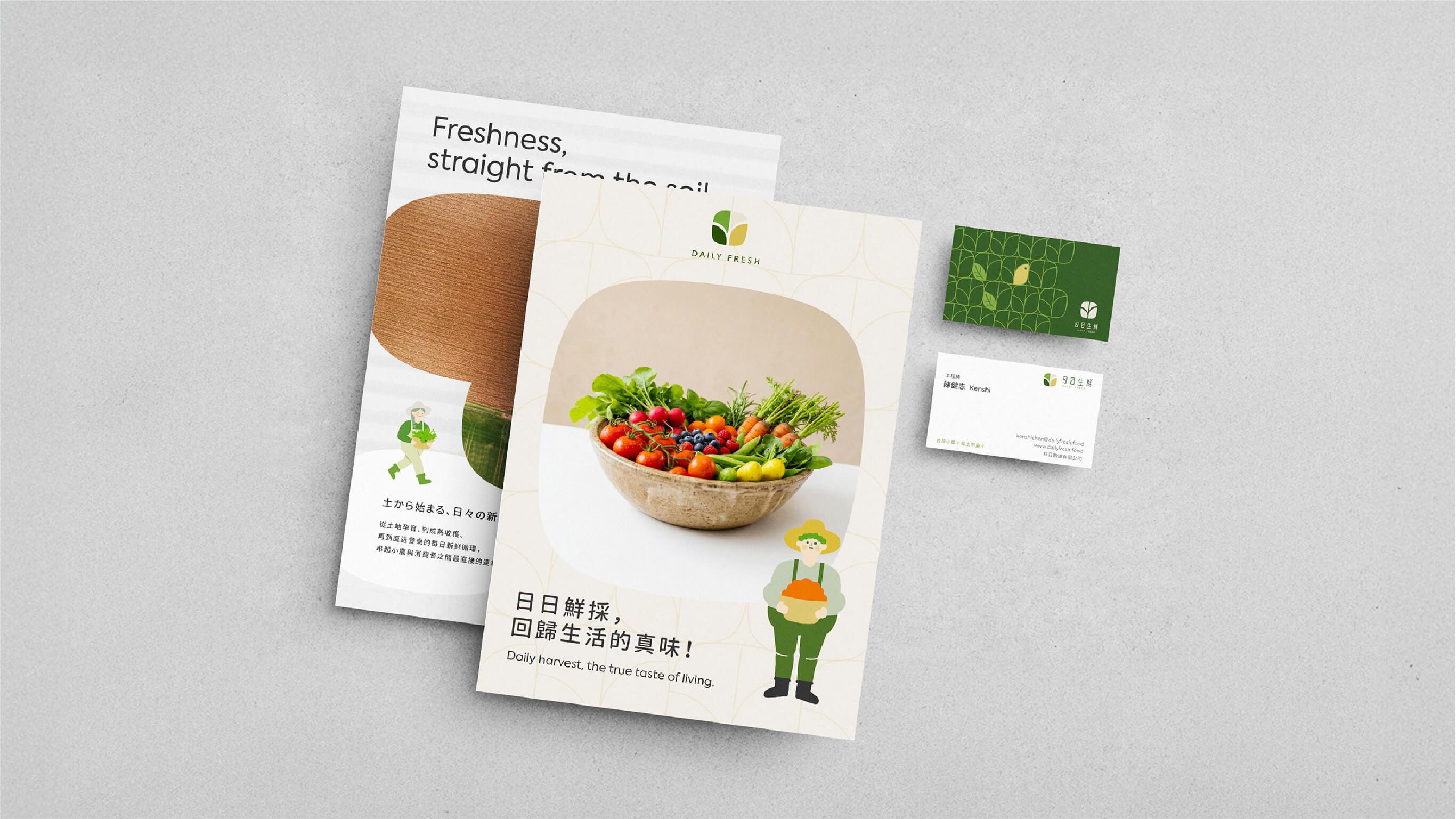
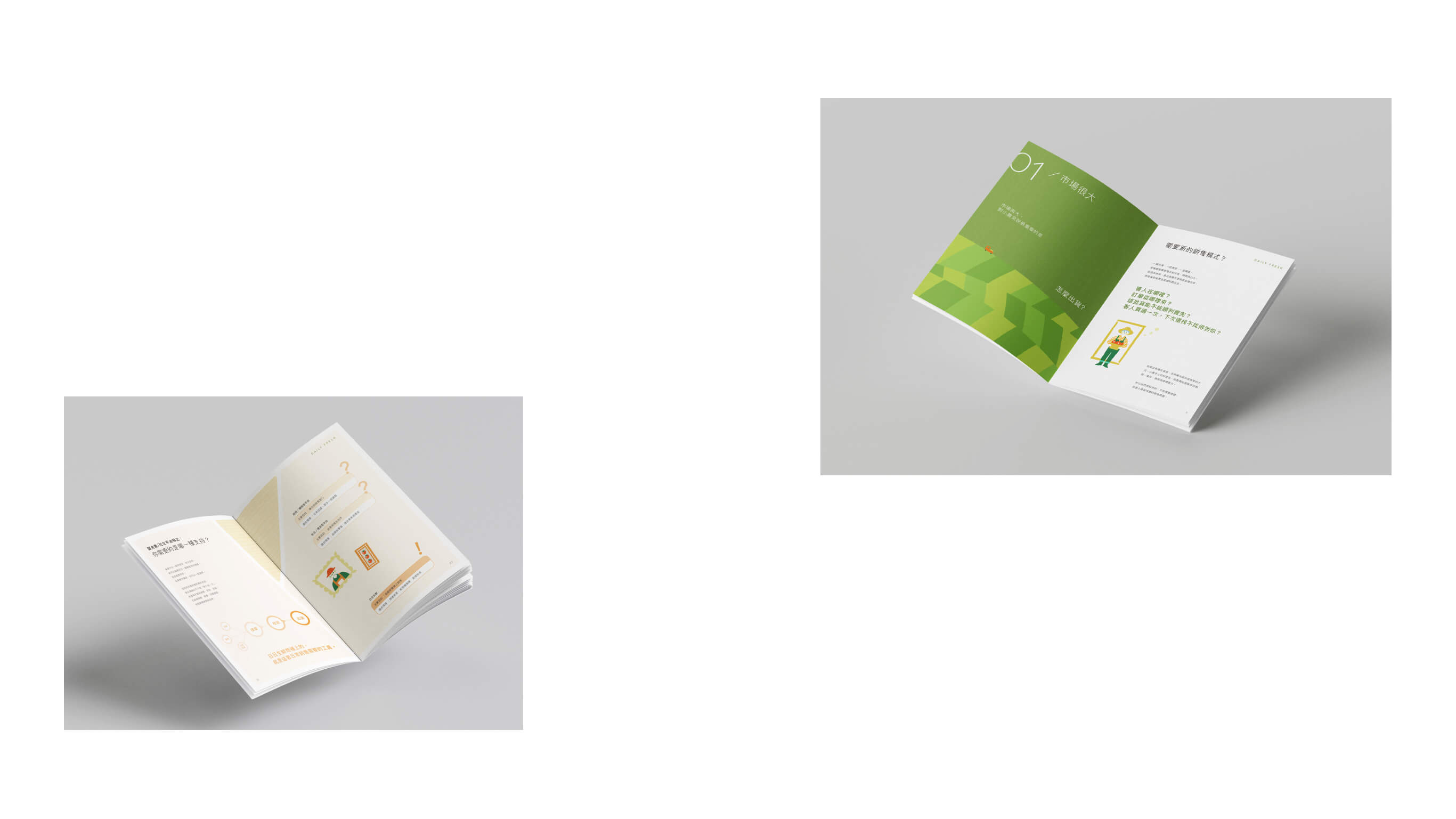
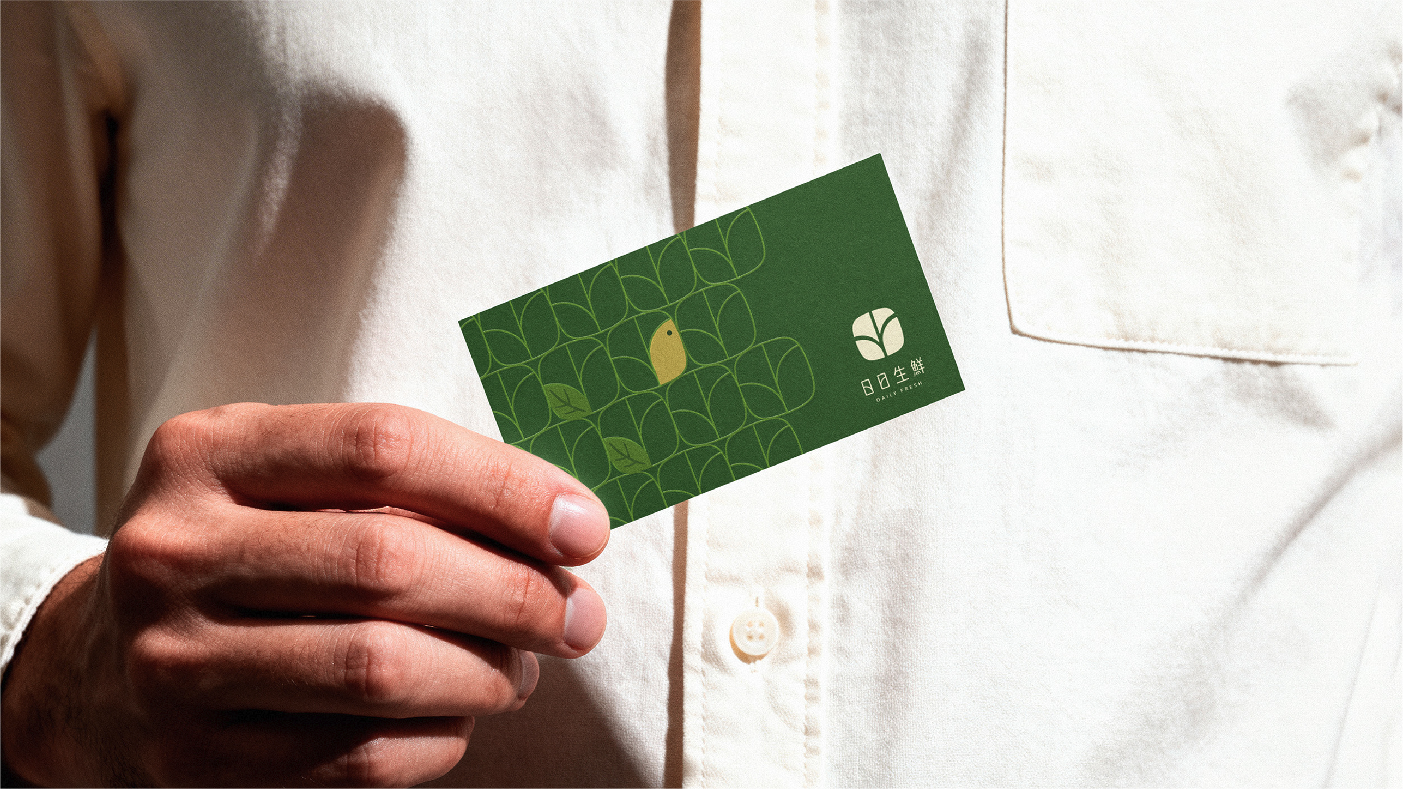
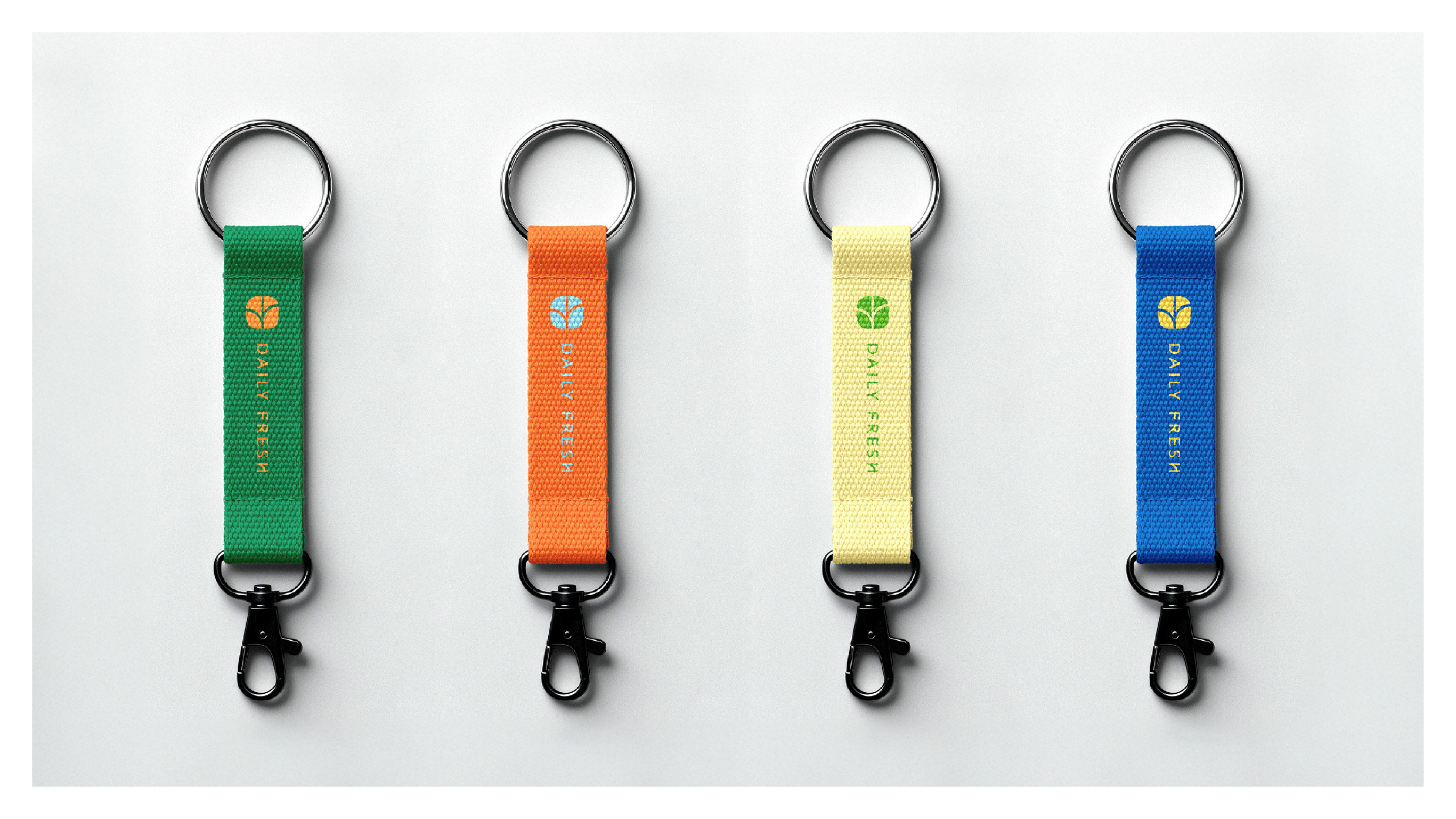
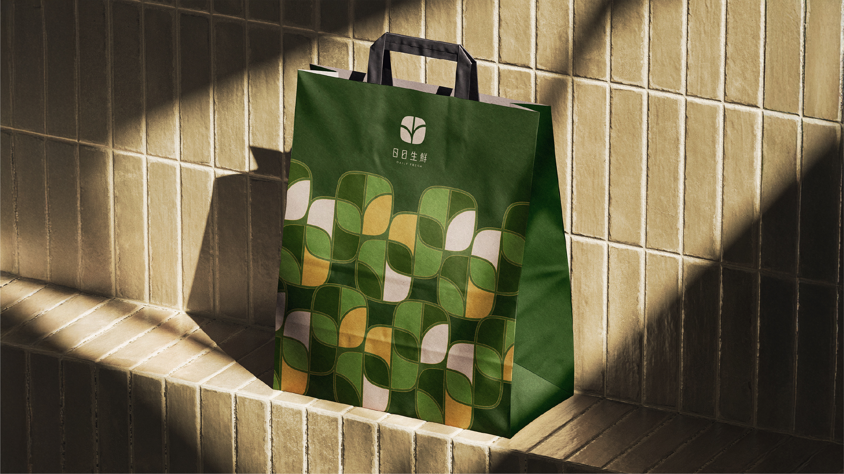
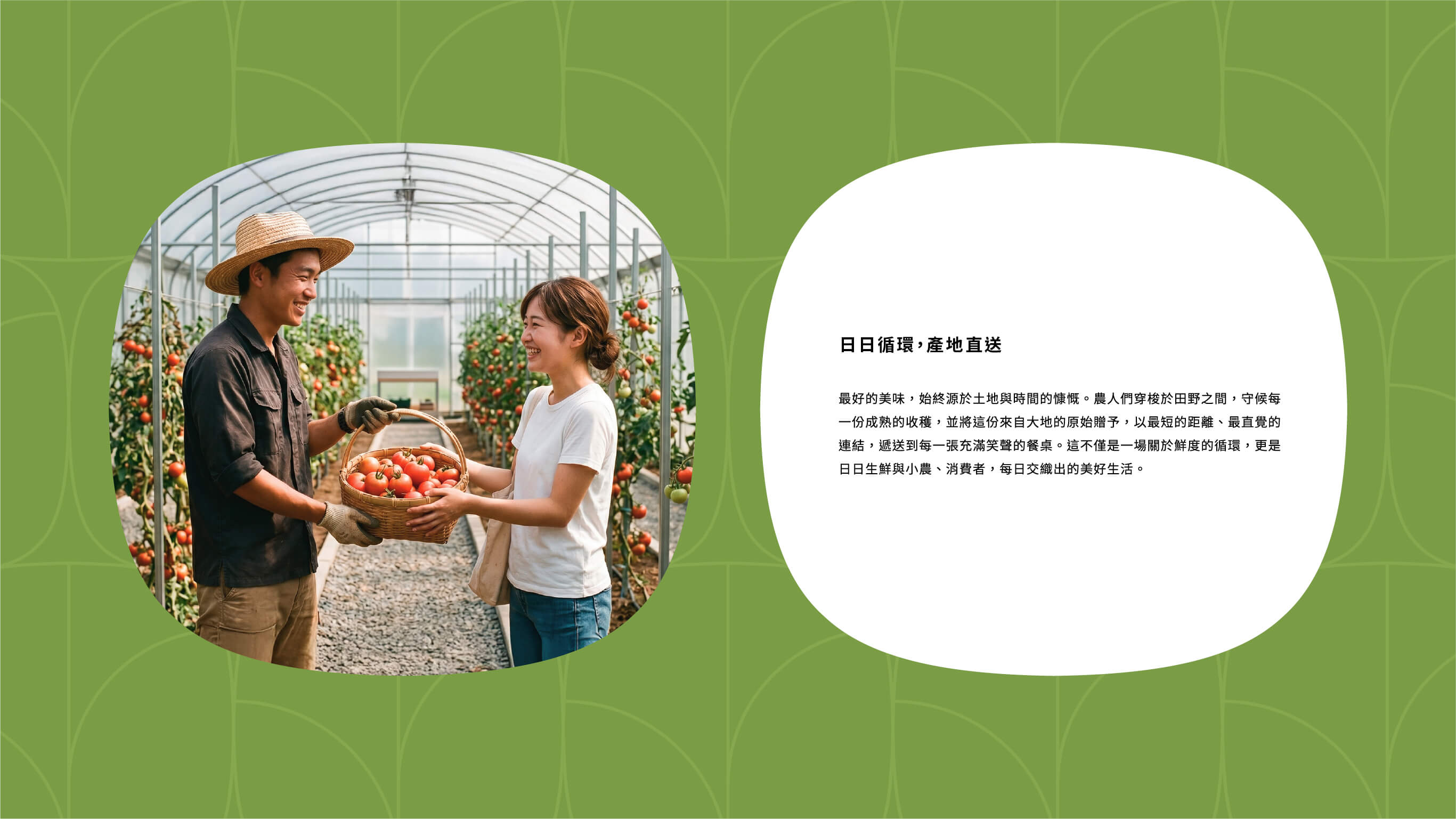
Four core design keywords — Rhythm of Time, Warmth, Purity, Connection — run through the entire visual system: colors drawn from the land across four seasons; rounded corners echoing the emotional warmth between the land and the people; negative space creating a transparent, fresh sense of breath; and supplementary patterns using organic curves to mimic aerial views of farmland, symbolizing the brand's most direct connection to the earth. Illustration characters also continue the logo's super-ellipse form, breaking the coldness of geometry so that every farmer and every tomato carries the approachability and groundedness that Daily Fresh wants to convey.