EUVORA
Consulting Is More Like an Ocean Than Anything Else
The ocean has no fixed shape, yet it can encompass everything and always flows forward — this is precisely the flexibility EUVORA demonstrates when working with different clients and industries.
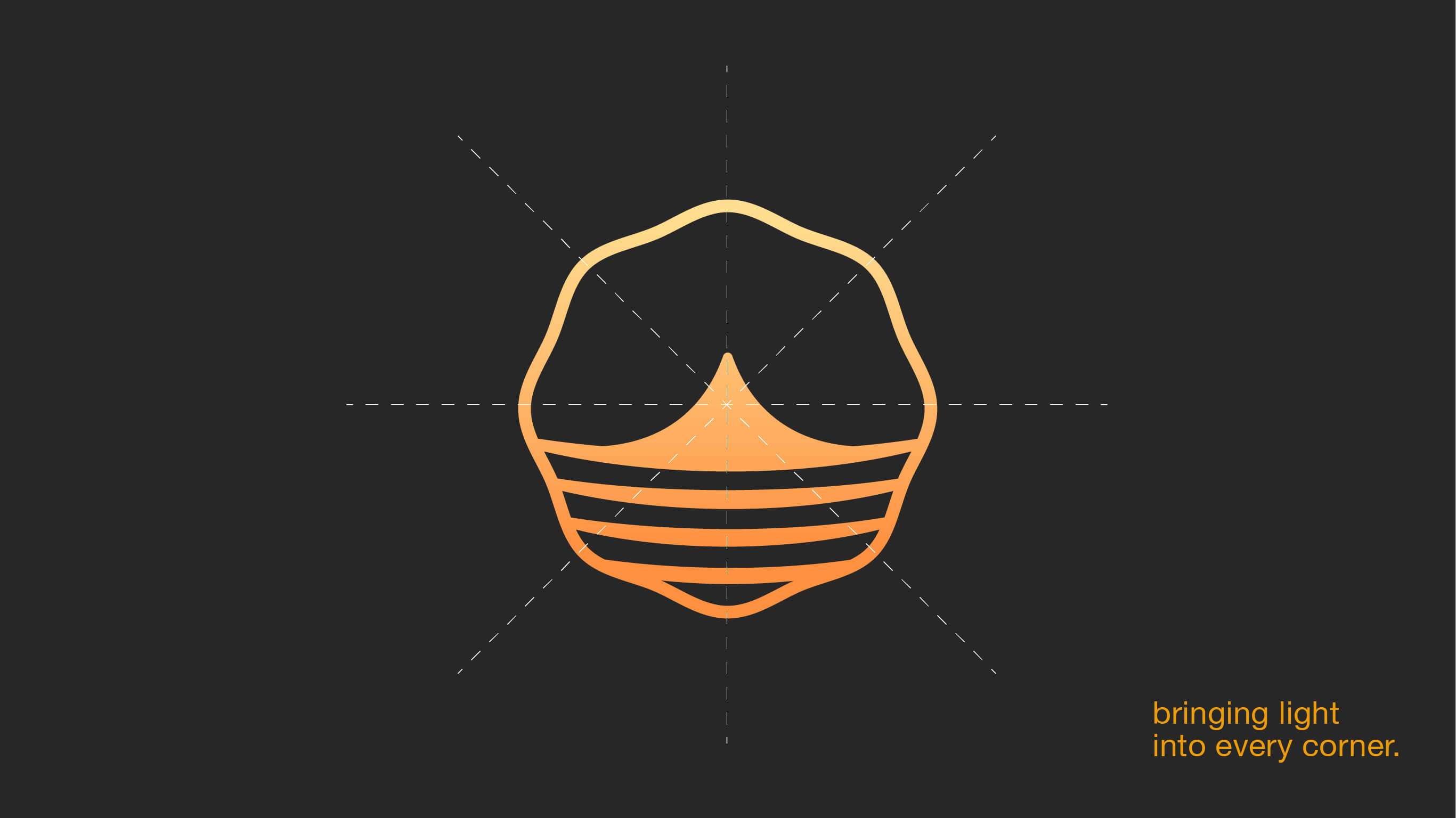
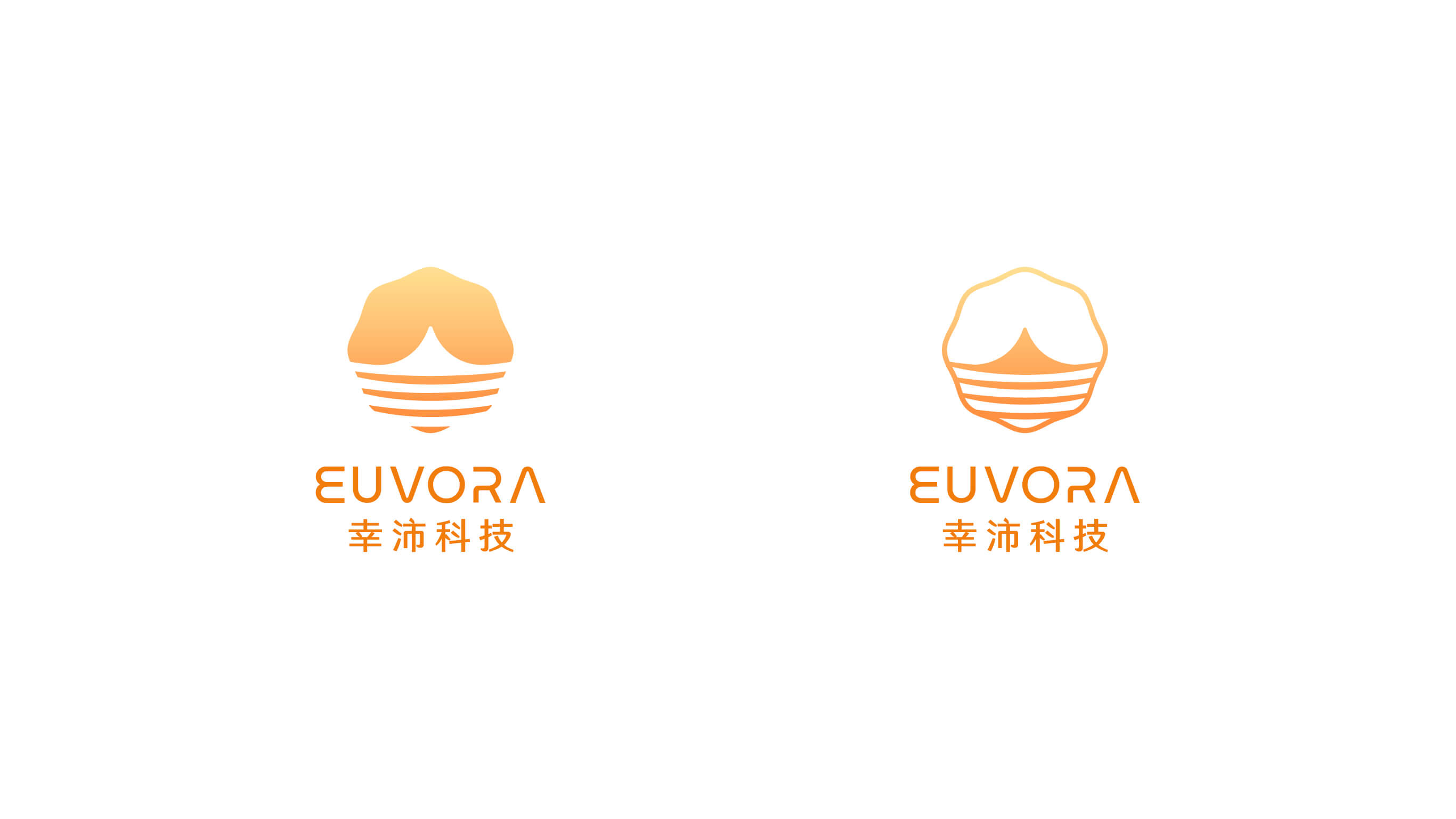
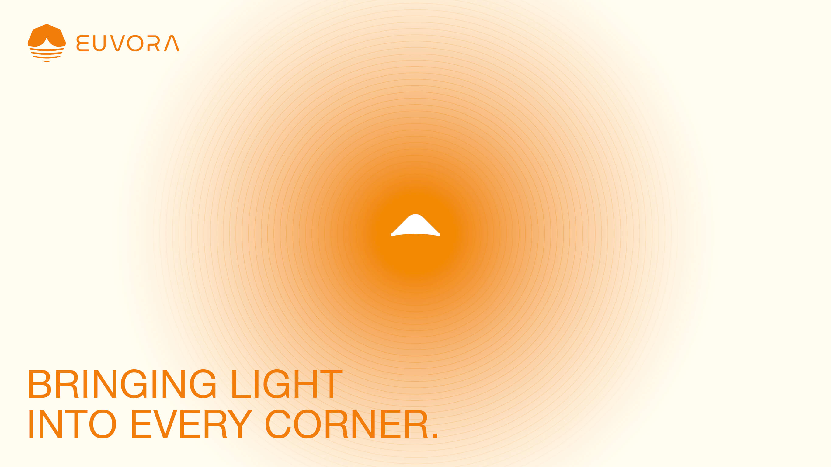
When light enters the ocean, energy radiates outward, nurturing a chain of vitality — echoing the positive impact the brand brings to its clients. And through long periods of flowing, a stable island always emerges on the surface. That is the raised core form at the center of the logo — representing the fact that no matter how EUVORA adapts to different clients on the outside, its inner professional essence and founding spirit never waver.
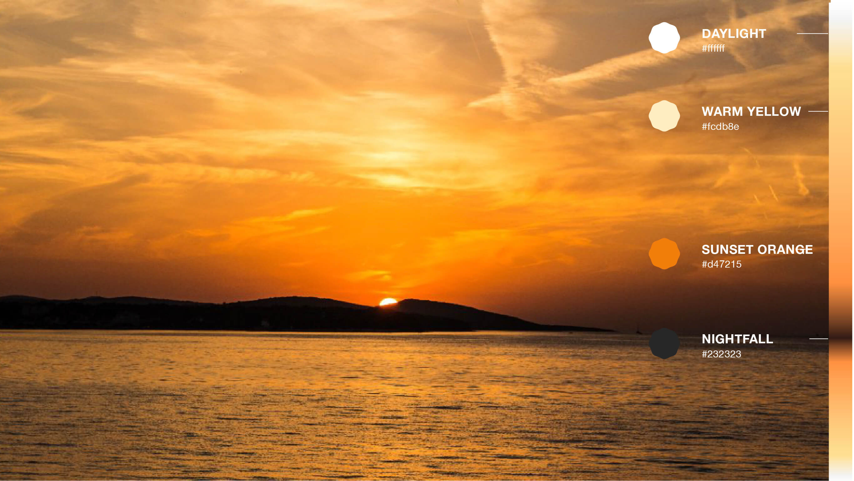
The color palette uses warm gradient orange-yellow, replacing the cold tones common in the tech industry, turning the abstract spirit of consulting into an image visitors can understand at a glance.