Fine Pasta
The Color Language of Dadaocheng — Where Vintage Meets Warmth
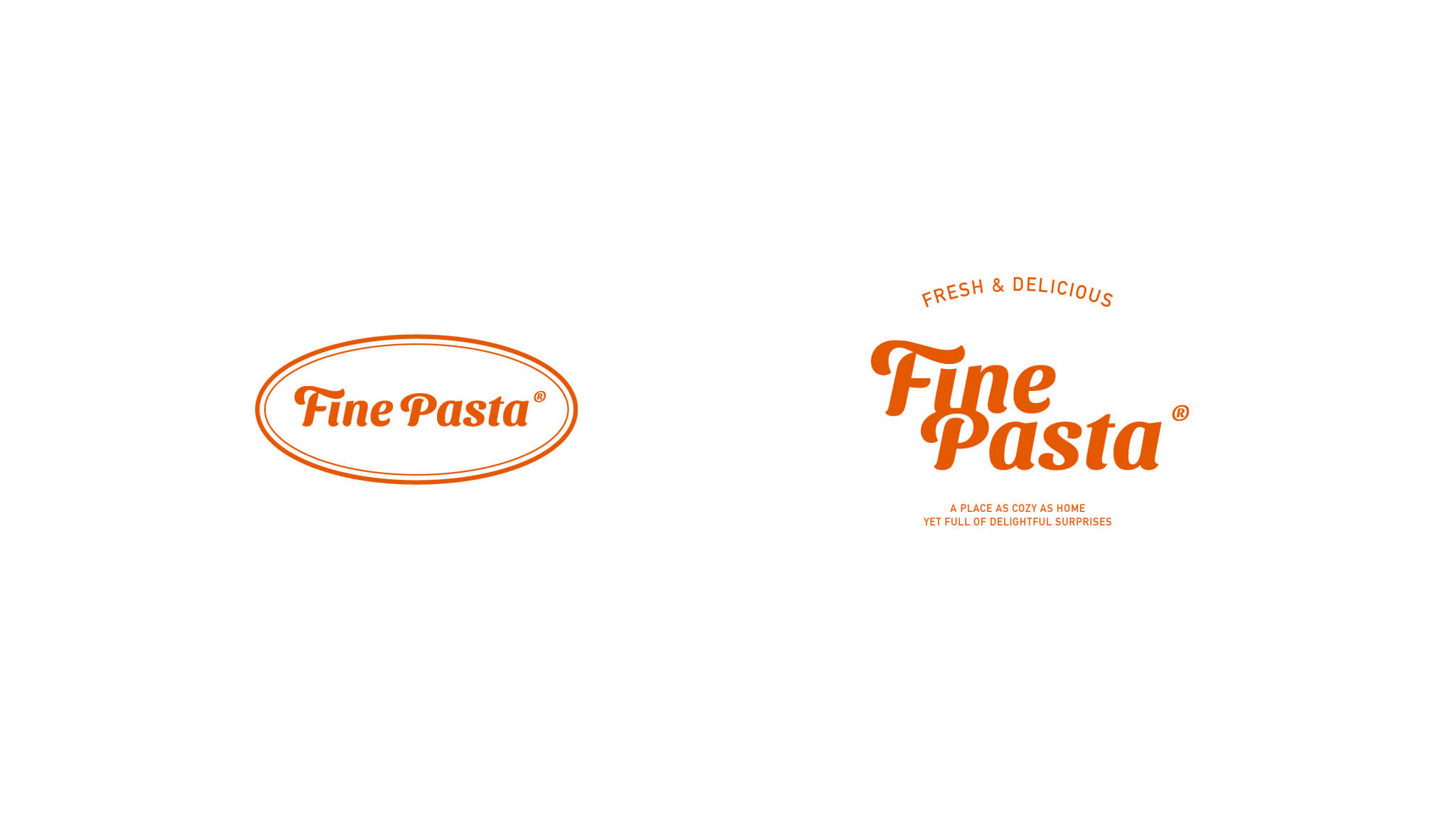
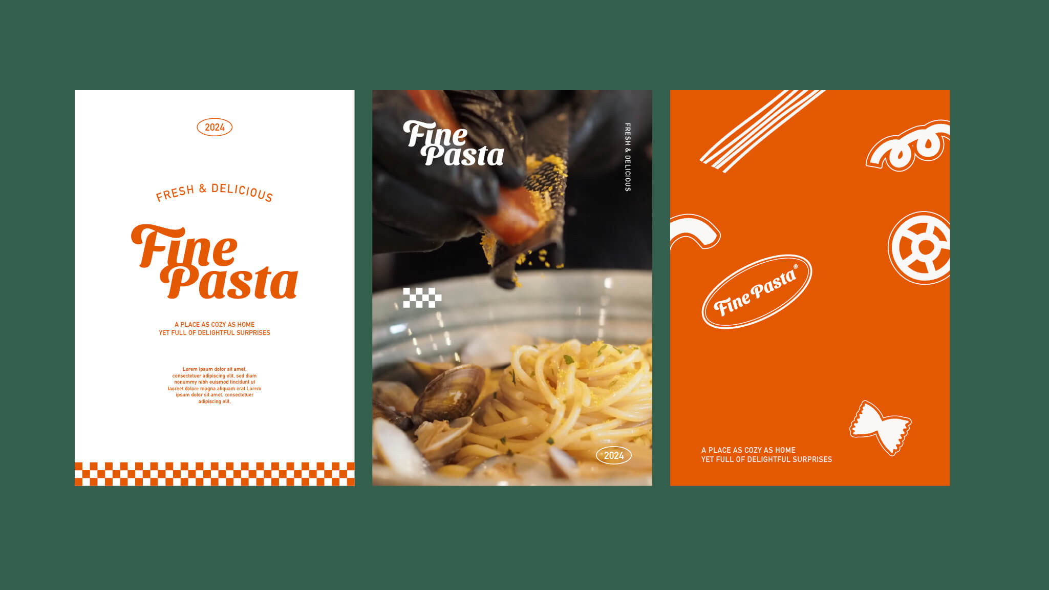
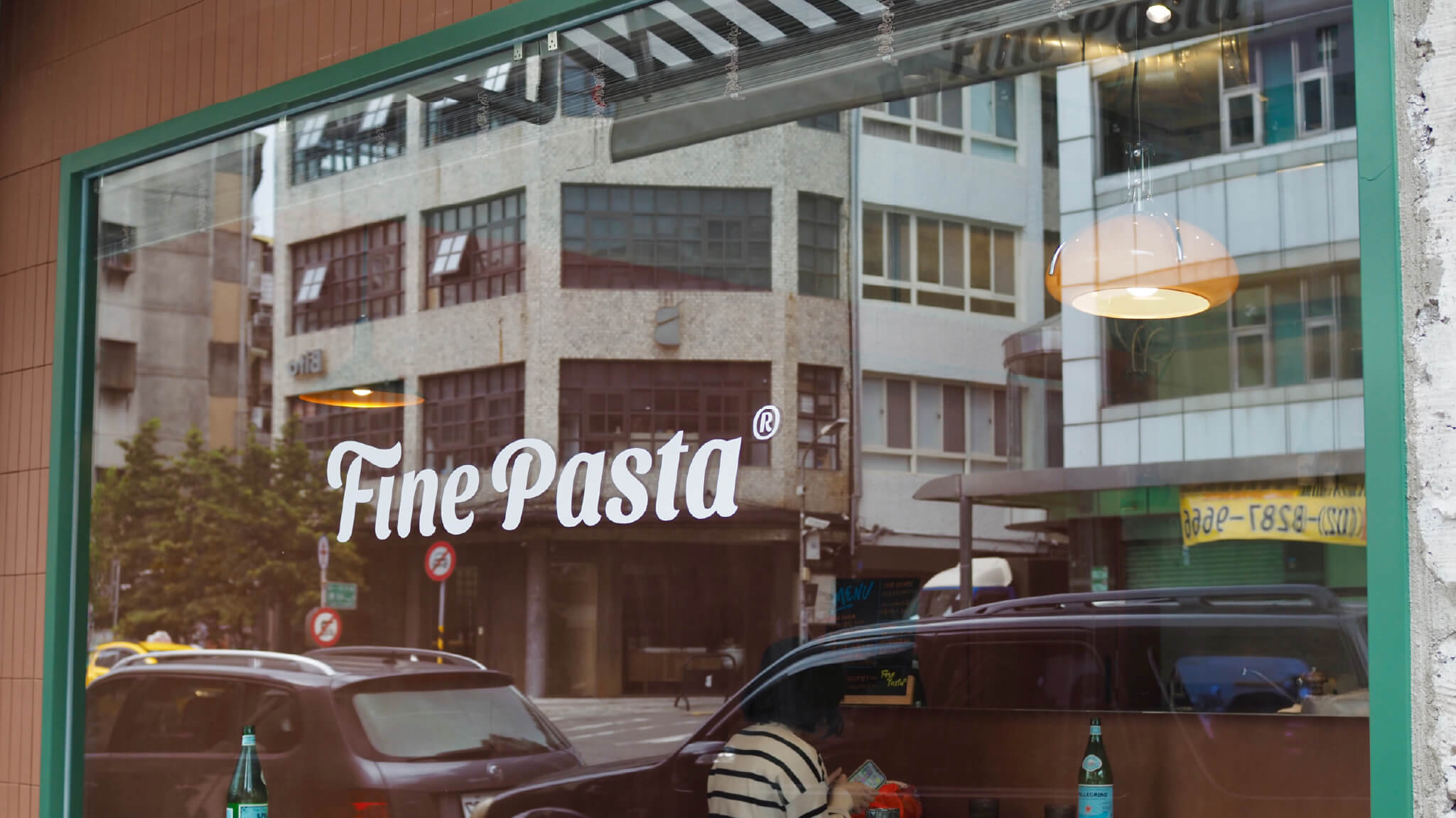
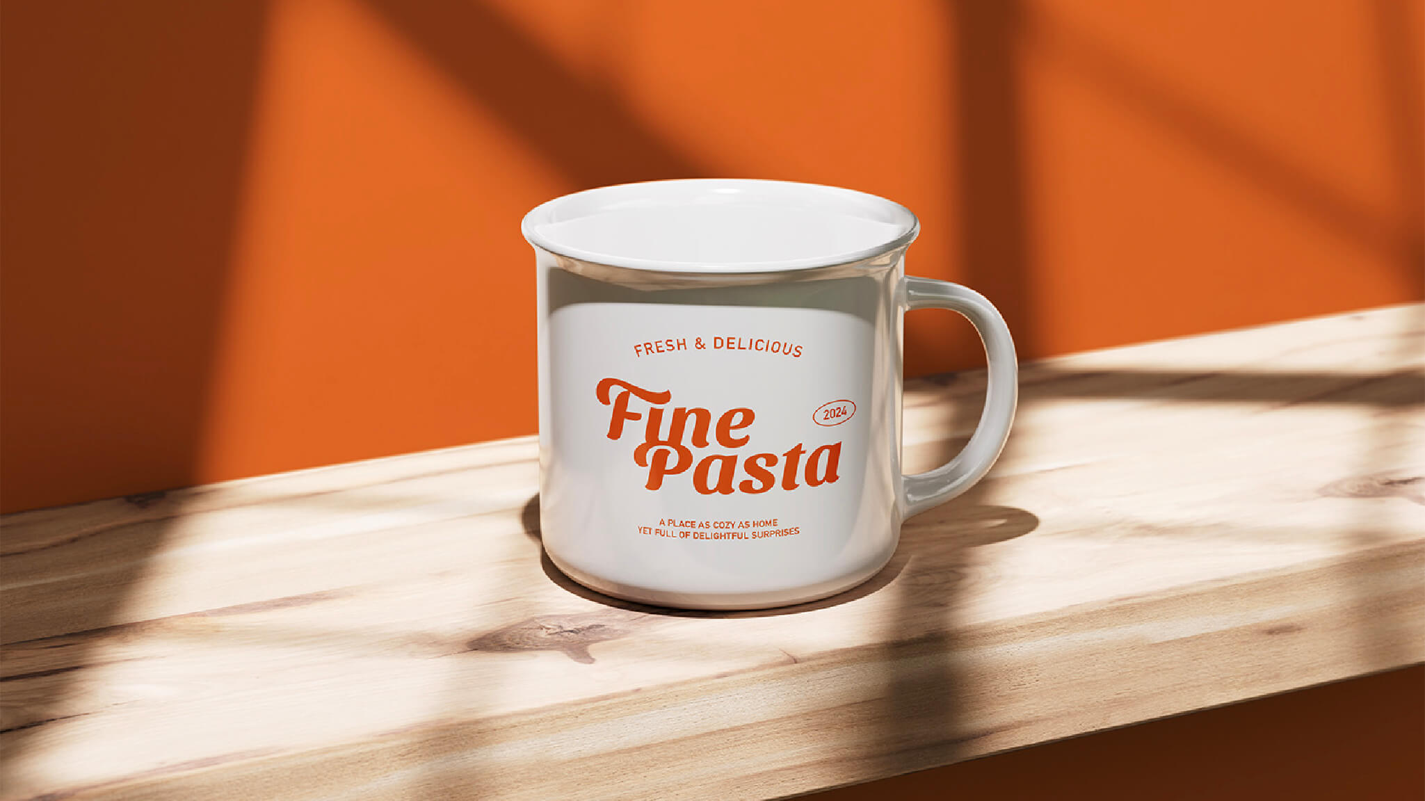
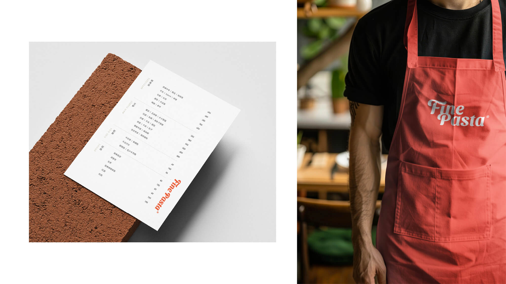
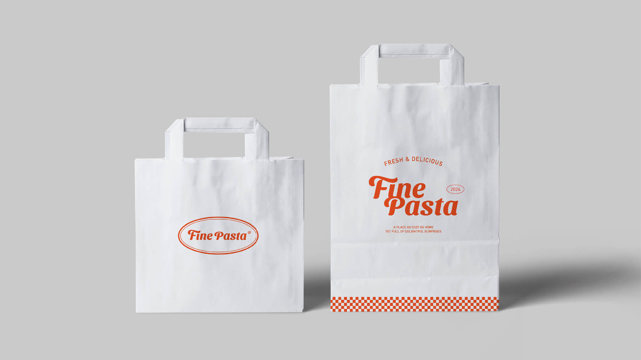
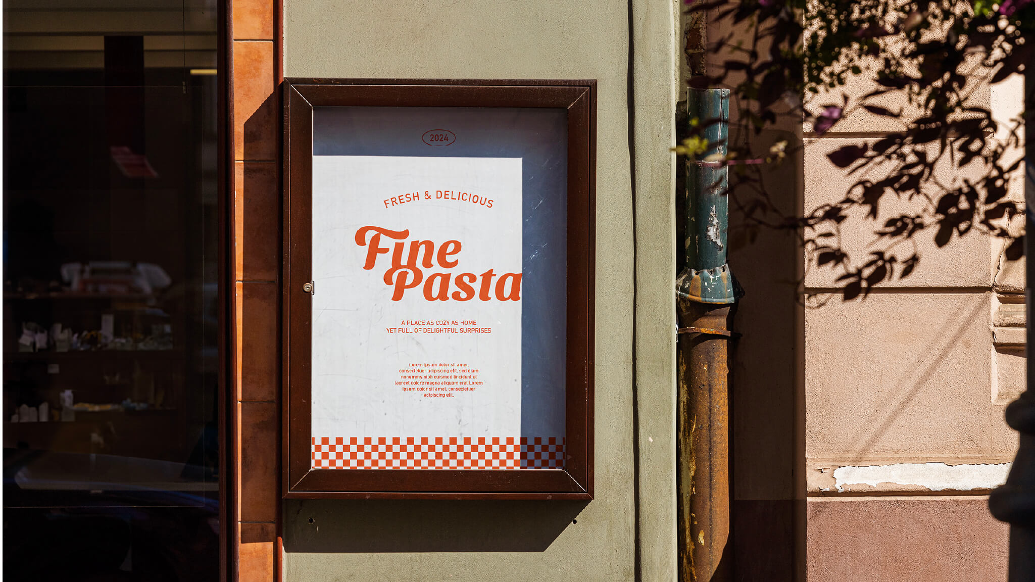
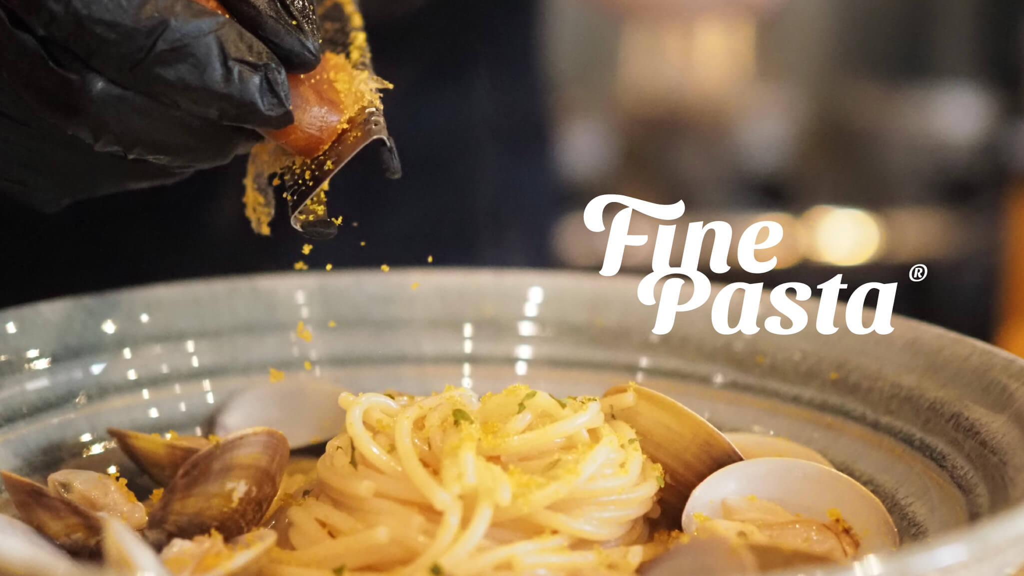
The logo is rendered in soft, curved lettering that evokes the flowing quality of Italian pasta and the warmth of handmade craft. Its rounded strokes echo the welcoming atmosphere of the cuisine, while a slight slant conveys the brand's spirit of being "casual yet refined." The rhythm of the typography recalls the process of cooking — from kneading and boiling to plating, each step holding life's small details and surprises.
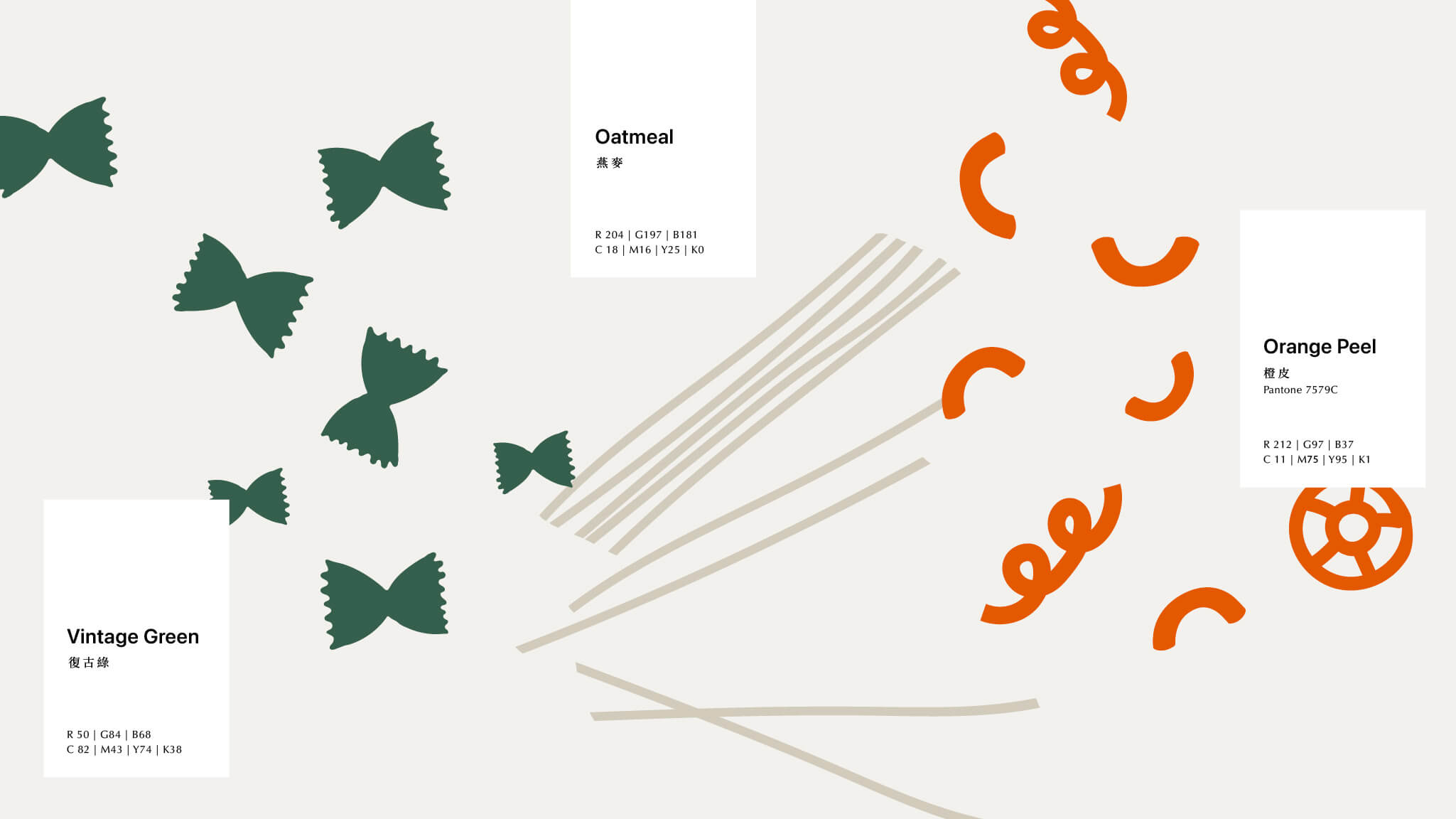
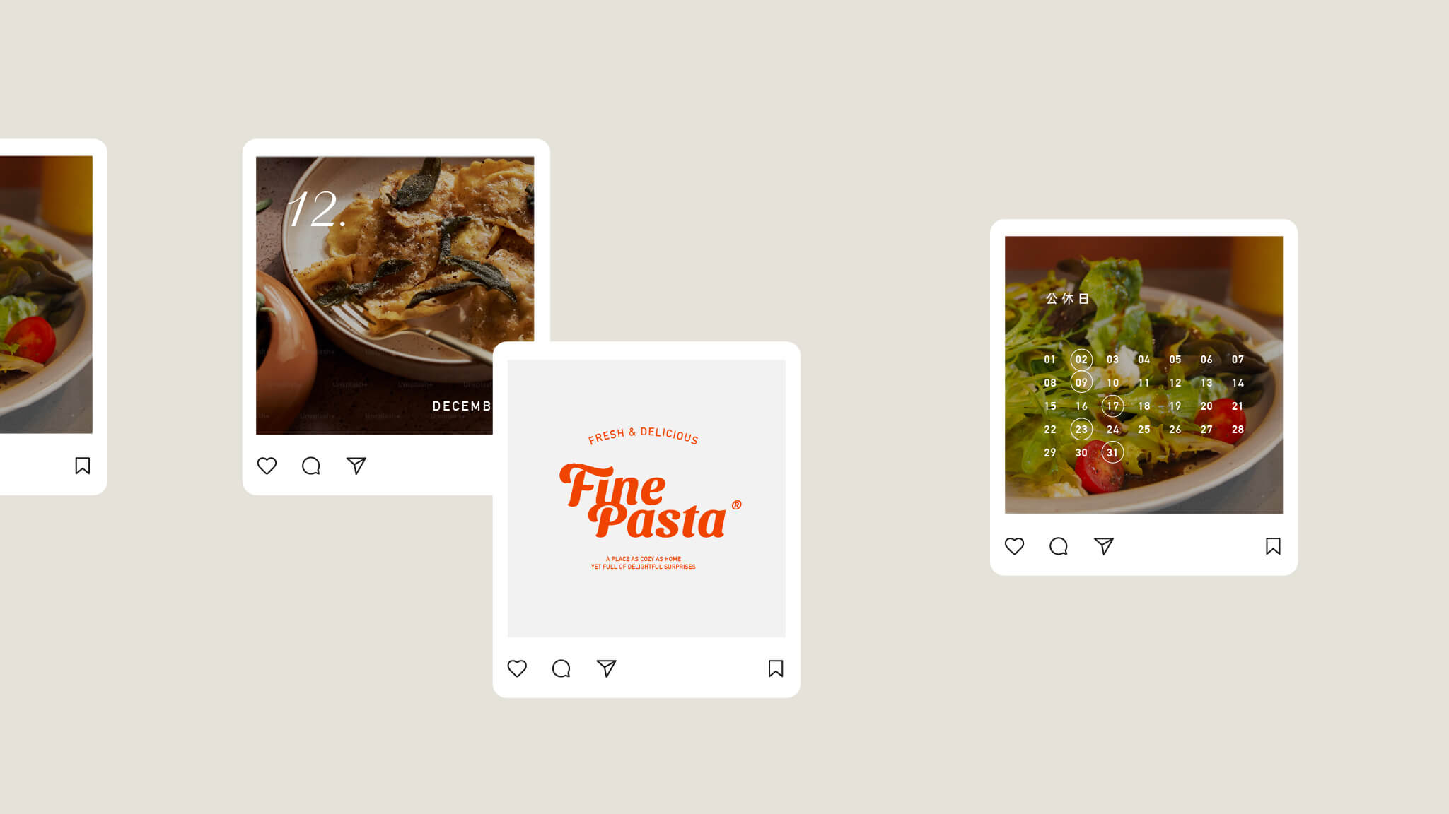
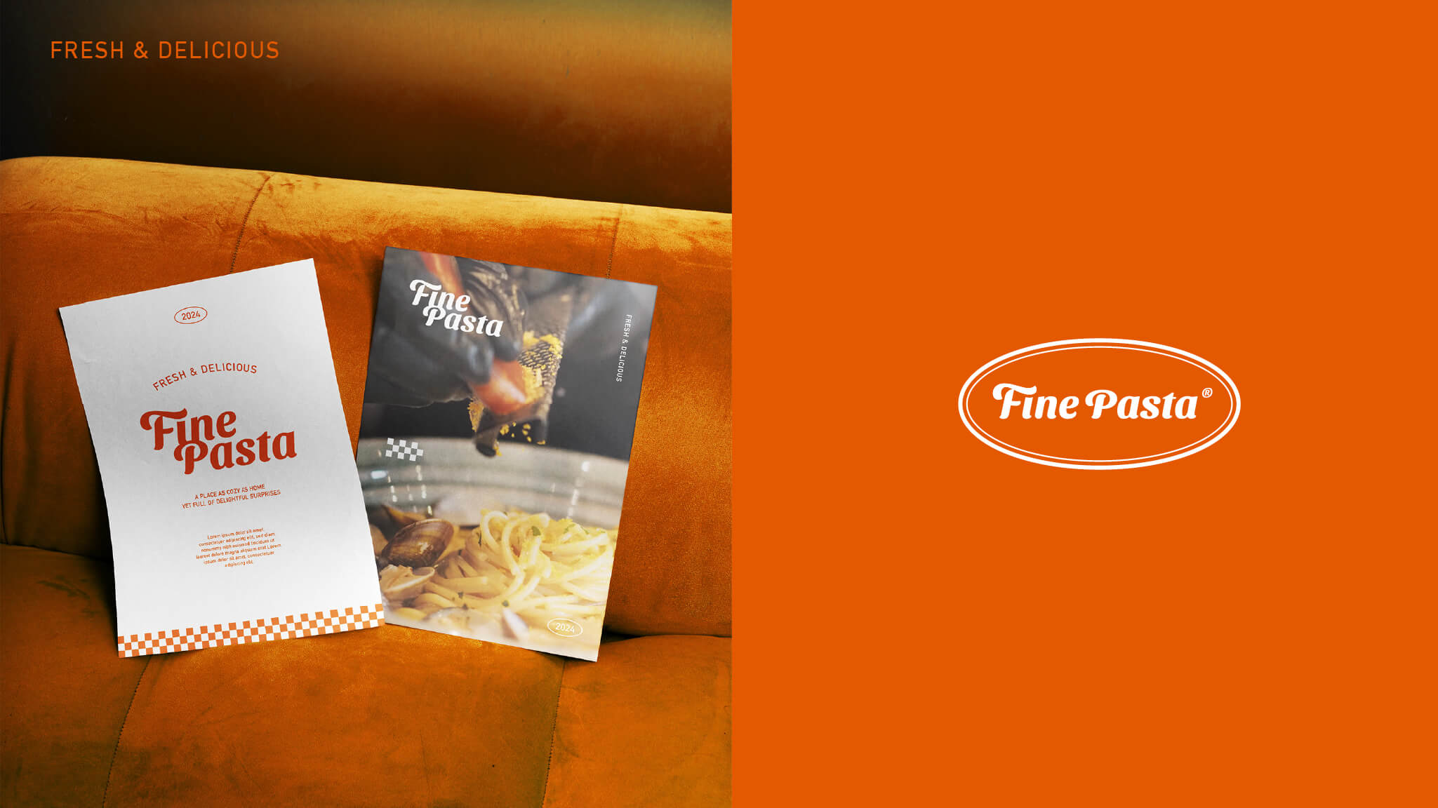
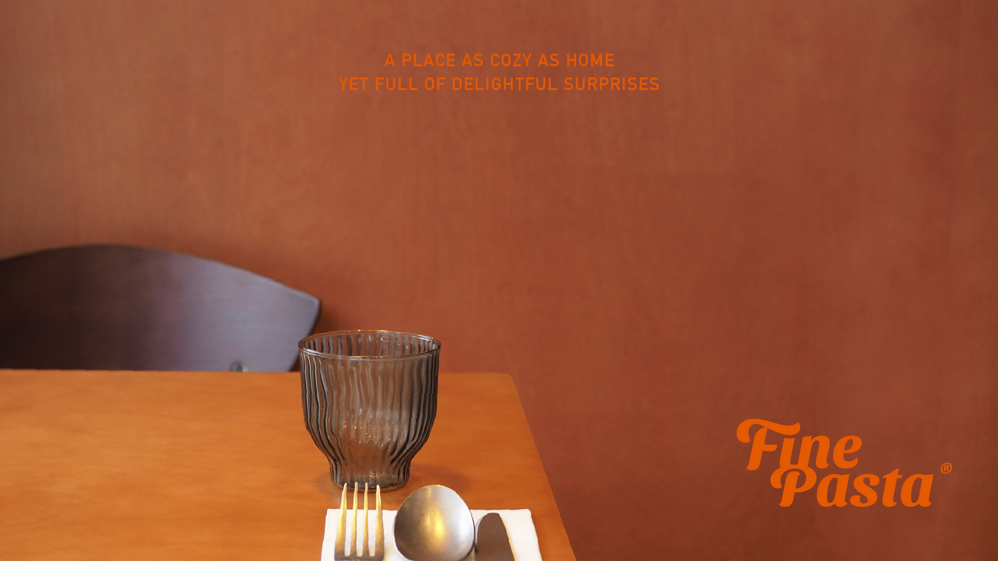
The color palette centers on a bold Italian orange-red, paired with creamy white and deep green, evoking a warm yet restrained Italian atmosphere — vibrant but grounded. This color strategy allows Fine Pasta's brand presence to stand out in the neighborhood while retaining a subtle, enduring everyday quality.