Hollie Blossom
Blossoms Fill the Tree, Radiant Through Every Season
Hollie Blossom takes inspiration from the verse: Blossoms fill the tree in a shower of red, radiant through every season — beneath an understated and refined exterior lies an inexhaustible vitality and beauty.
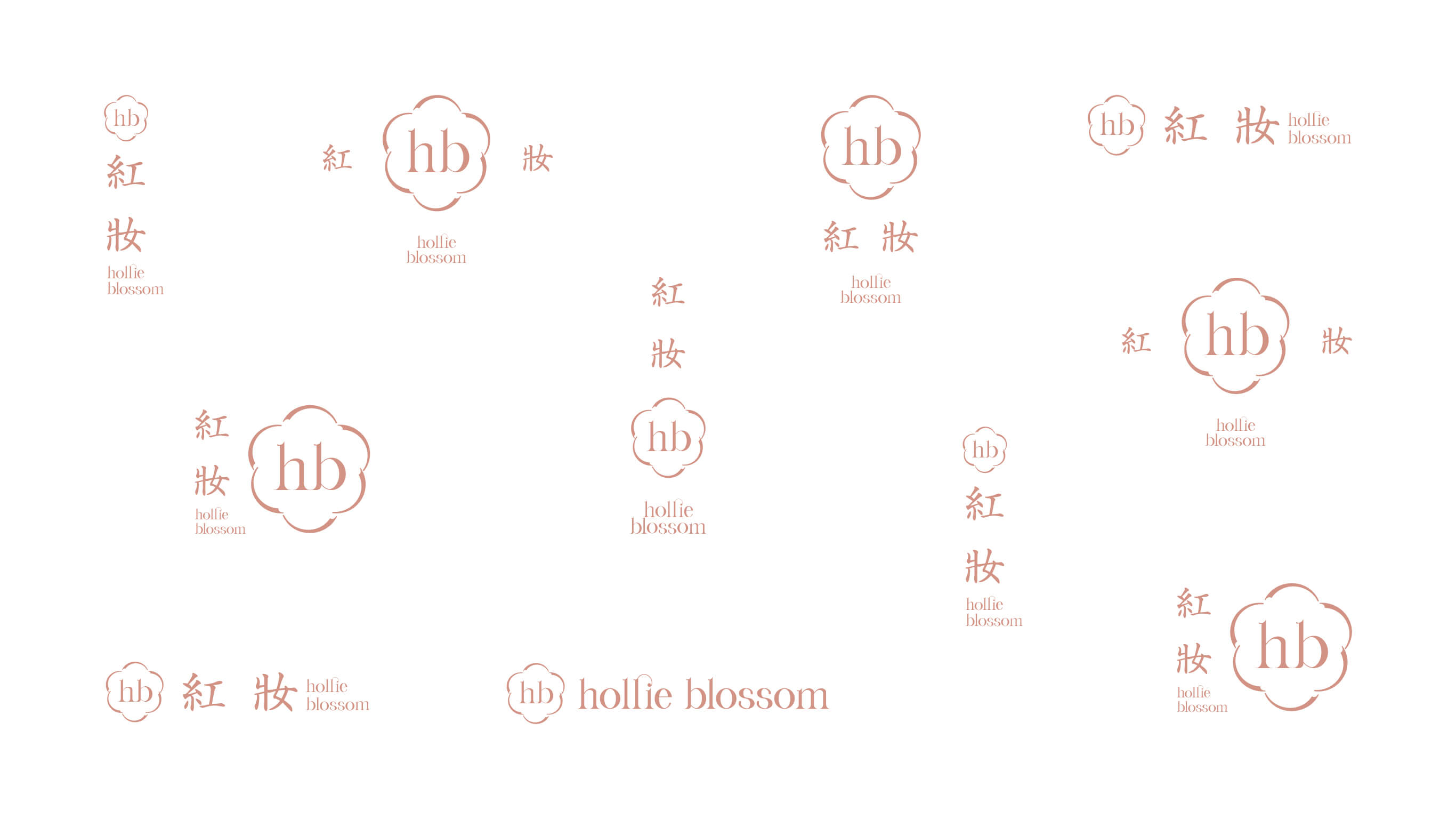
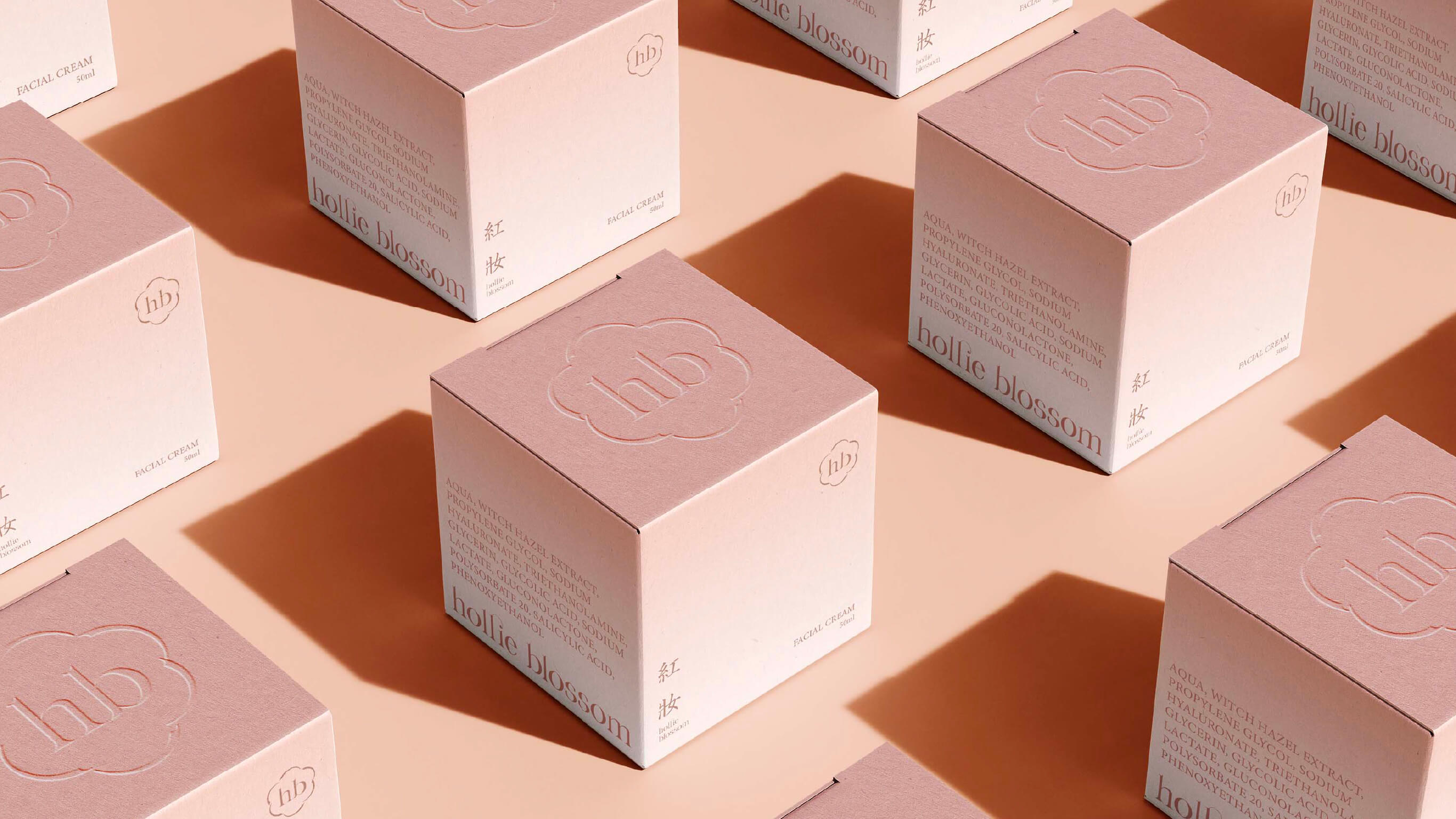
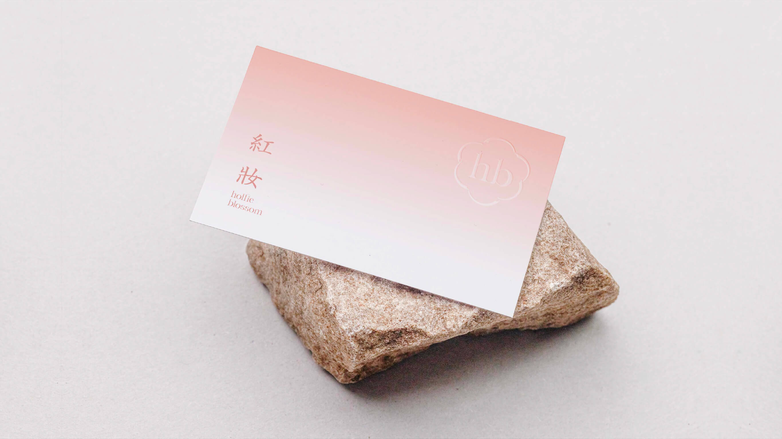
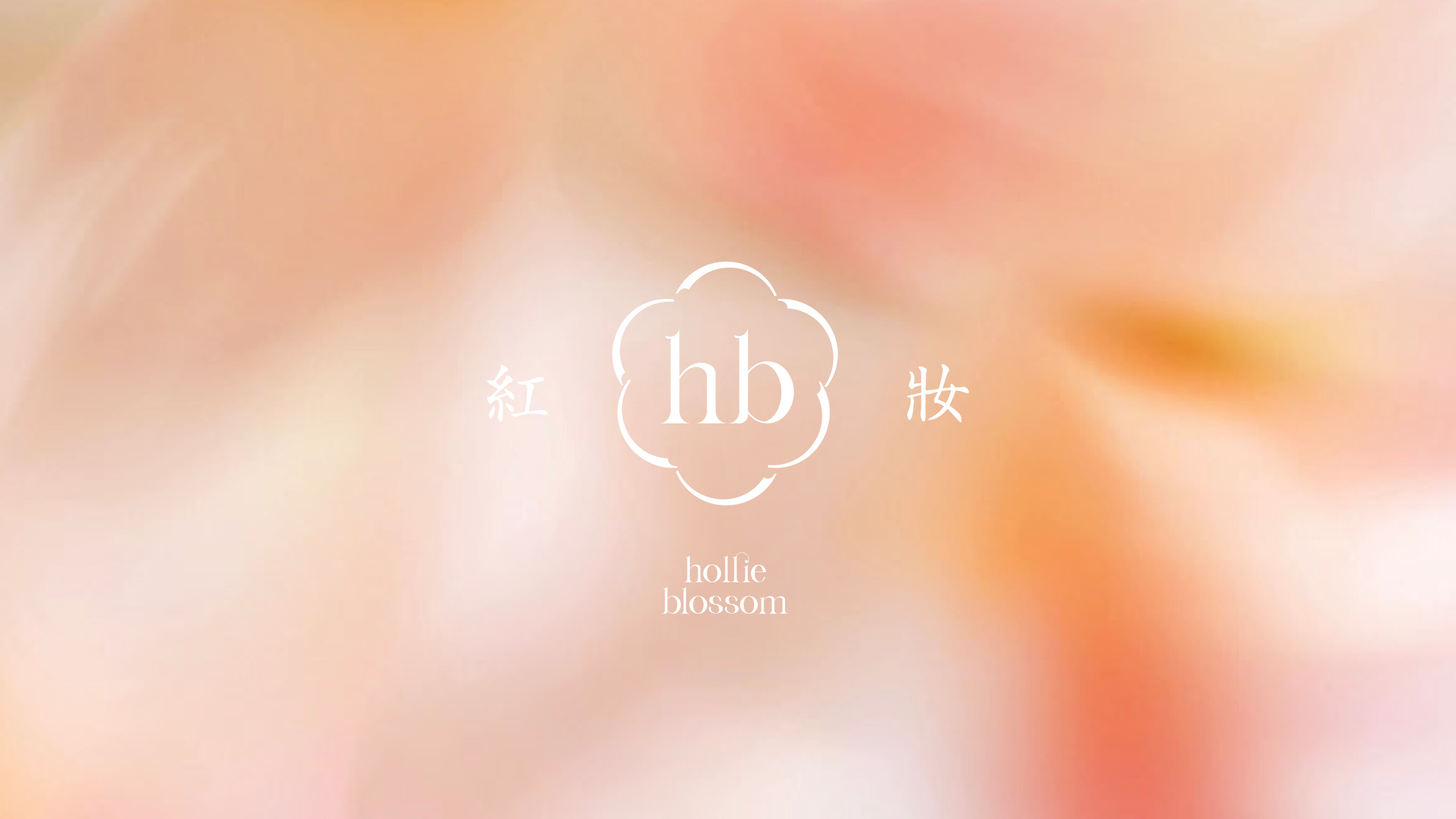
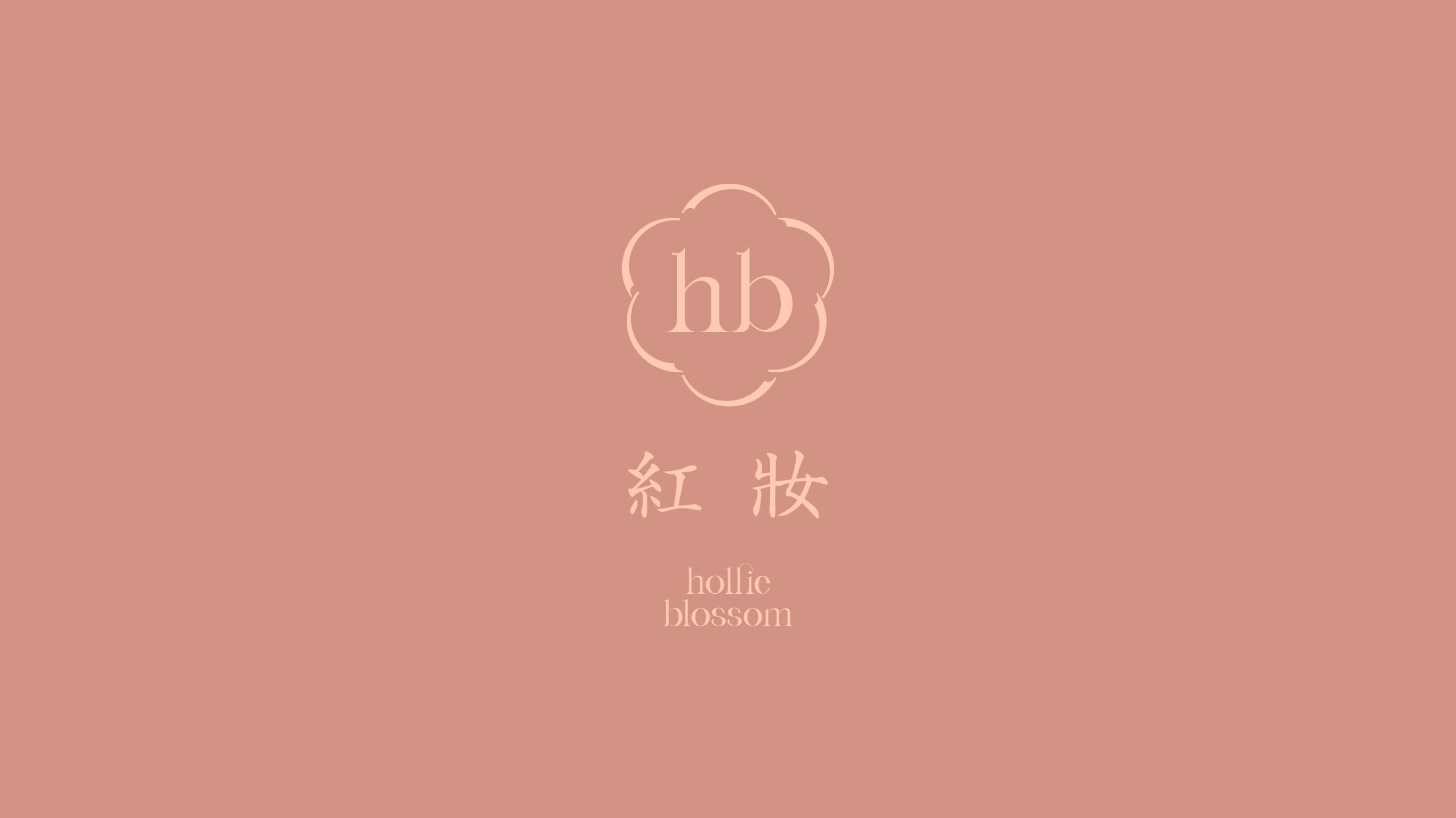
The logo design is inspired by the image of blossoms opening, with abstracted lines simulating the curved surface of petals in full bloom, symbolizing the softness and resilience of femininity. The overall form balances elegance and tension, echoing Hollie Blossom's quality of being understated yet glowing. The negative space between the lines carries a breathing rhythm, giving the mark a sense of ease and the pulse of life, embodying the cultural depth of an Eastern aesthetics brand.
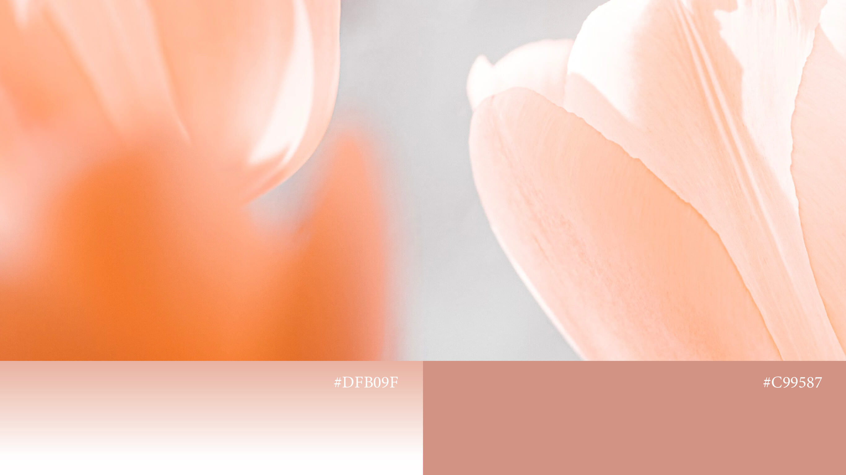
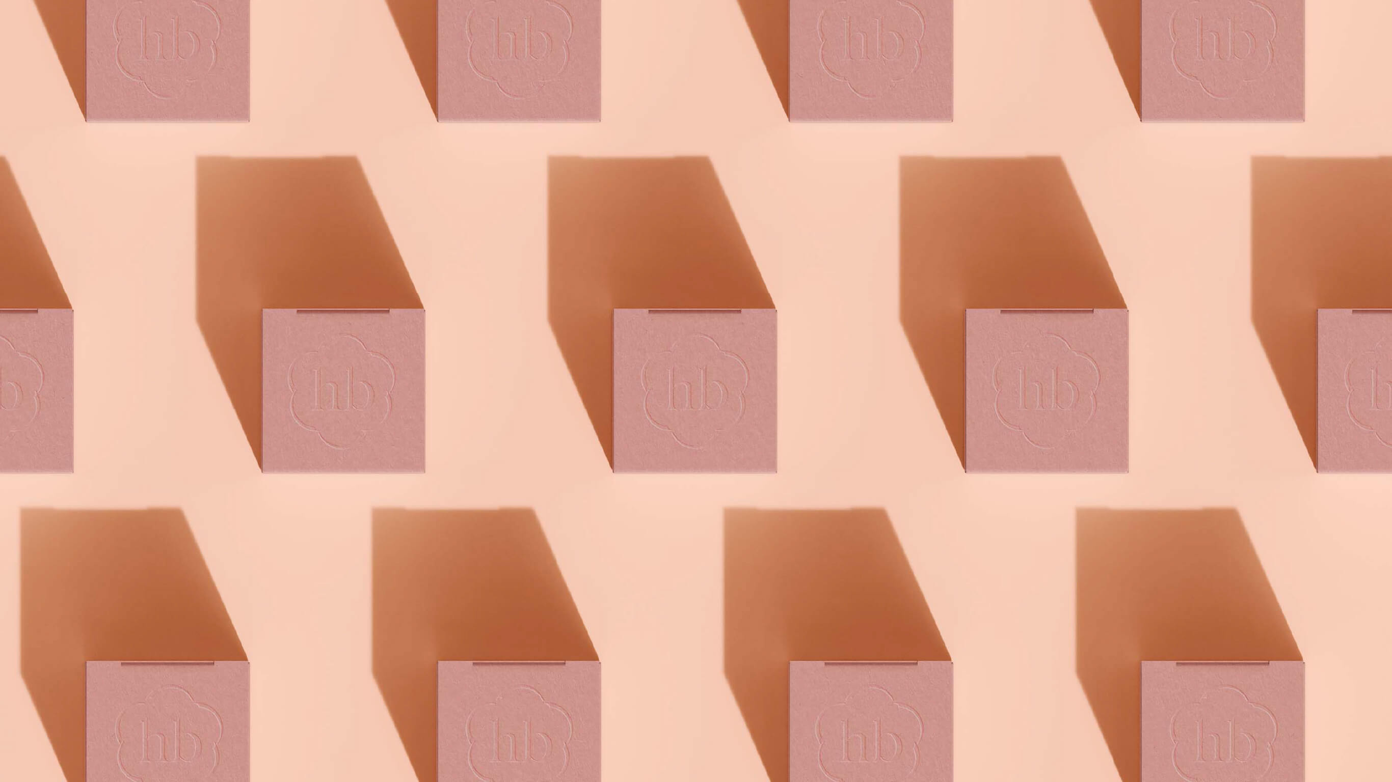
The color system centers on cinnabar red, diffusing outward into shades of off-white and pale gold, forming a poetic color language that conveys softness and approachability. The overall palette is warm and full, expressing the brand's quiet magnificence and the confidence of natural herbs, reinforcing its market positioning as a premium skincare brand.