Horizon Wellness Center
Finding Balance Amid Flow and Change
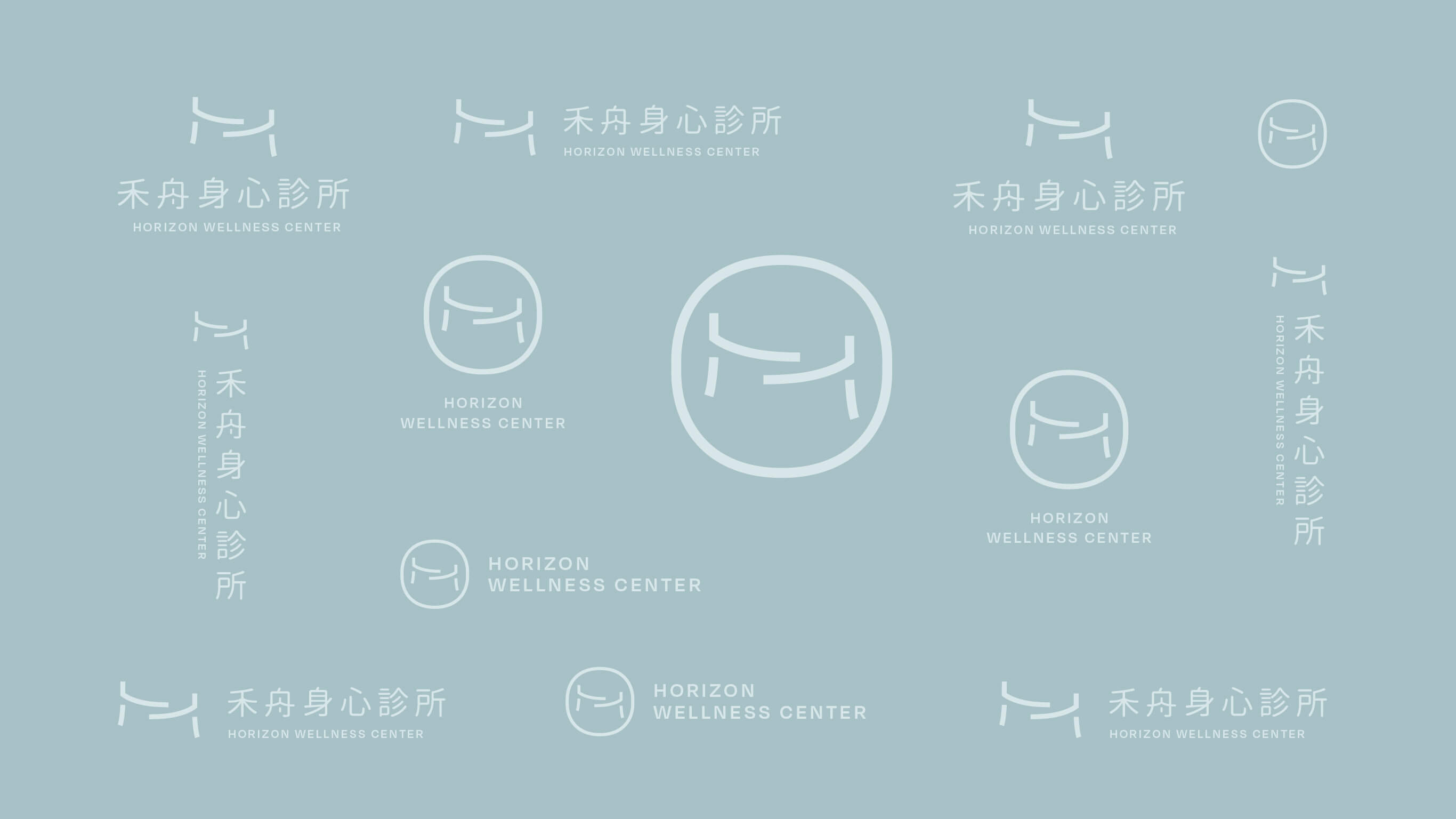
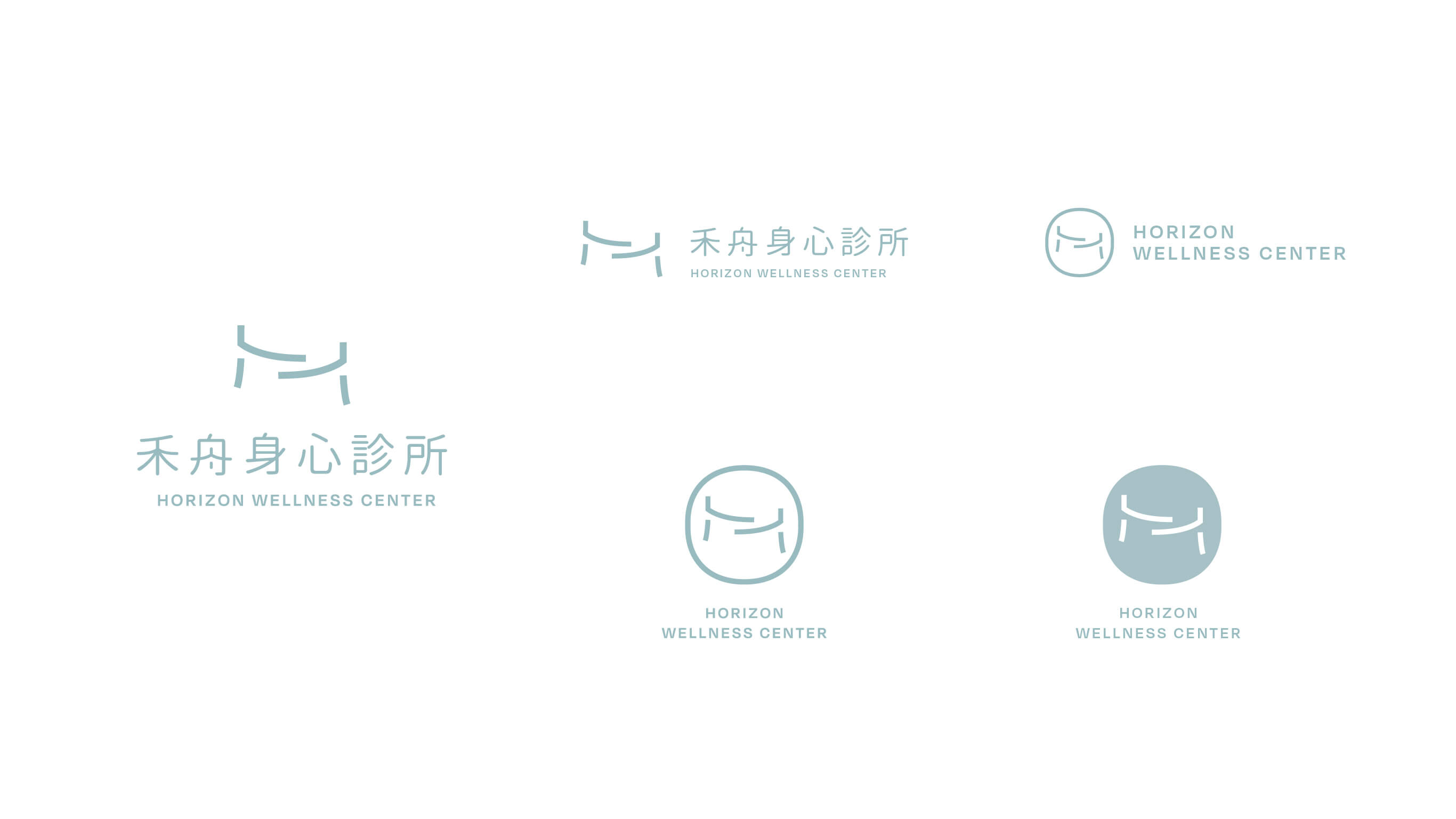
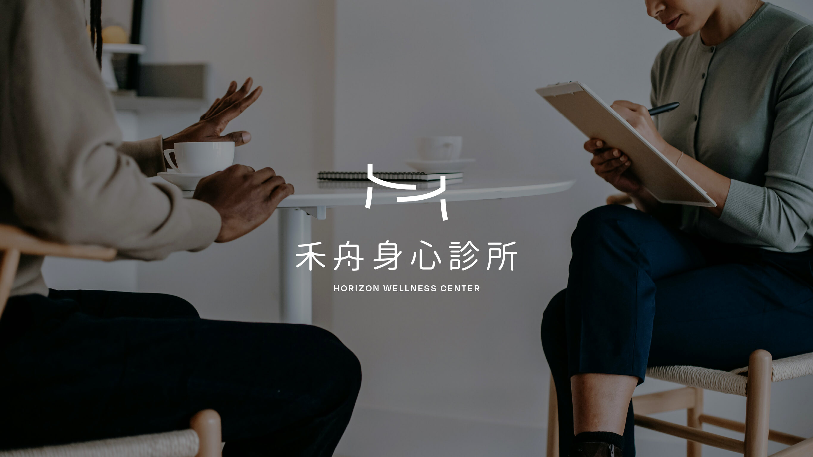
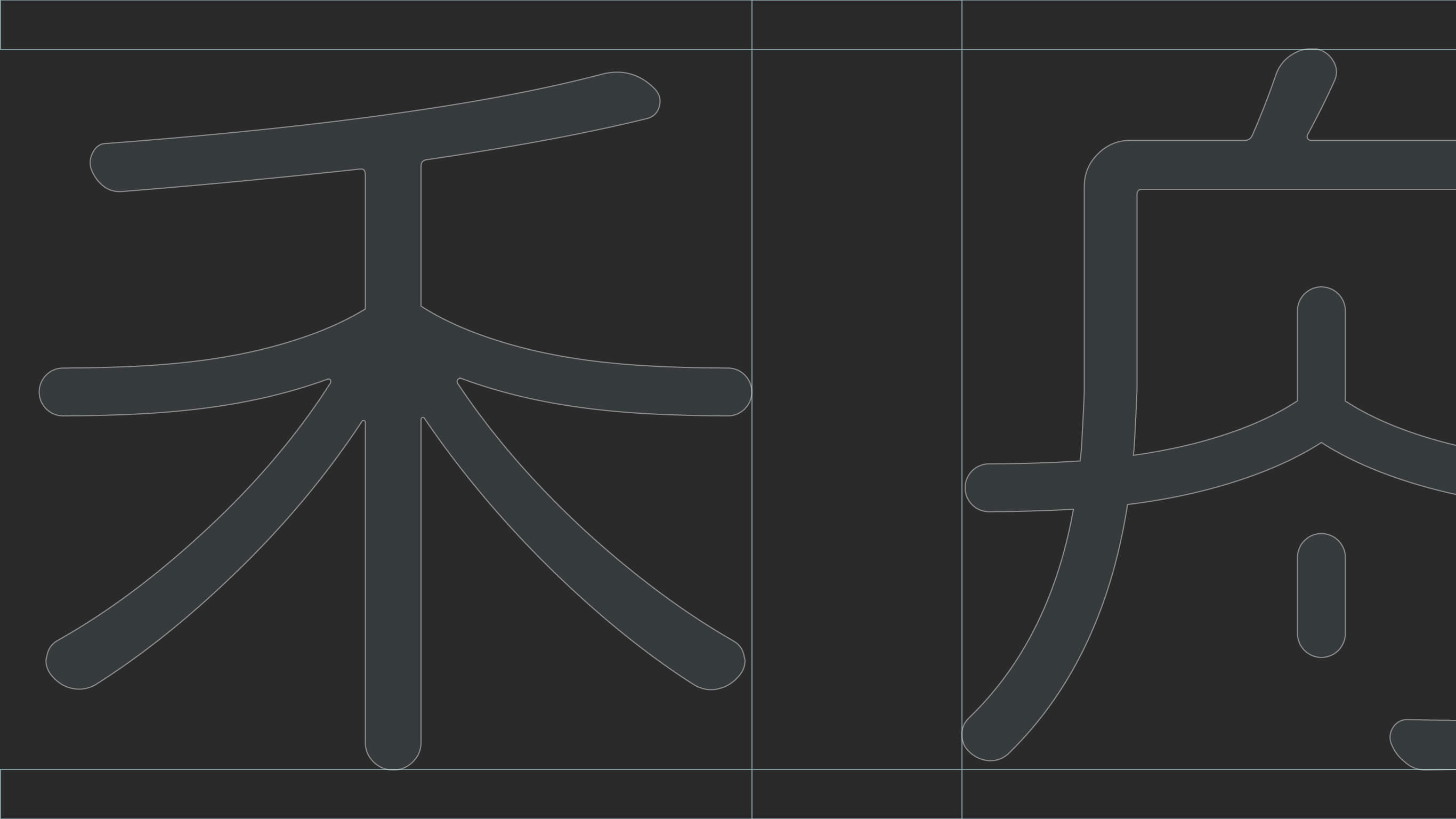
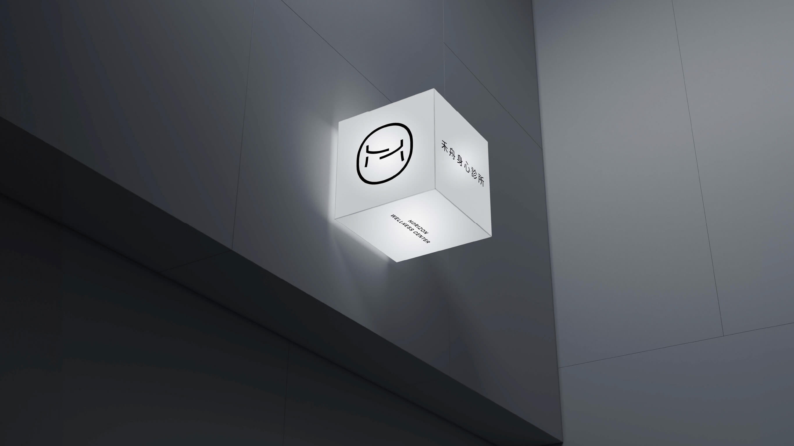
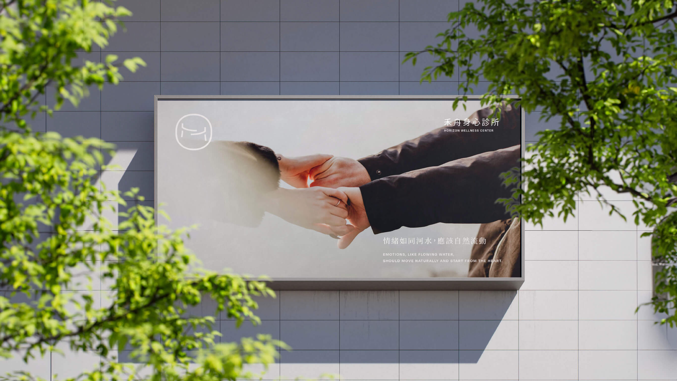
The logo for Horizon wellness center draws inspiration from "two people supporting each other," symbolizing the core of psychological healing — holding one another, offering mutual support. We built the form with minimal lines, preserving breath and space between strokes, as if creating a resting place for the mind.
The overall silhouette is light, seeking stability within movement — balancing a grounding strength with a warm, embracing quality. It reflects the brand's spirit of accompanying people through their inner landscapes and helping them find peace again.
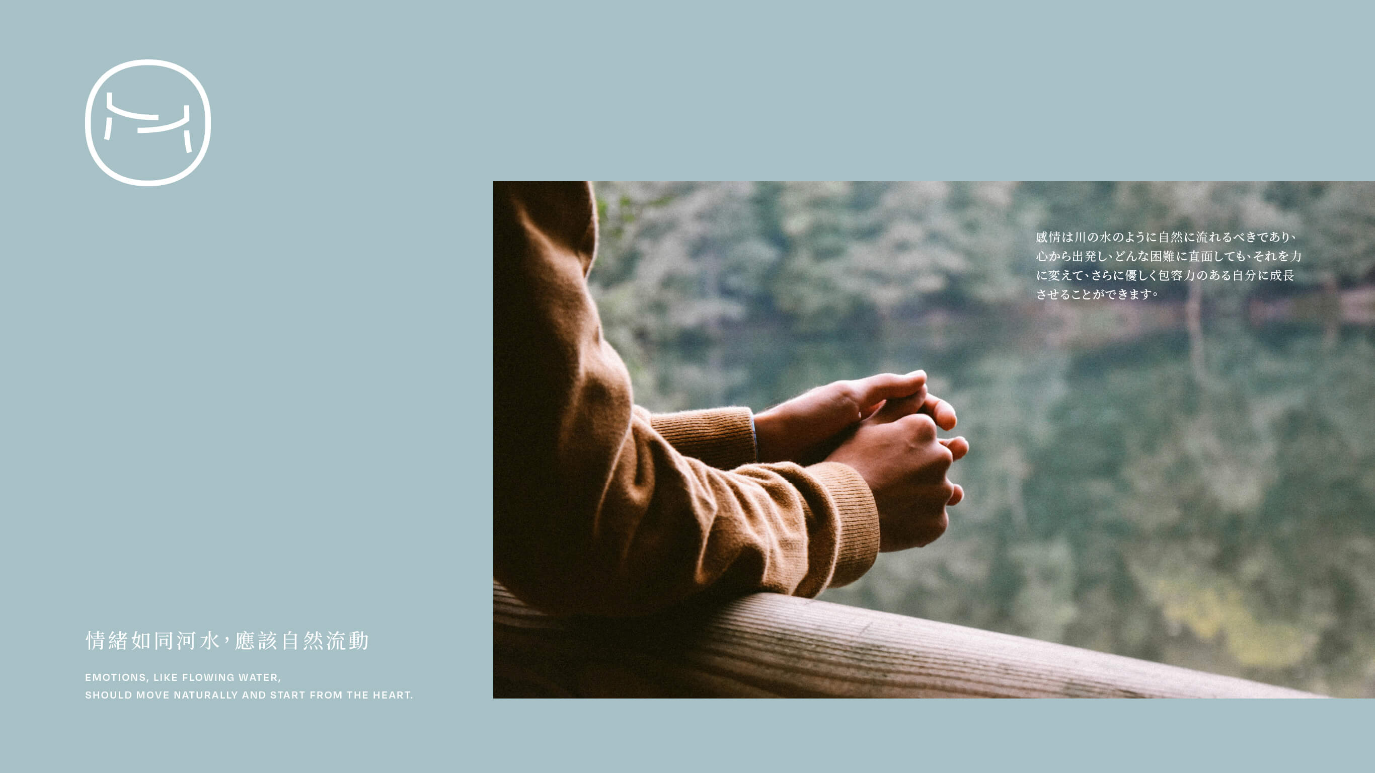
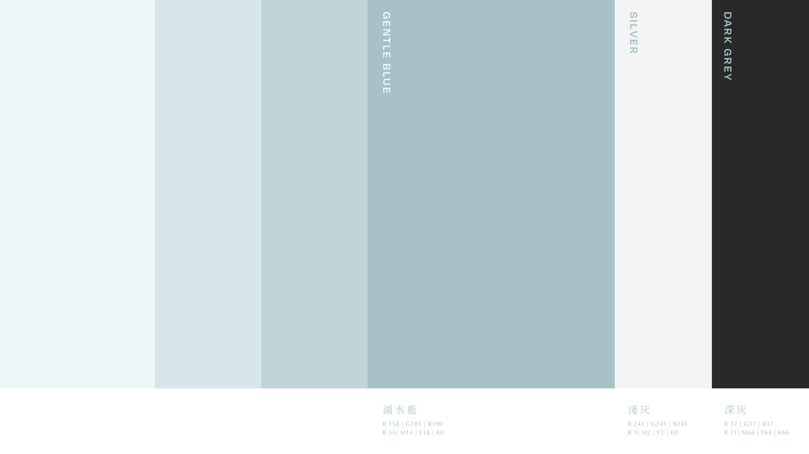
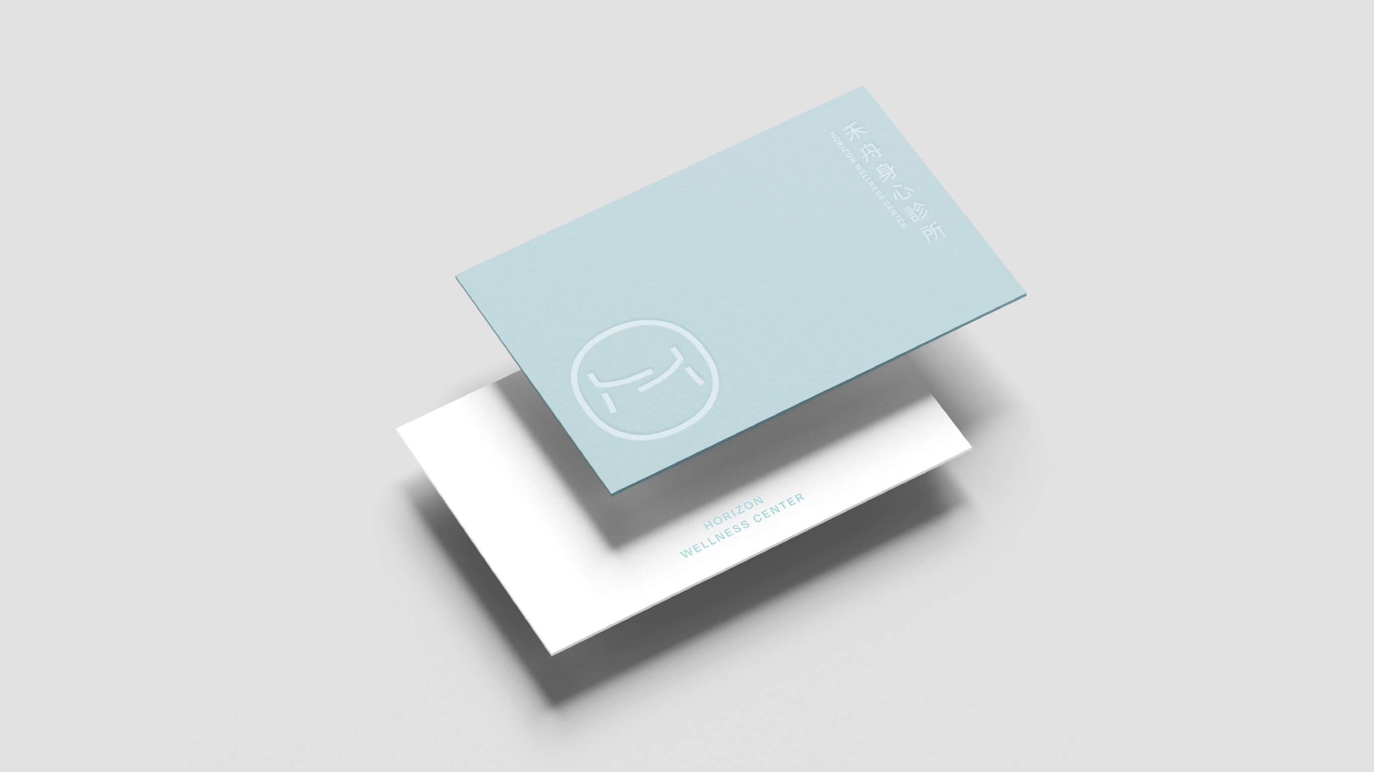
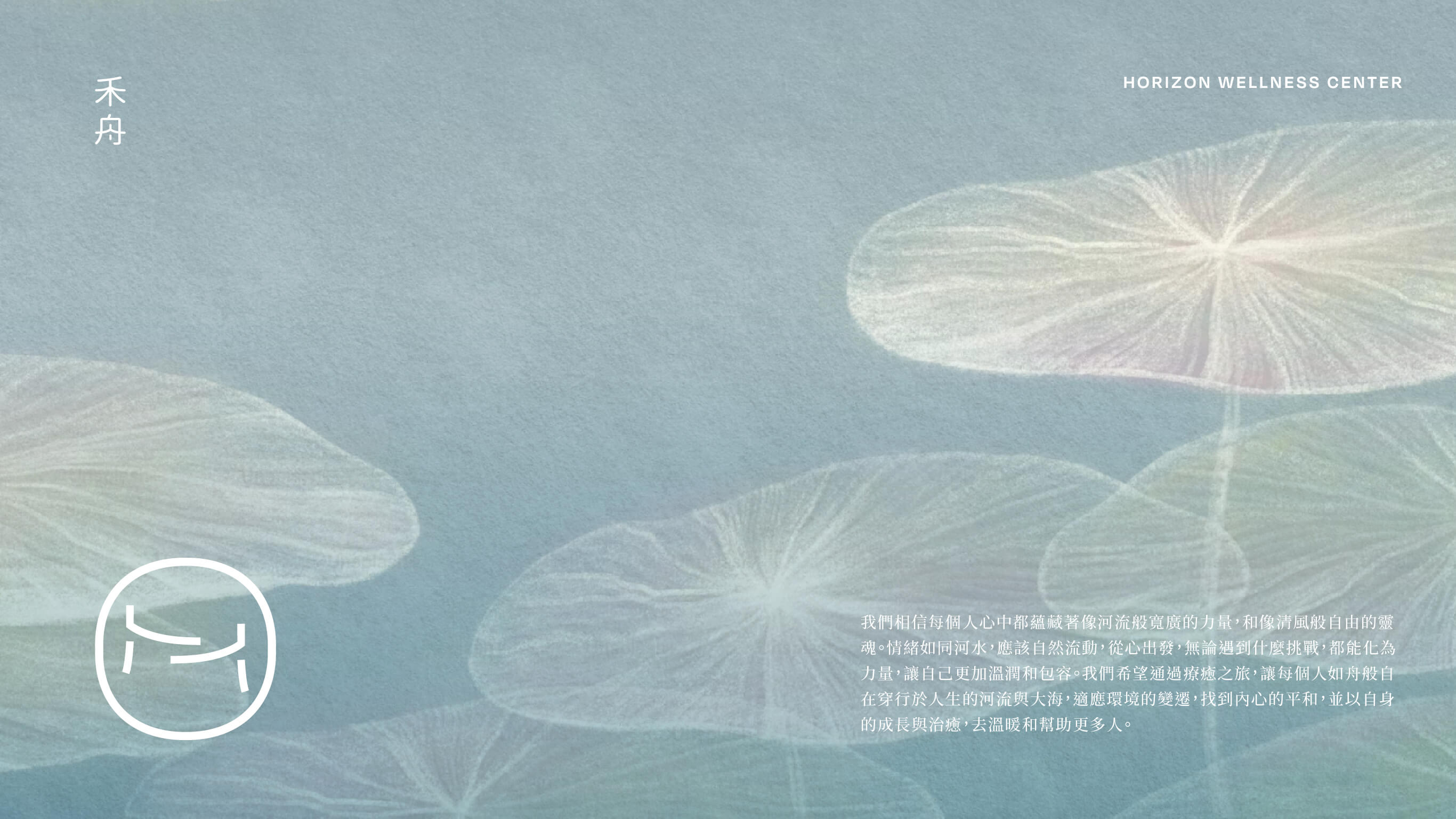
The primary color is a soft lake blue, symbolizing calm, clarity, and rationality — echoing the professional character of a mind-body clinic. Supplemented by warm off-white and misty gray, the palette creates a settled, serene atmosphere that communicates the warmth of a healing space and the rhythm of a deep breath, giving the identity both medical professionalism and a gentle, humanistic quality.