LIWU Craftwork
Building Warmth with the Spirit of Handcraft
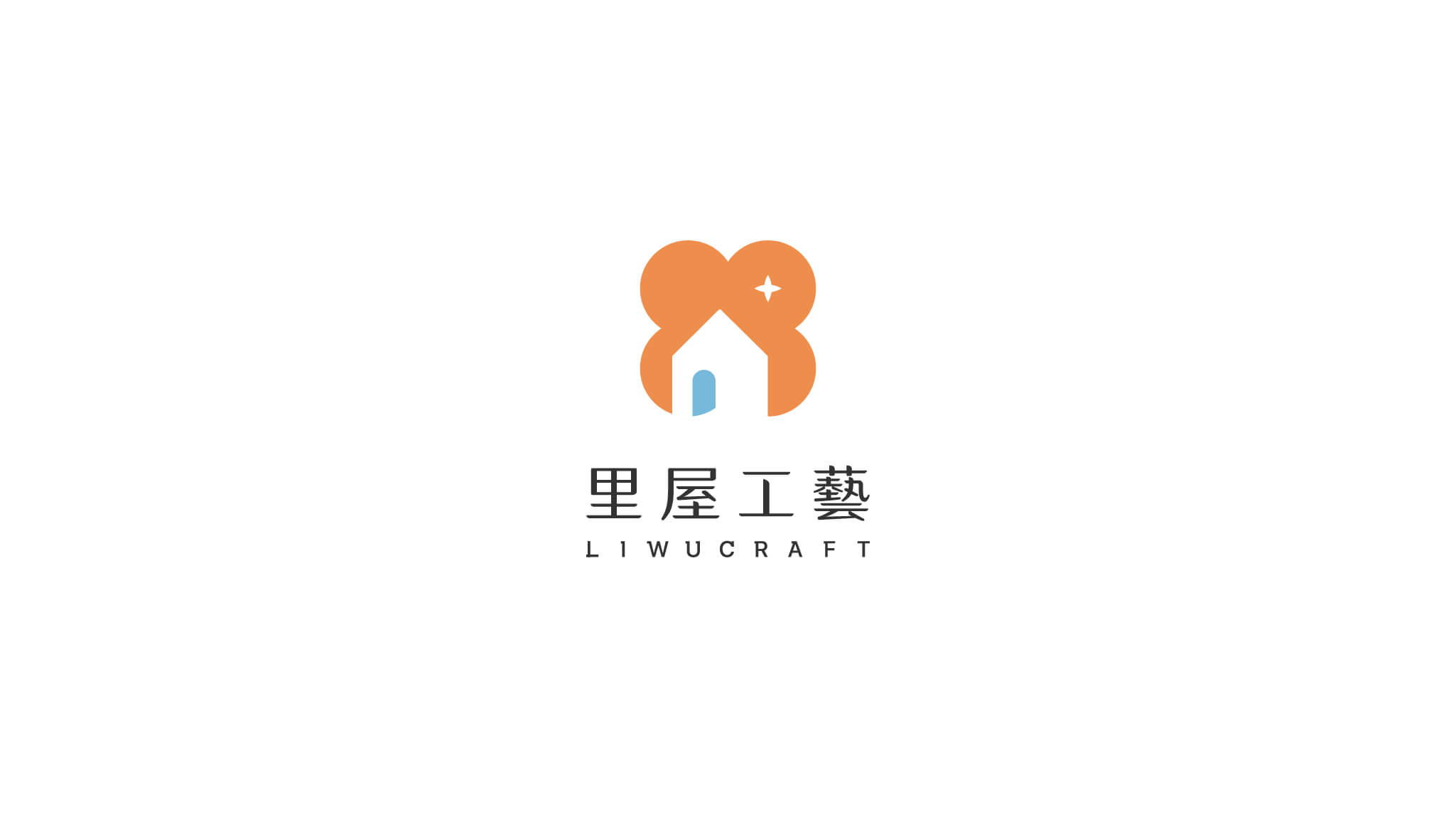
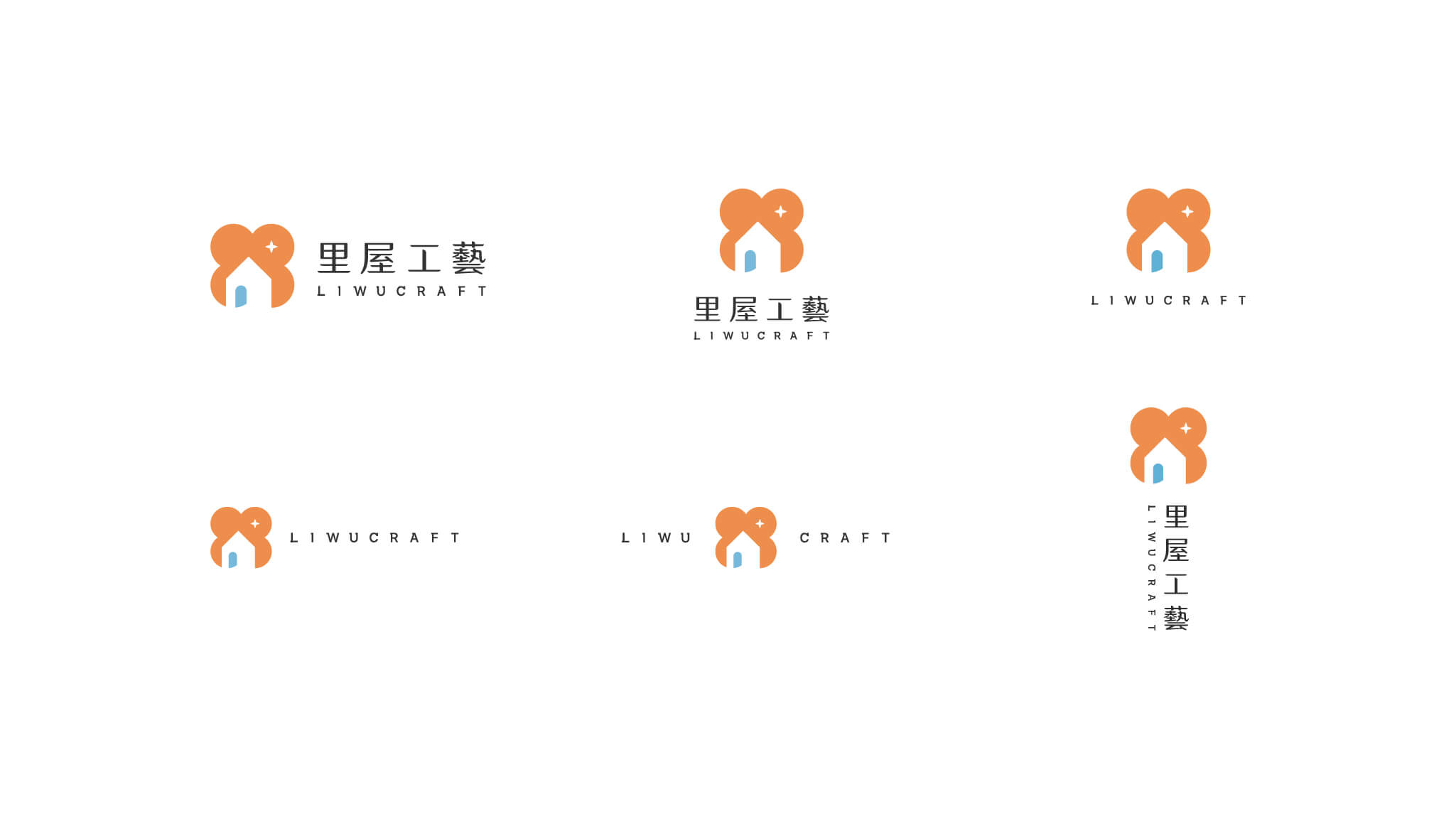
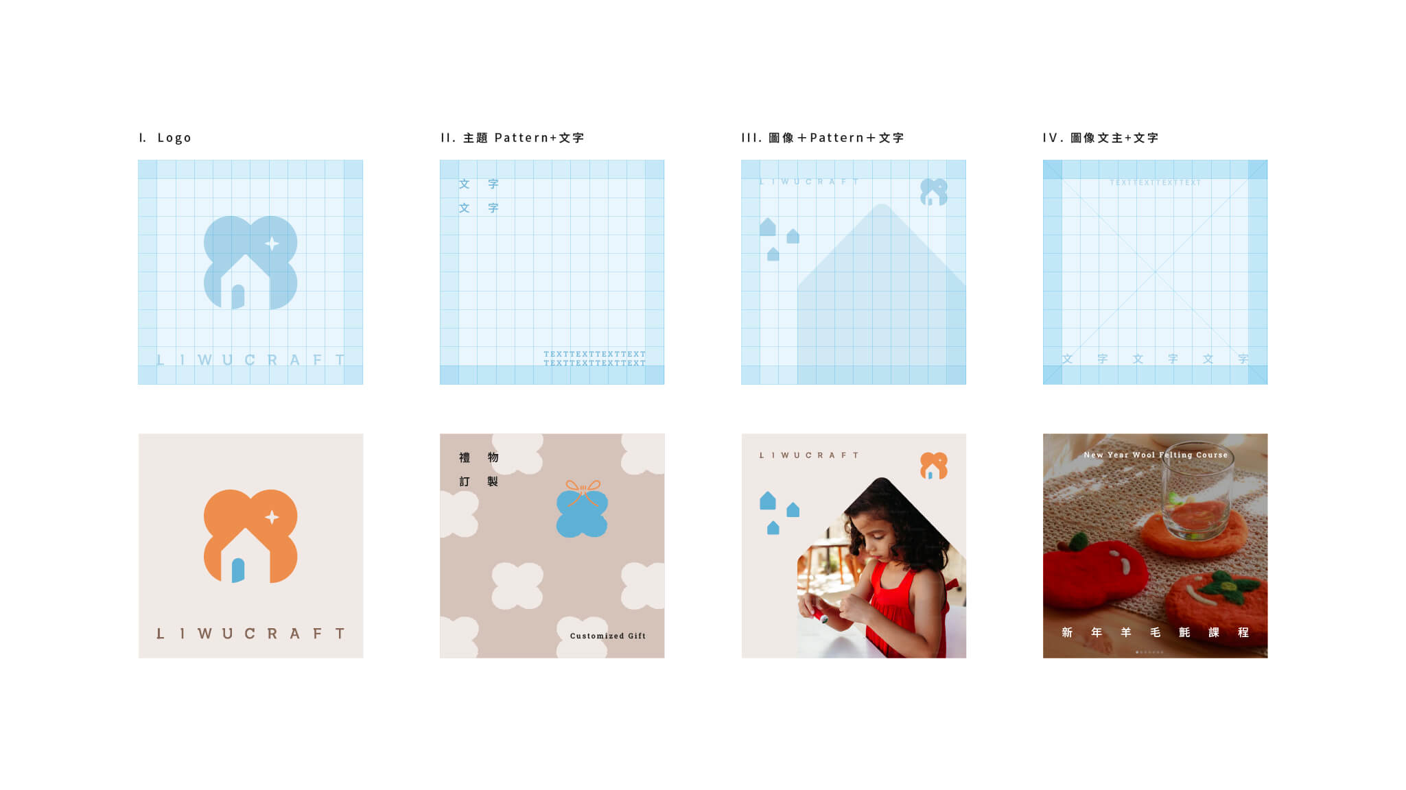
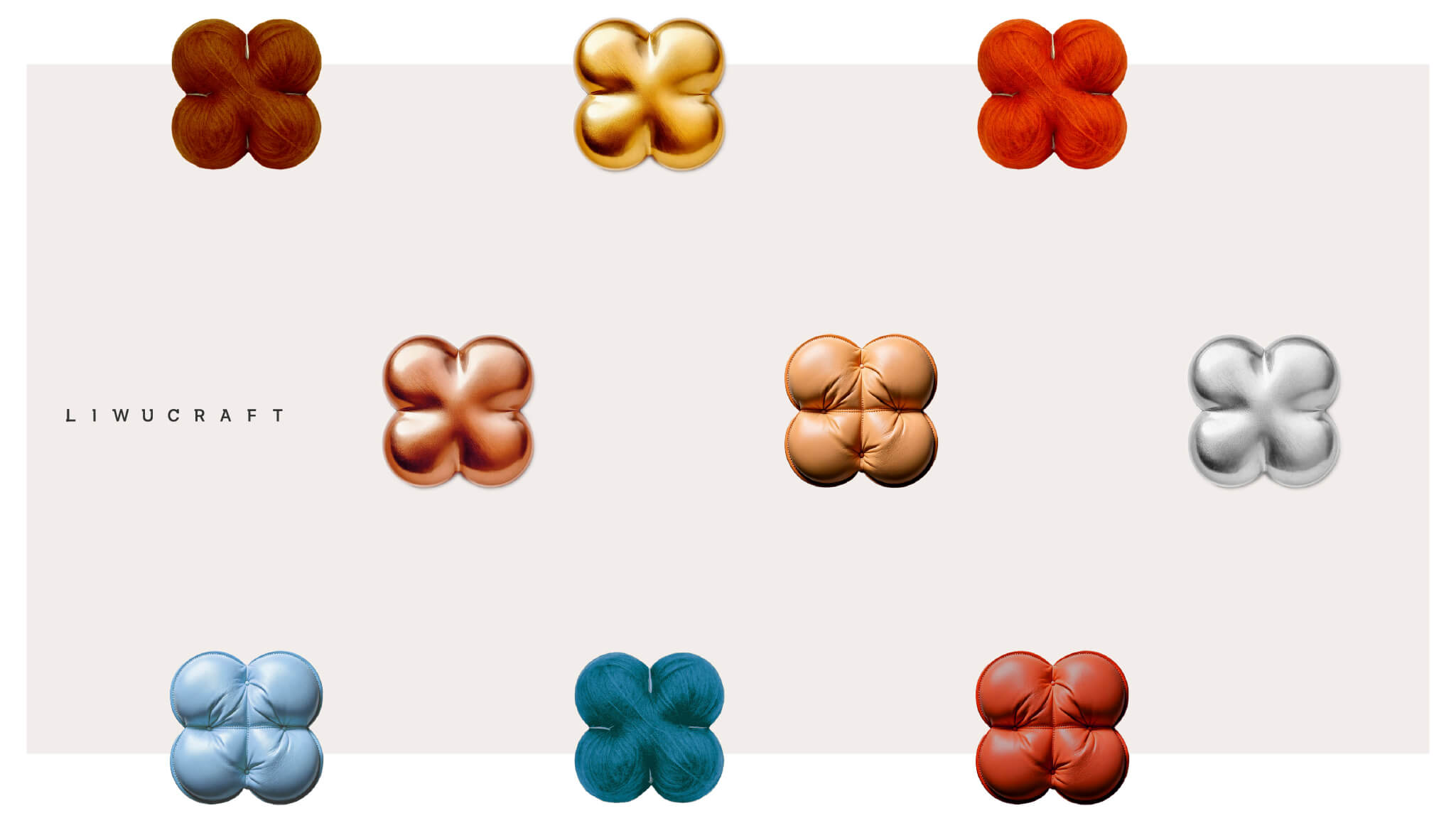
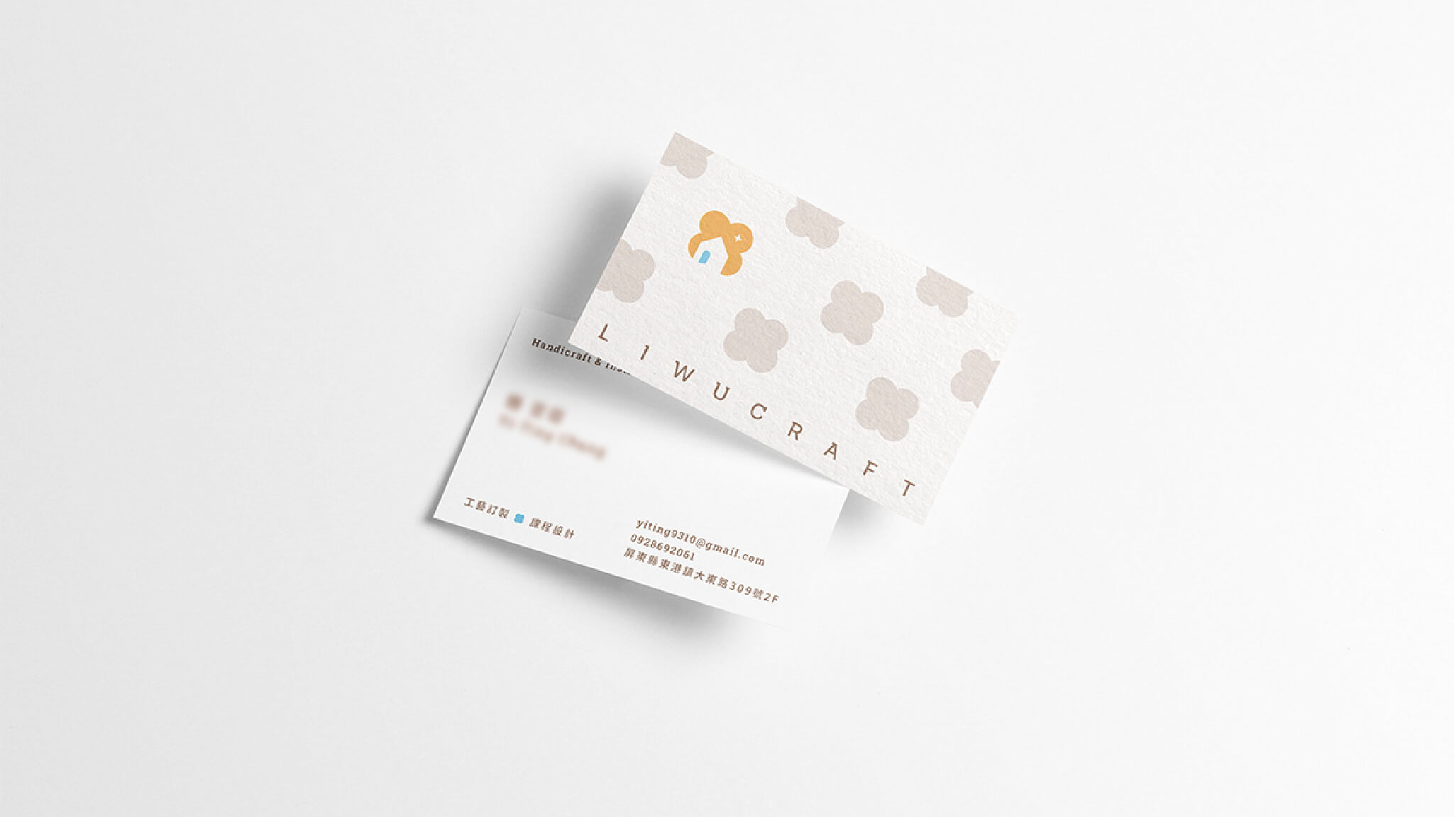
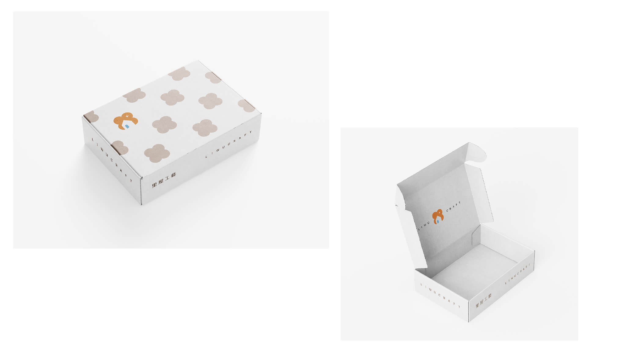
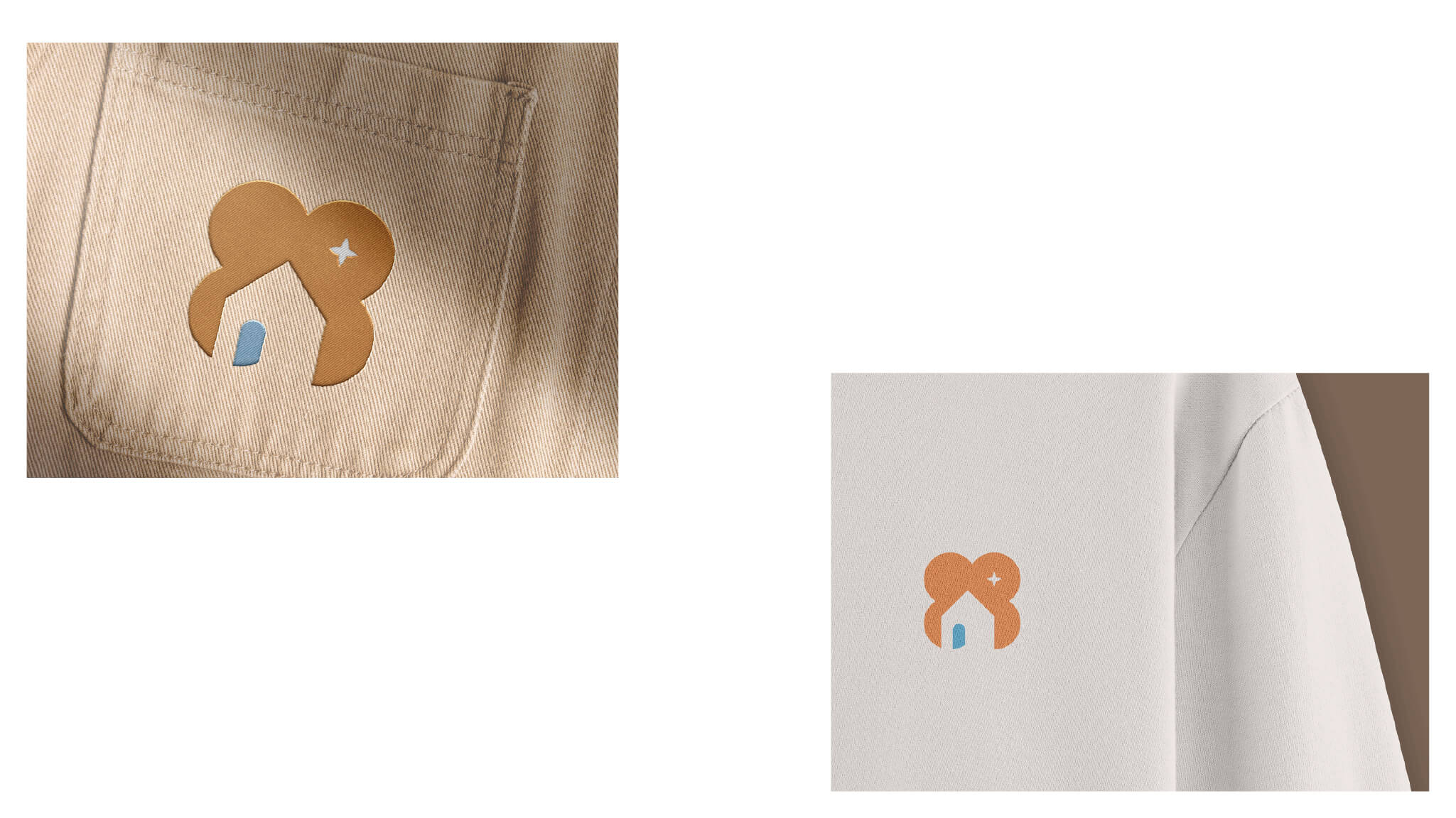
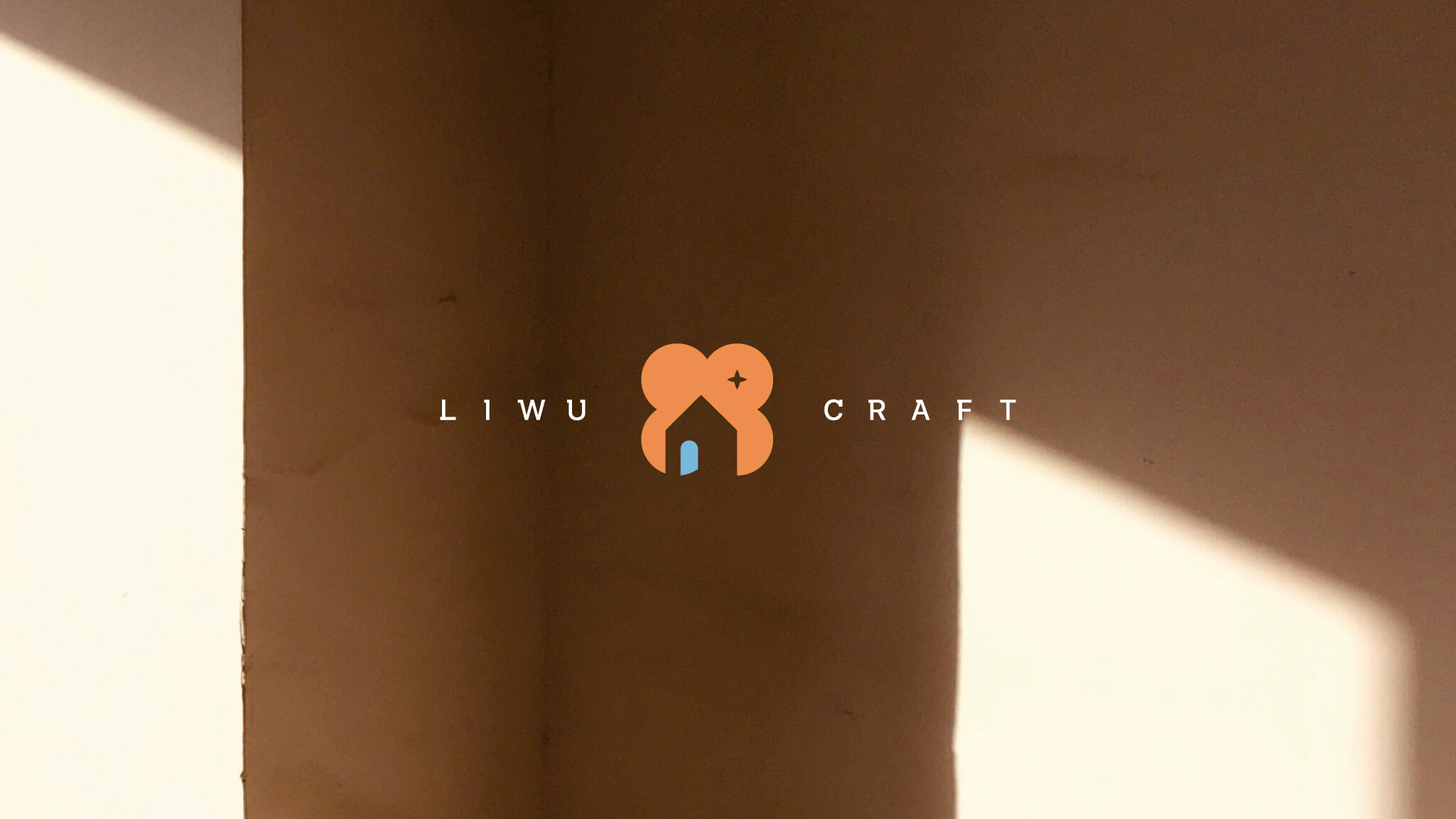
The logo's primary form is built from four circles derived from the character "里" (li), forming a floral petal shape that symbolizes the vitality and resilience of creativity. Through negative space design, the silhouette of "屋" (house) is carved out, representing the space of creation. A small sparkling star at the center symbolizes inspiration and "experience," conveying the brand's hope that everyone who visits LIWU's space will enjoy a joyful and inspiring time of handcraft.
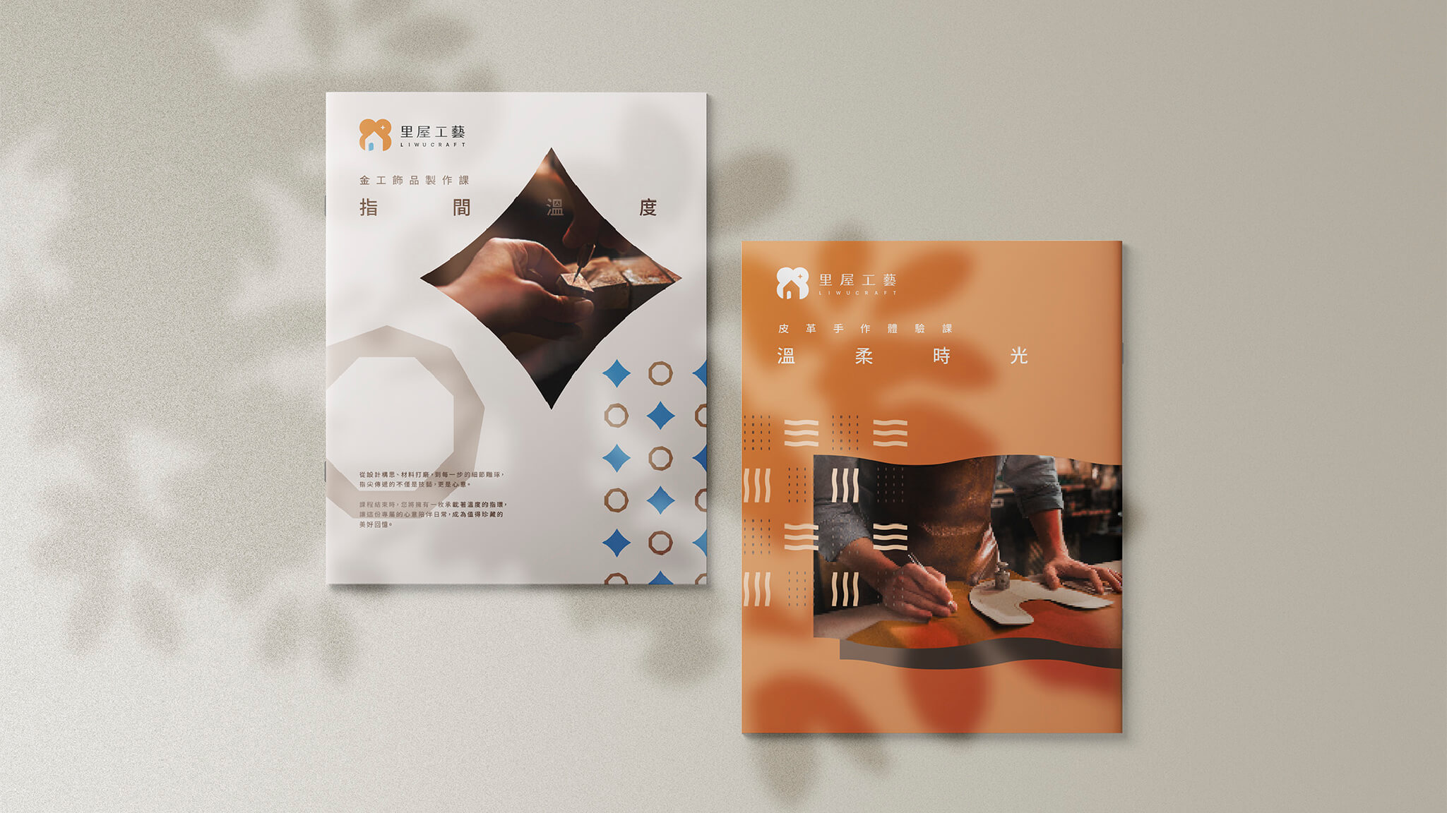
The primary color is a warm terracotta orange, representing the warmth of handcraft and the earthiness of clay; it is complemented by a refreshing sky blue, symbolizing the flow of inspiration and breath. Together they create a soft, sunlit atmosphere, echoing the brand's core vision of "turning warmth into everyday scenery" and expressing the healing quality that a craft experience brand calls for.