Meowitch
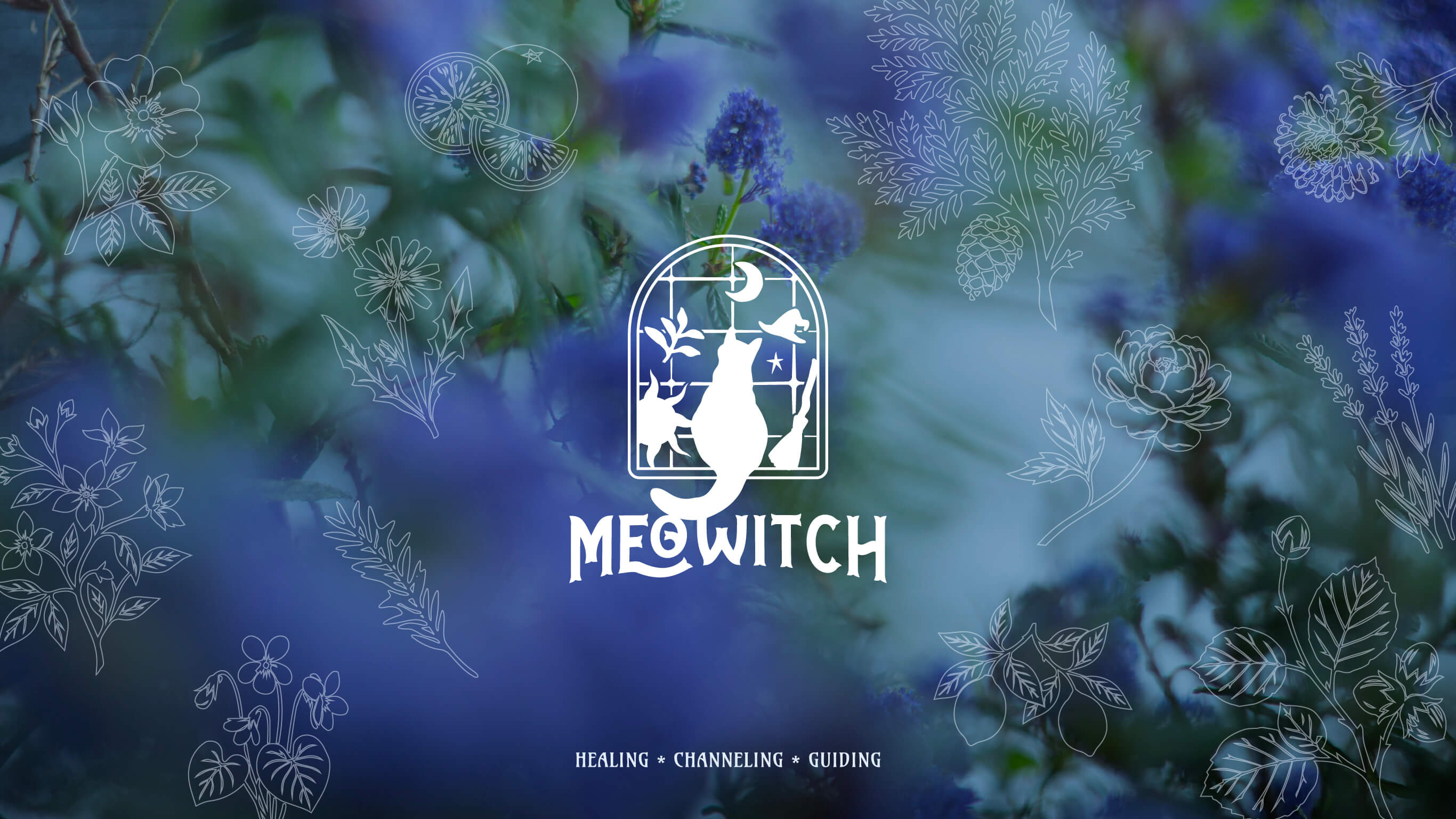
Healing, Channeling, Guidling
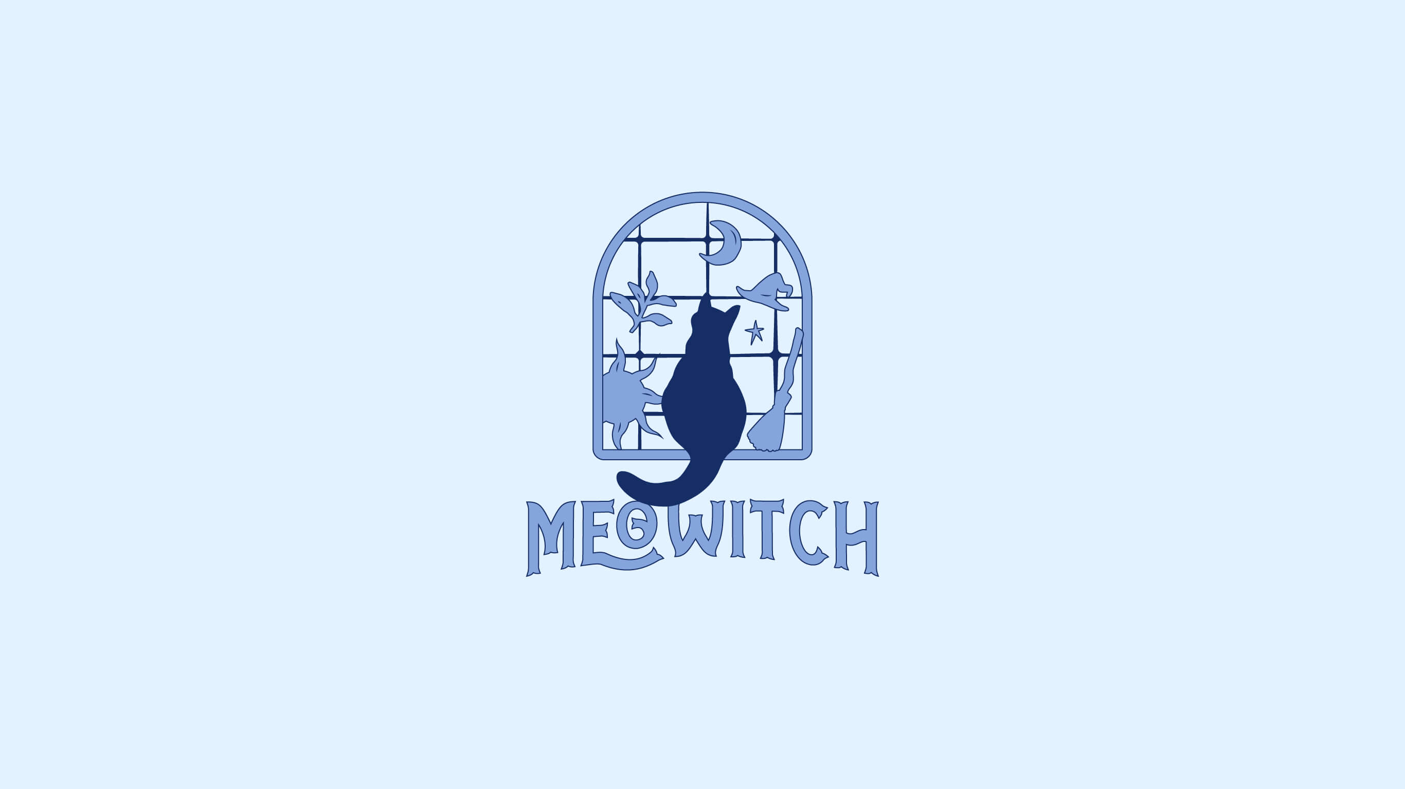
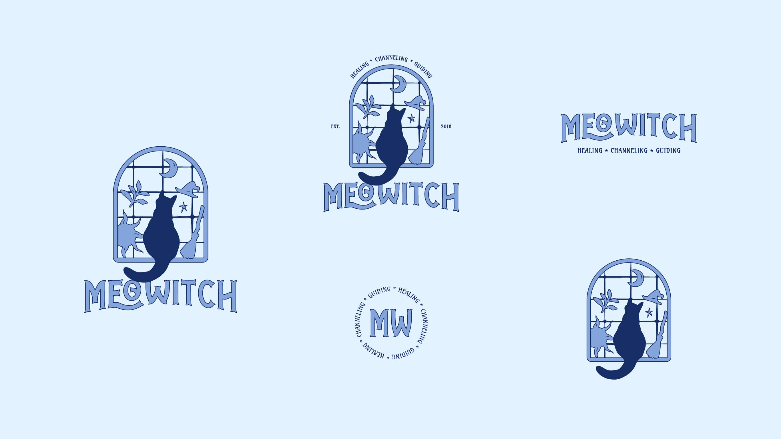
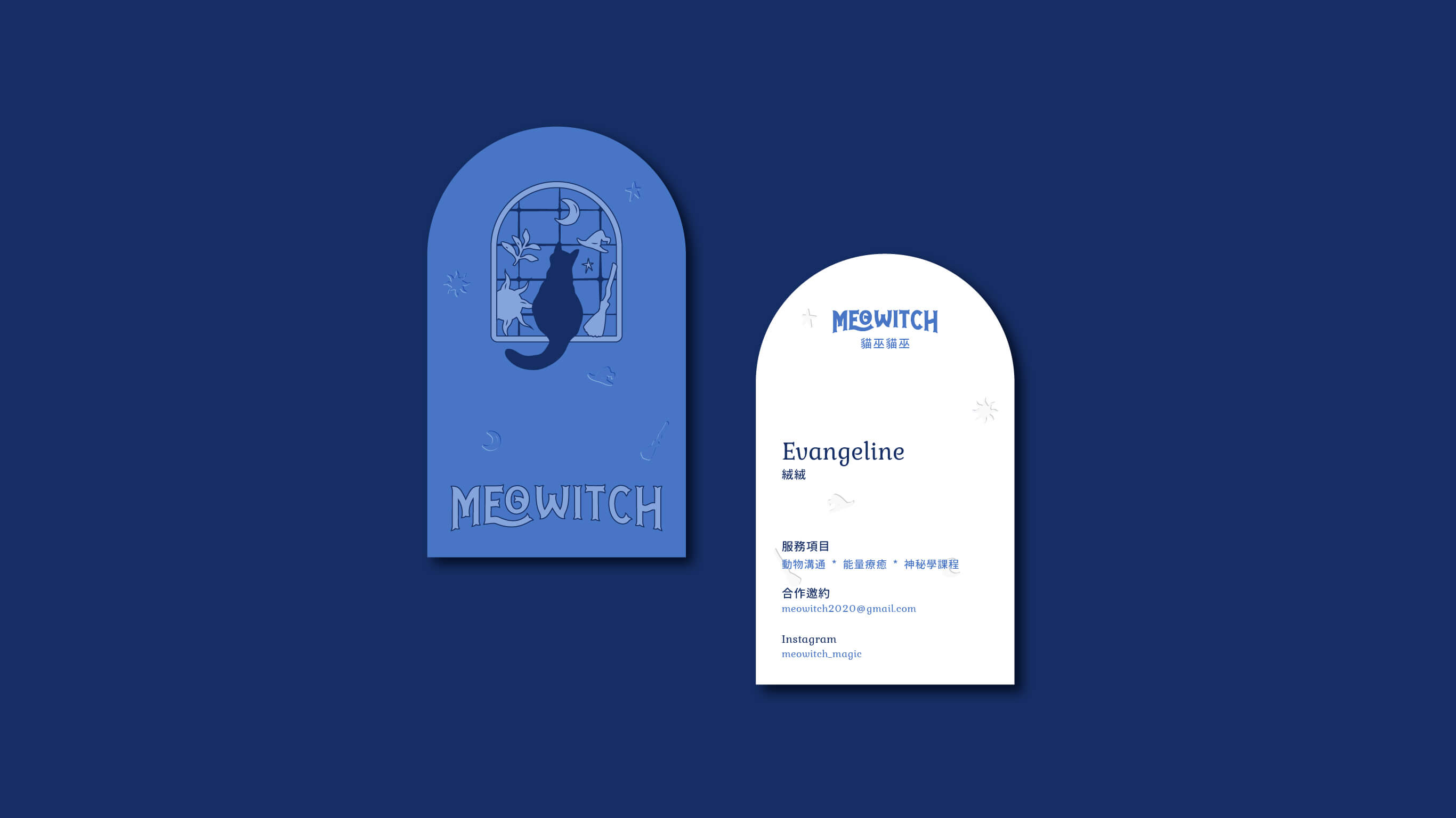
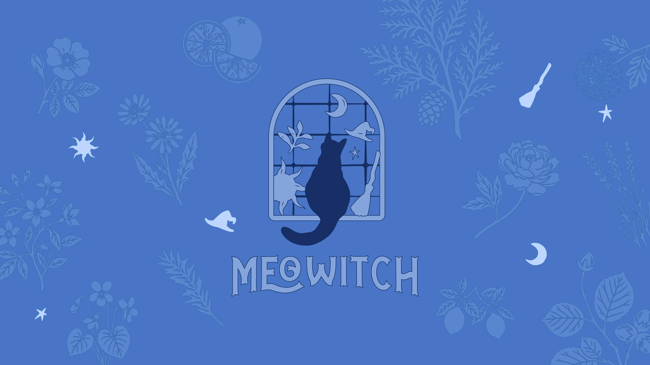
The blue in Meowitch's logo represents the water element — associated with channeling, healing, and nourishment. A cat sits peacefully by the window, gazing outward: a connection between the inner world and the outside. The light streaming through stained glass windows is colorful, a reminder that all things have their own unique beauty. Patterns of the sun, moon, stars, and herbs symbolize a witch in touch with nature. The curves of the logotype flow like vines, soft and winding in an embracing posture — echoing the healing core of Meowitch.