NOGIKU Coffee
Growing Freely, Moving Toward the Light
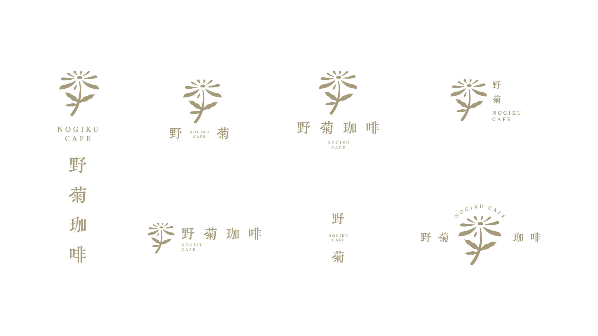
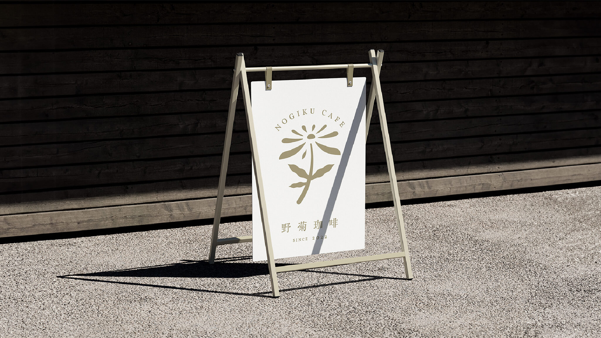
The NOGIKU Coffee logo depicts the posture of a wild chrysanthemum growing freely, reaching toward the light. The petals are composed of clean, refined lines that carry the softness of hand-drawing, and the overall form preserves the natural imperfection and breath of nature — giving the whole mark a clean, gentle strength that successfully expresses the brand spirit of "Nogiku."
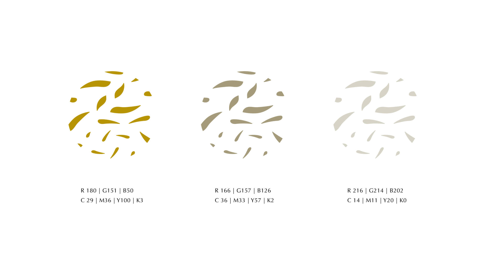
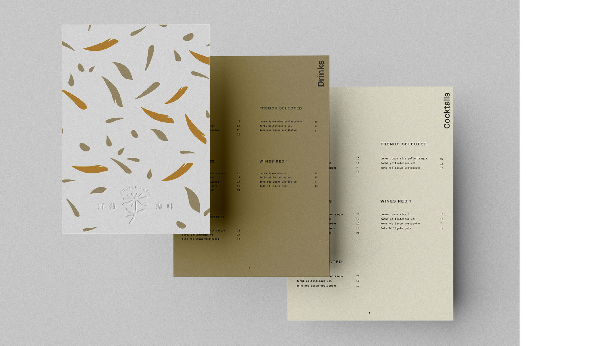
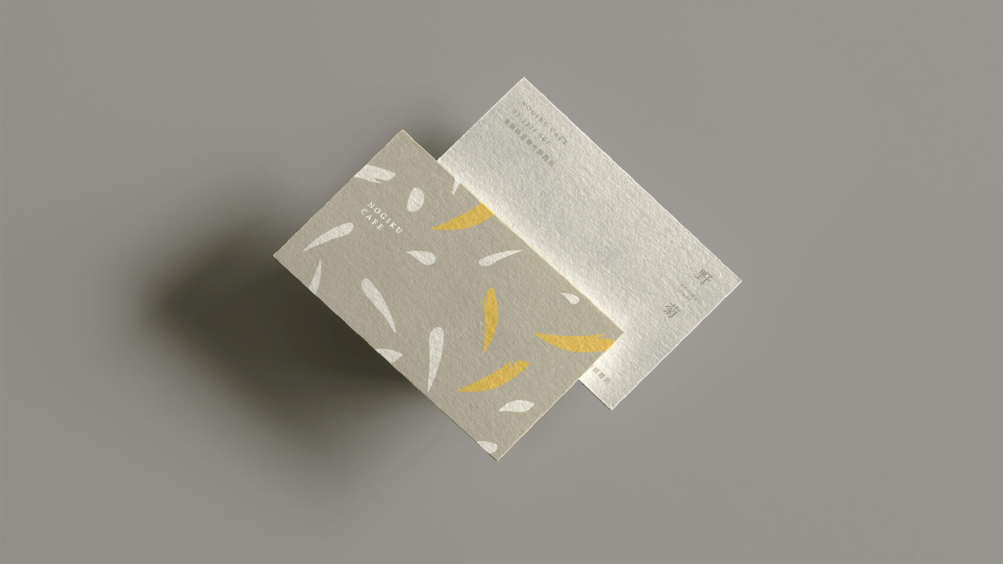
The color palette uses golden yellow, earthy brown, and warm gray-white as the primary tones. Golden yellow symbolizes warmth and sunlight; earthy brown represents the earthiness of the land; and the warm gray-white balances the overall visual with freshness and quiet. Together, the three construct a soft and breathing brand atmosphere, allowing NOGIKU Coffee's visual language to carry forward the brand's spirit of "purity and sincerity," quietly blooming in everyday life.