Tea Layers
Inspired by Layering — Reflecting the Layered Beauty of Tea Culture
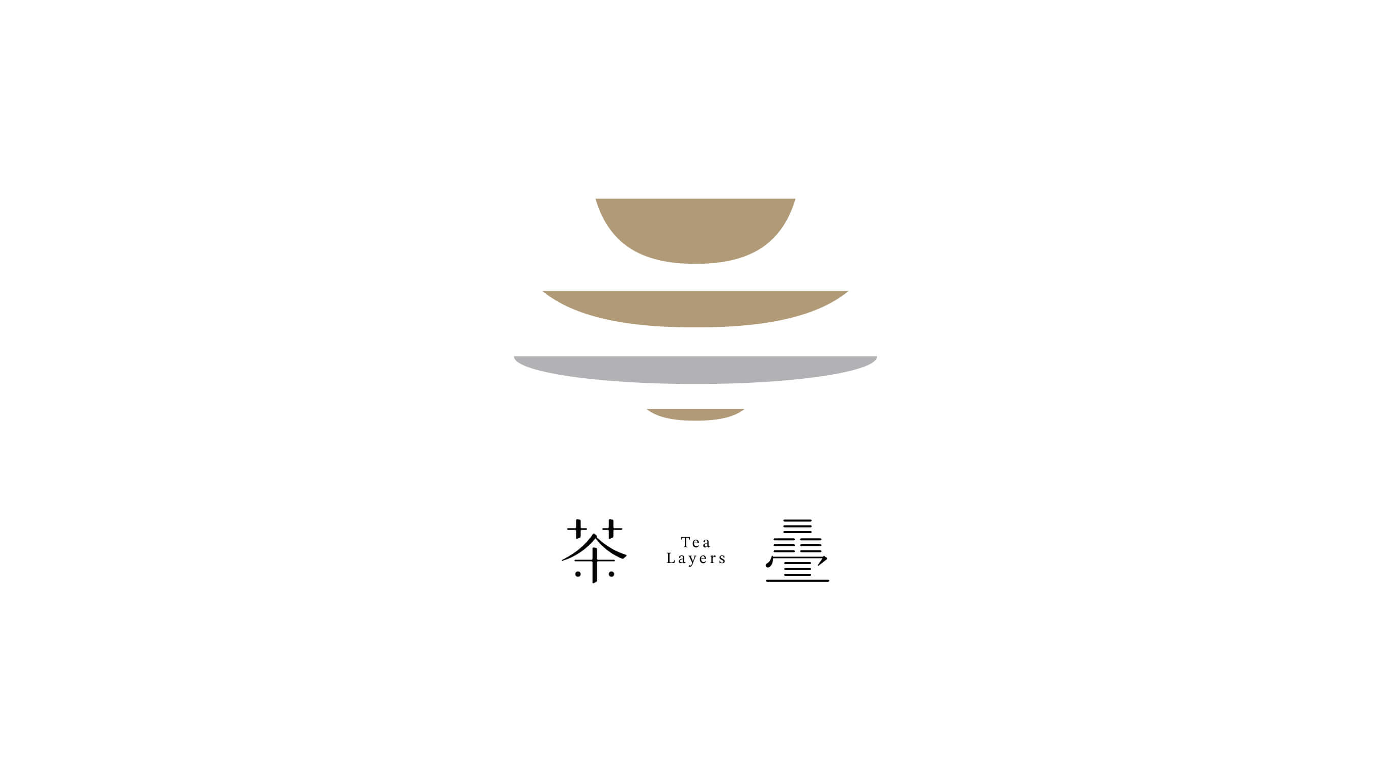
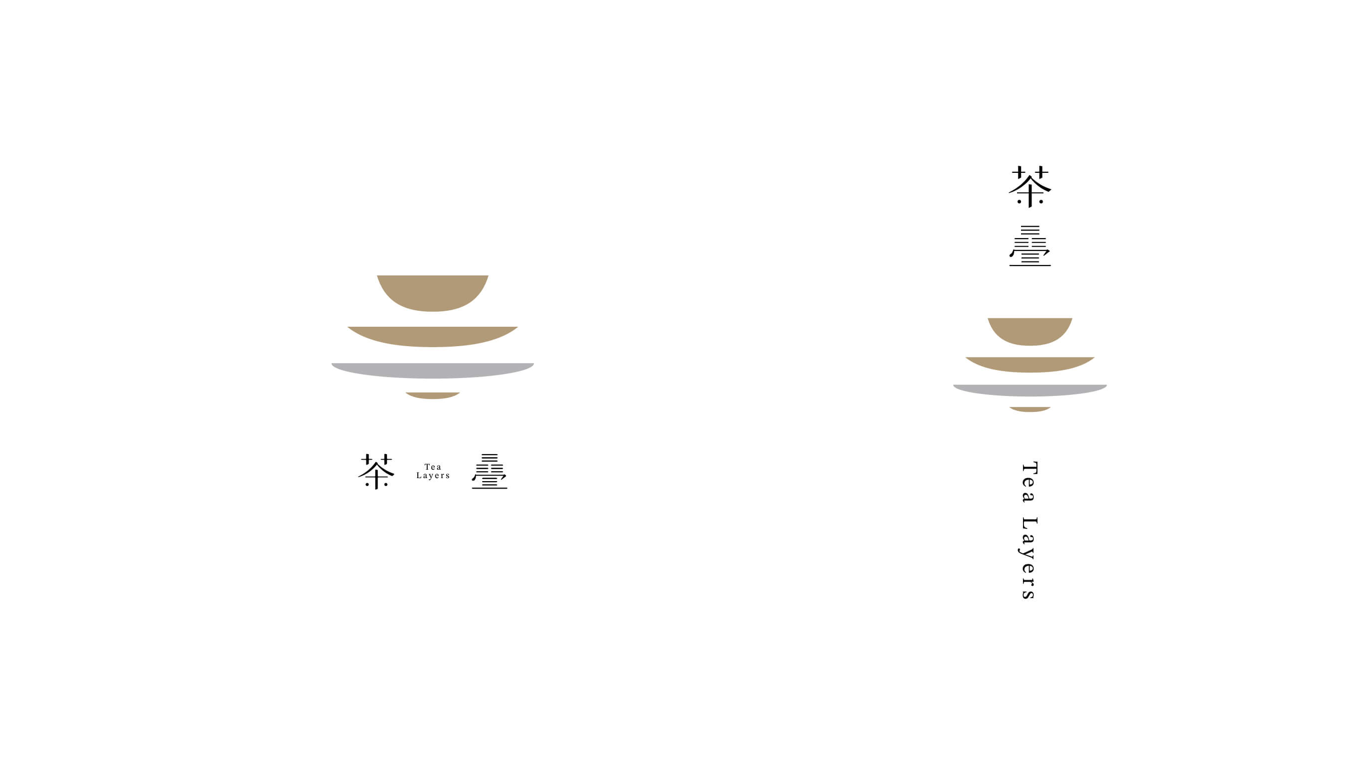
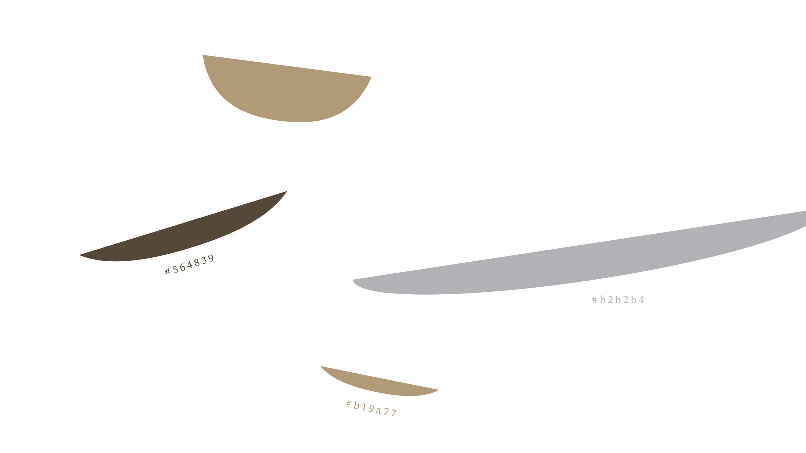
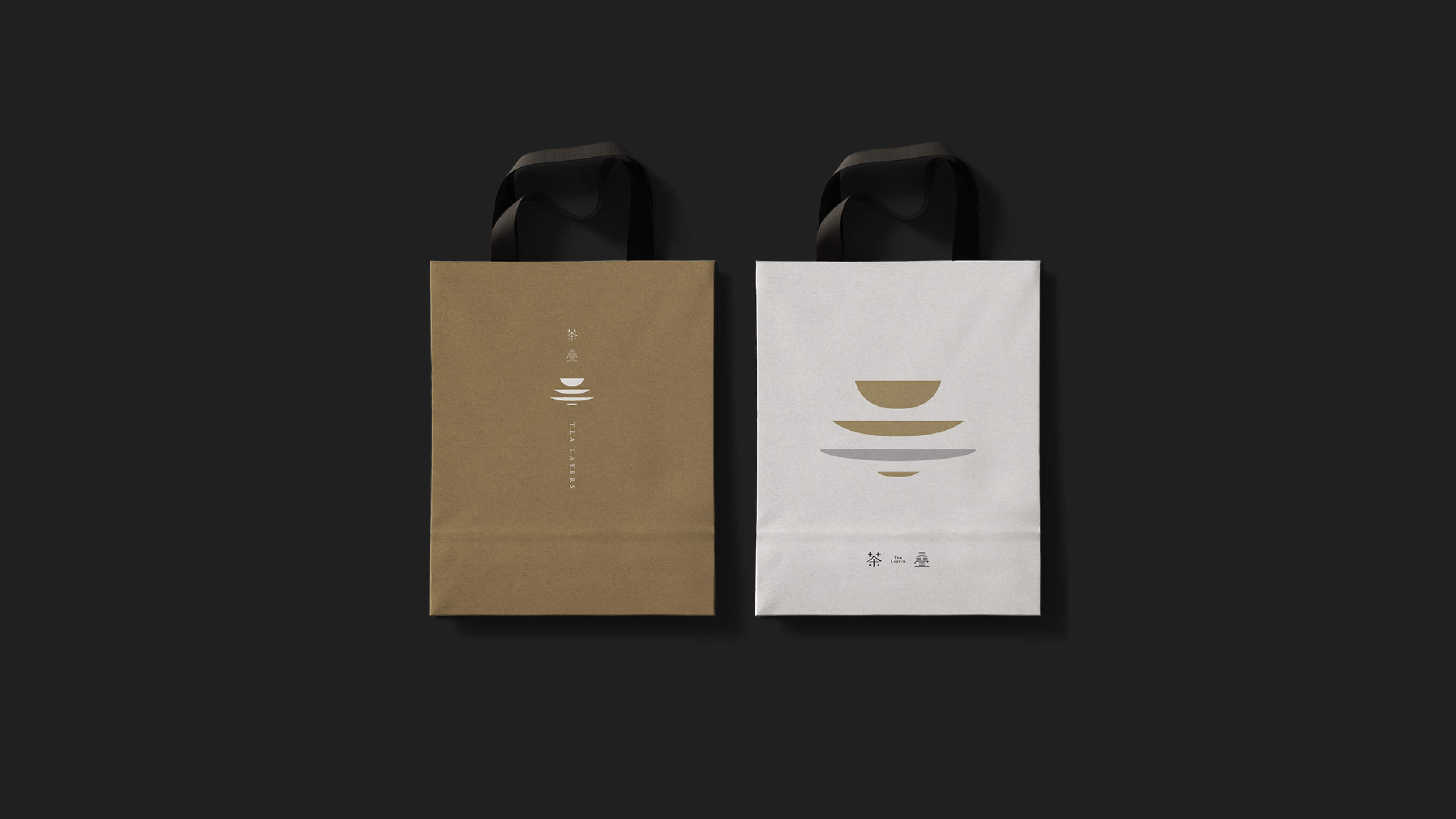
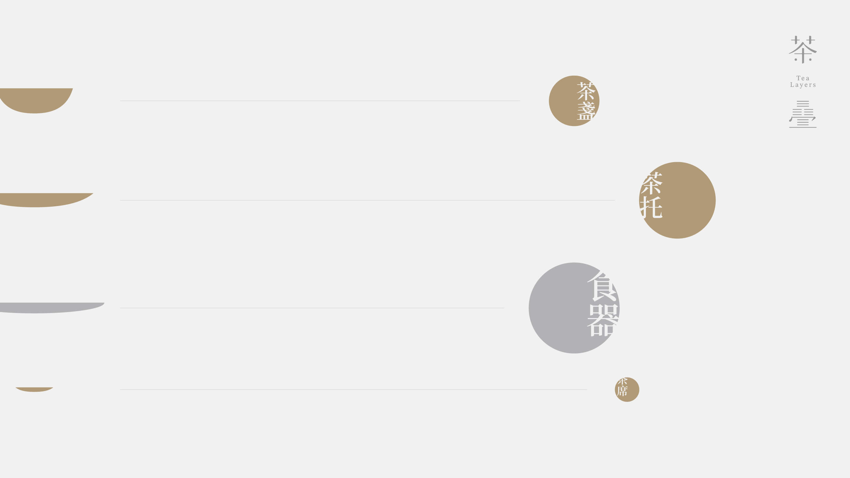
Starting from the concept of "layering" in Japanese tearoom culture, we translated the imagery of tea's stacked depths, teaware forms, and spatial accumulation into the structural vocabulary of the logo — so that the mark itself communicates a sense of building layer by layer, of slow, quiet settling. The overall style follows a minimalist direction with generous use of negative space, echoing the rhythm of a tearoom that invites you to pause and savor rather than rush to fill every inch with information.
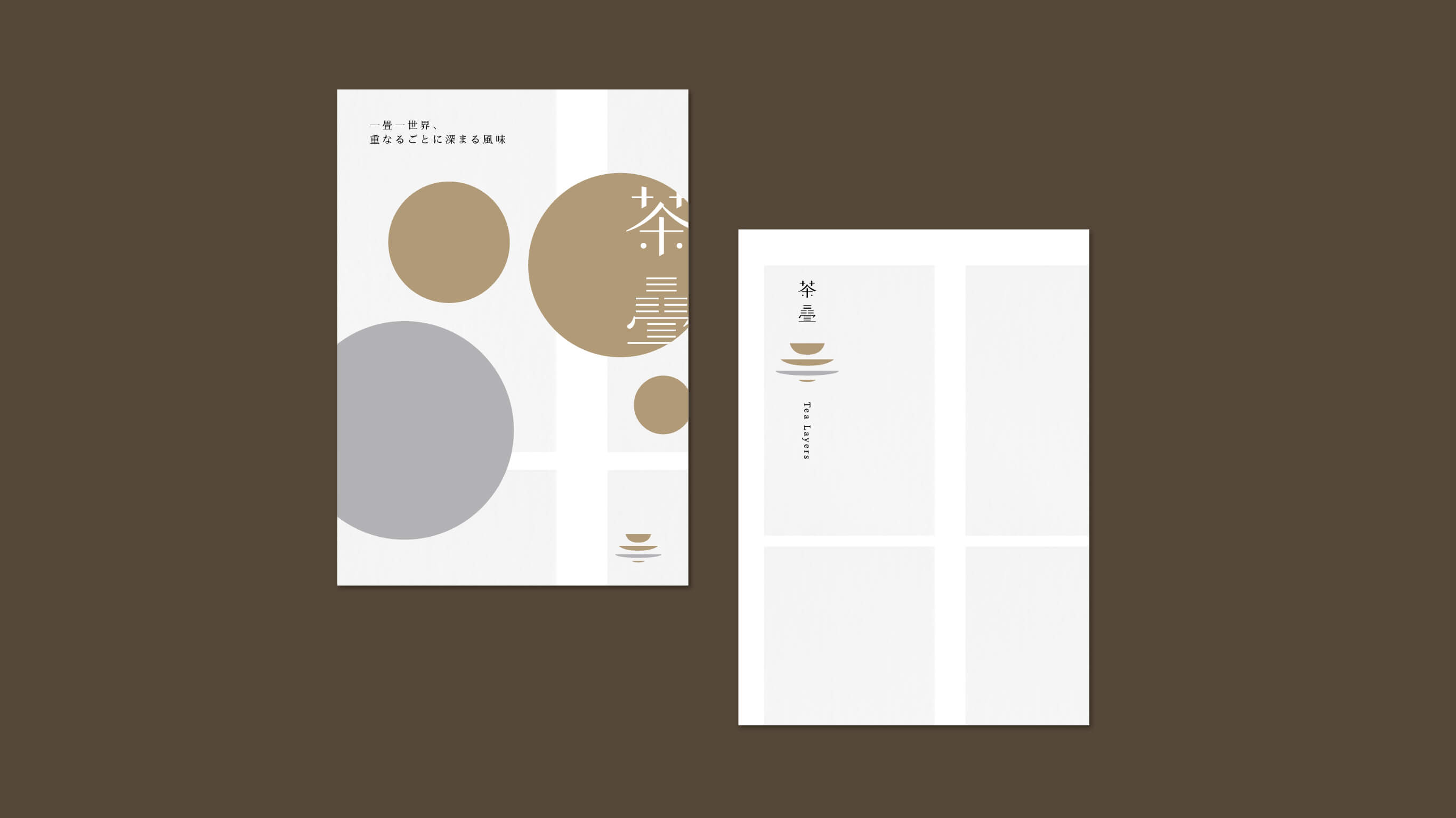
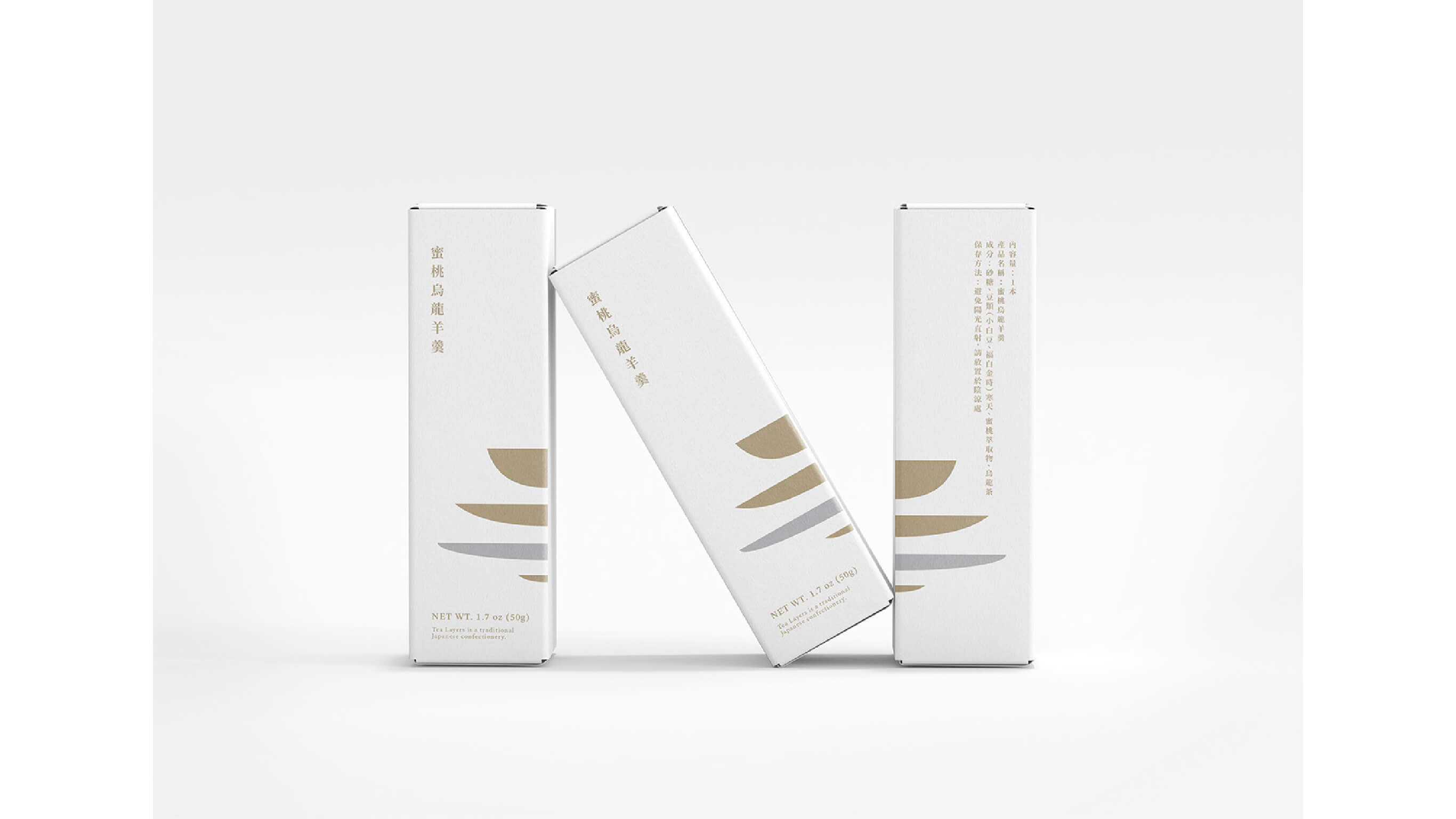
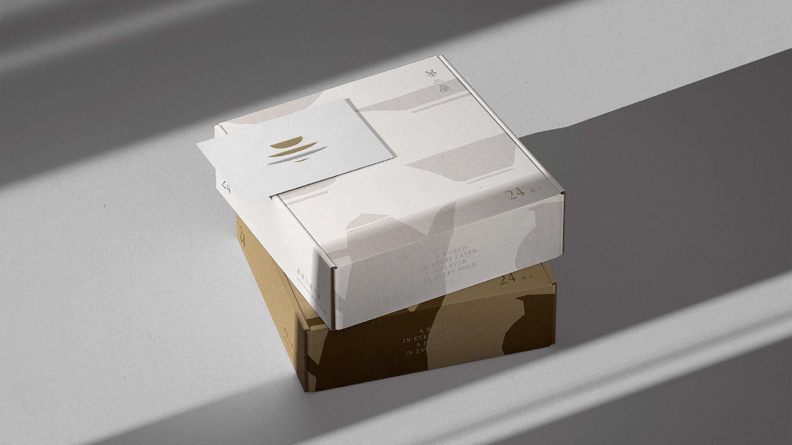
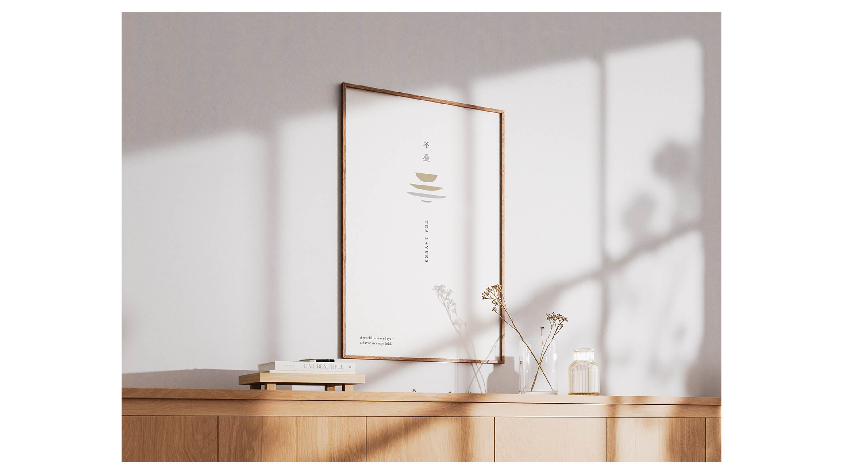
In the extended applications, this layering vocabulary stretches across packaging and accompanying objects, so that each piece held in hand feels like a miniature of the tearoom itself — not seeking grandeur, but in restraint and white space, naturally slowing the pace, inviting one to quietly savor the gentle warmth of tea.