Sweet Plum Sake Bar
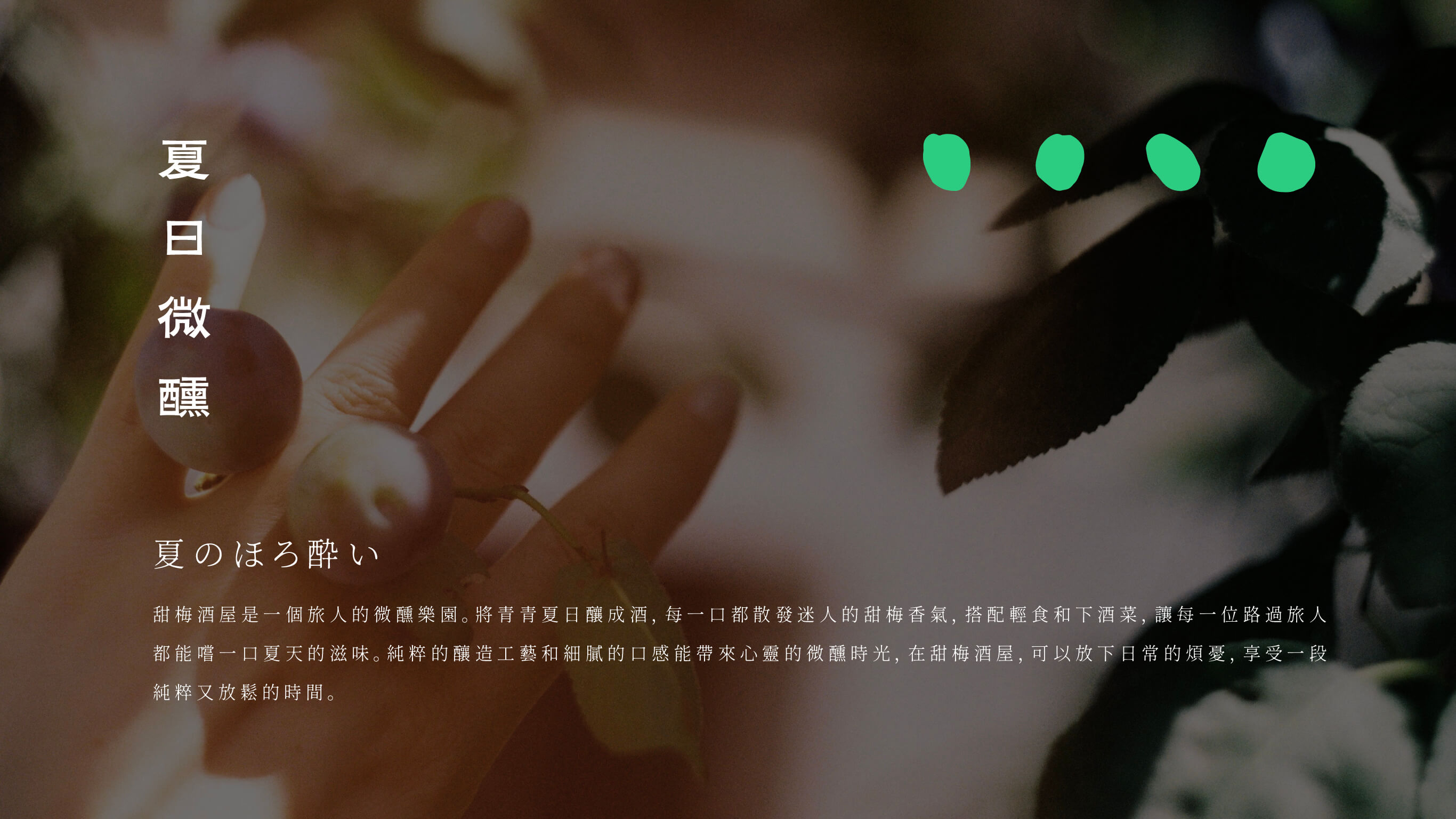
A Whole Summer's Taste, Distilled into a Bottle
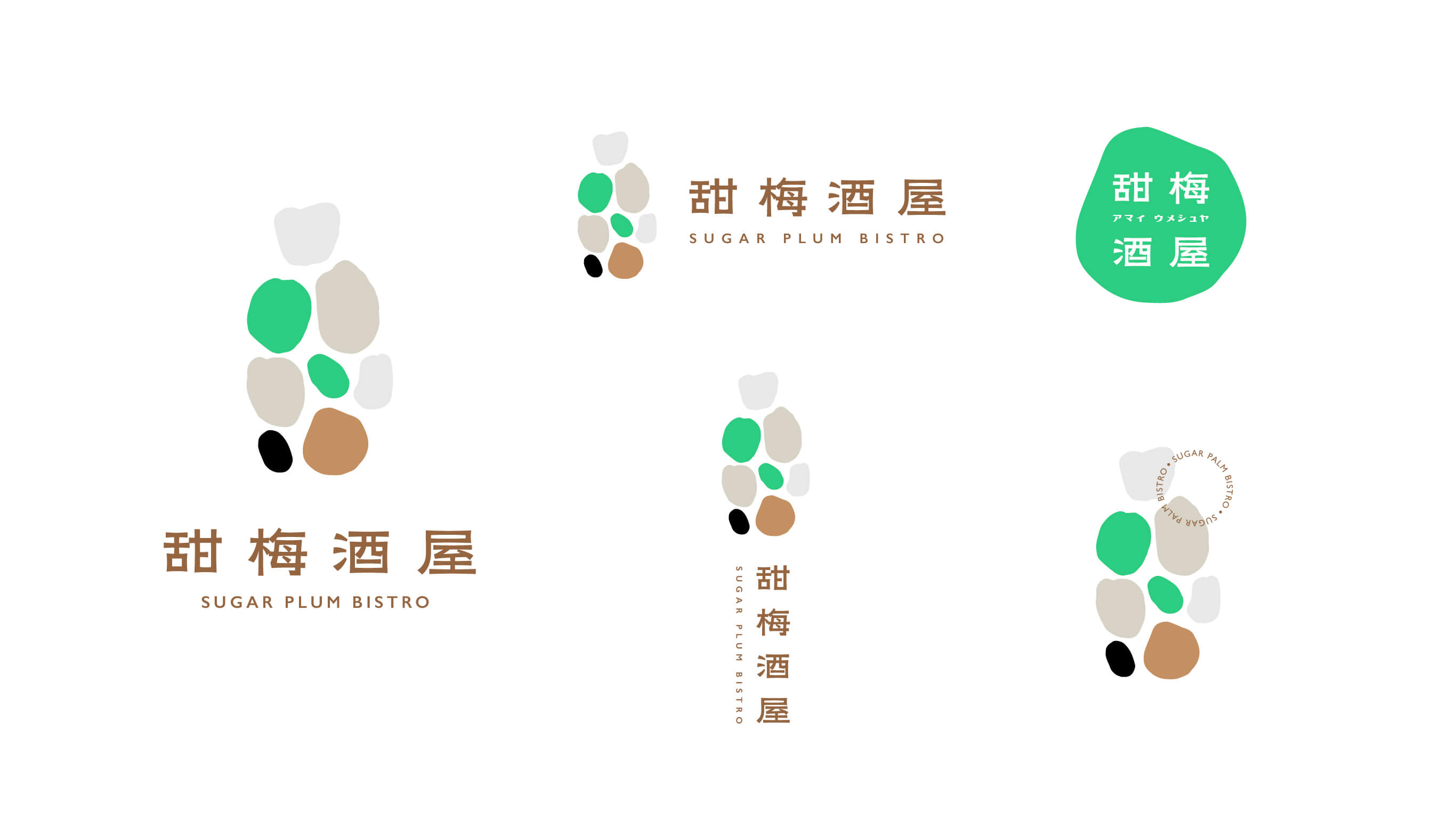
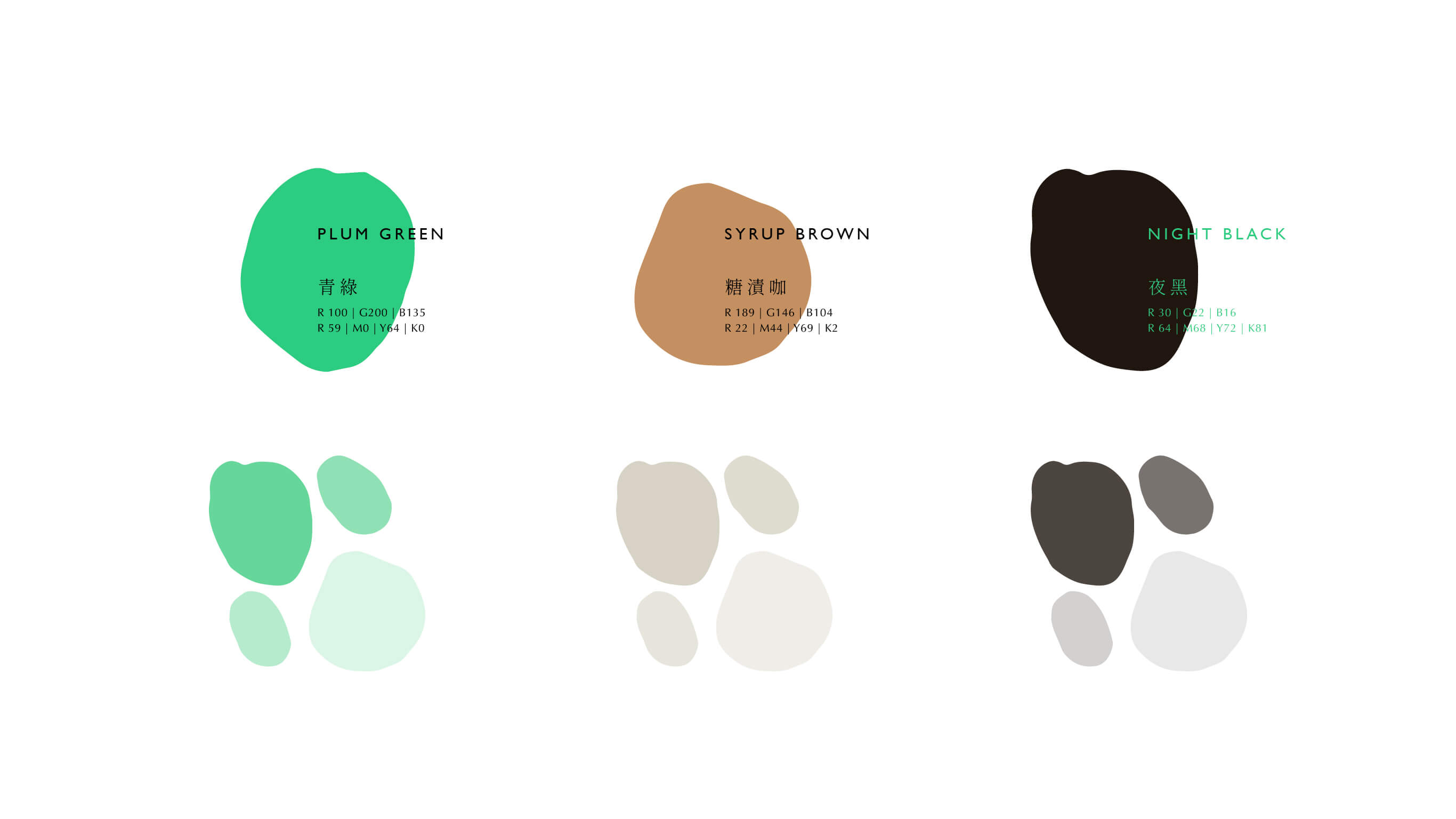
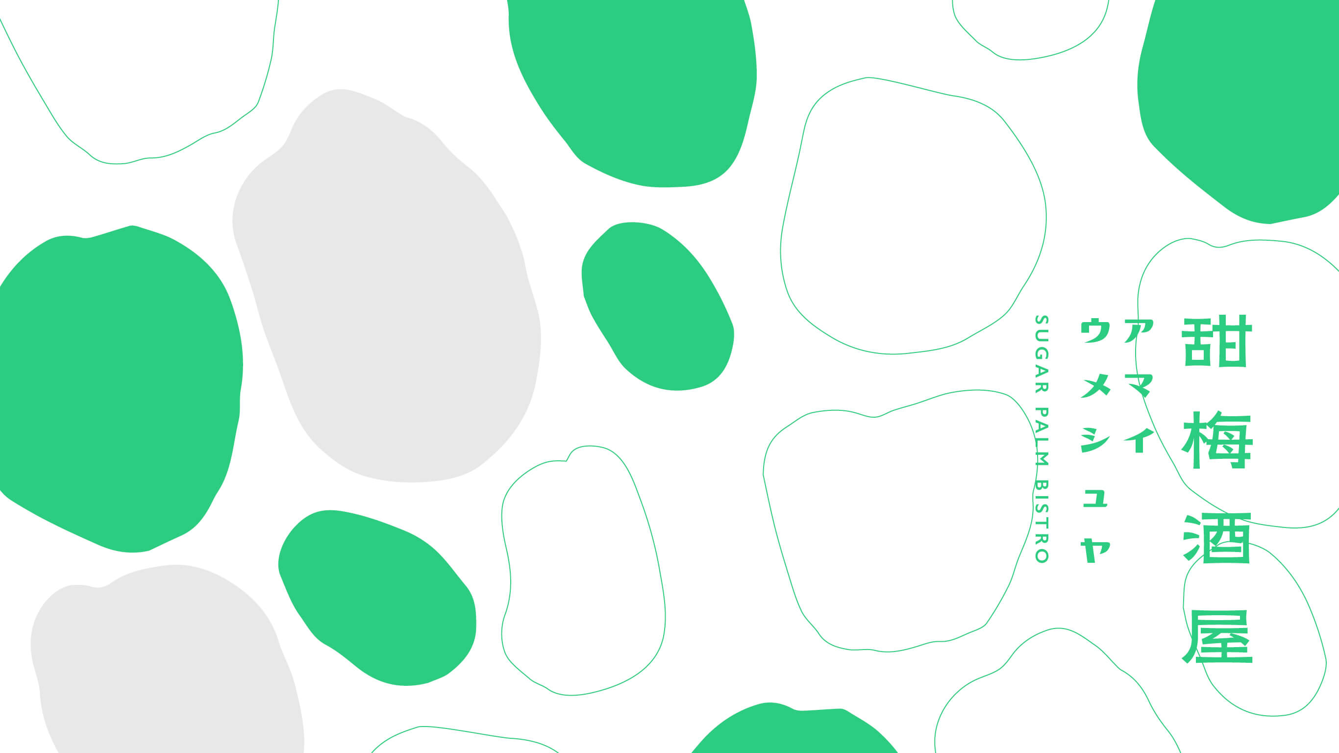
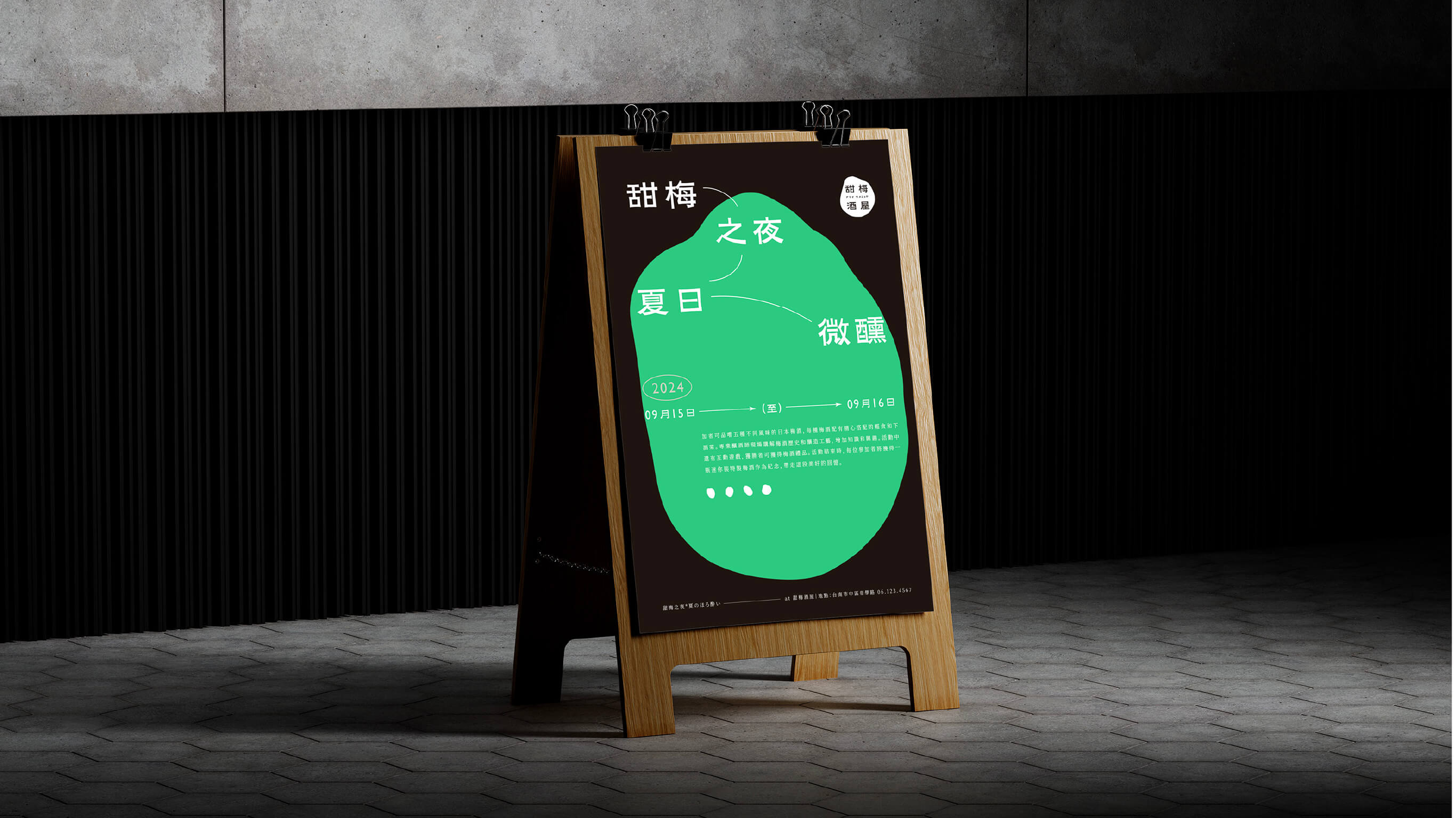
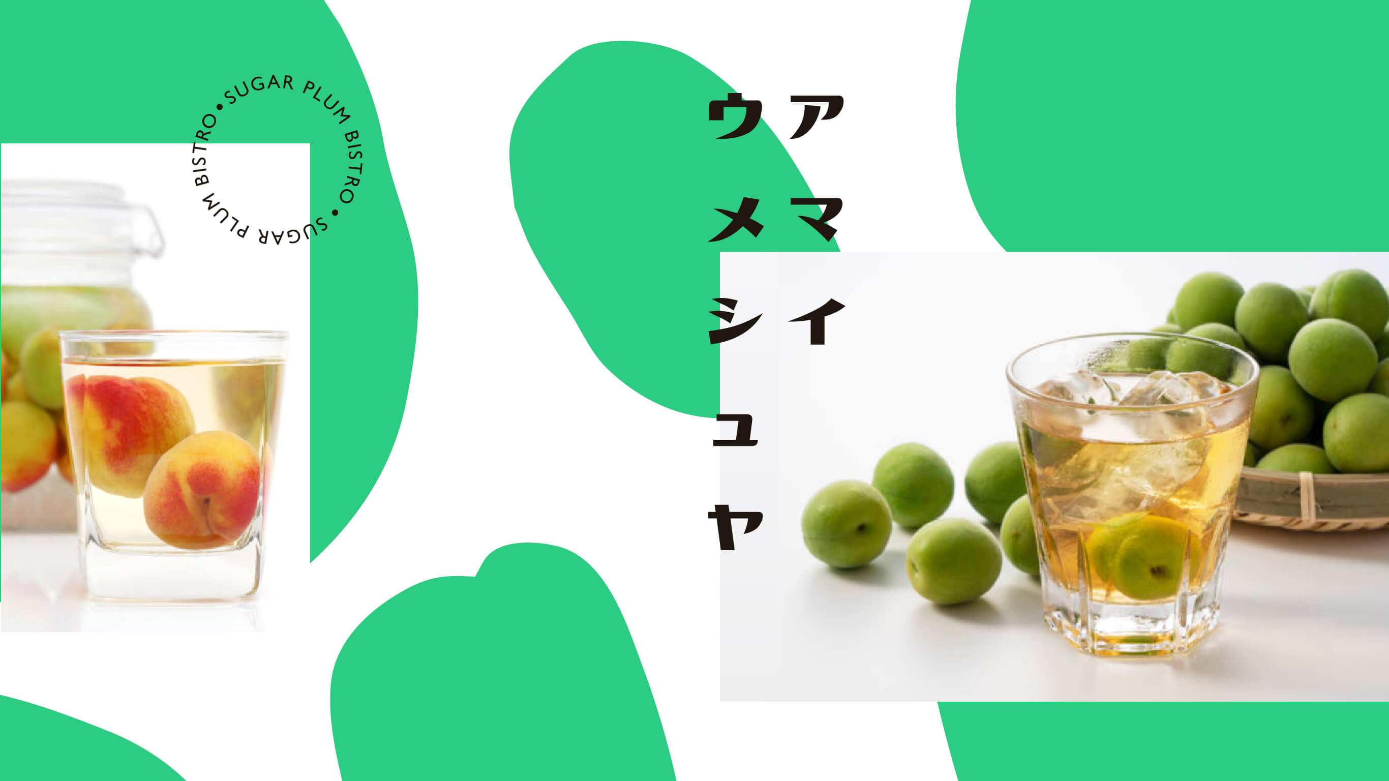
We began with the process of brewing plum sake and translated the summer sun, the tartness and sweetness of green plum, and the gentle haze of a slight buzz into the brand's color palette and graphic vocabulary — so that the visuals themselves carry a certain warmth and languor, rather than following the precise and serious aesthetic of a bar. The overall style preserves handcraft and warmth, echoing the role of the "wanderer" — not in pursuit of luxury, but offering the kind of approachability that invites you to sit down and let your guard down when you happen to pass by.
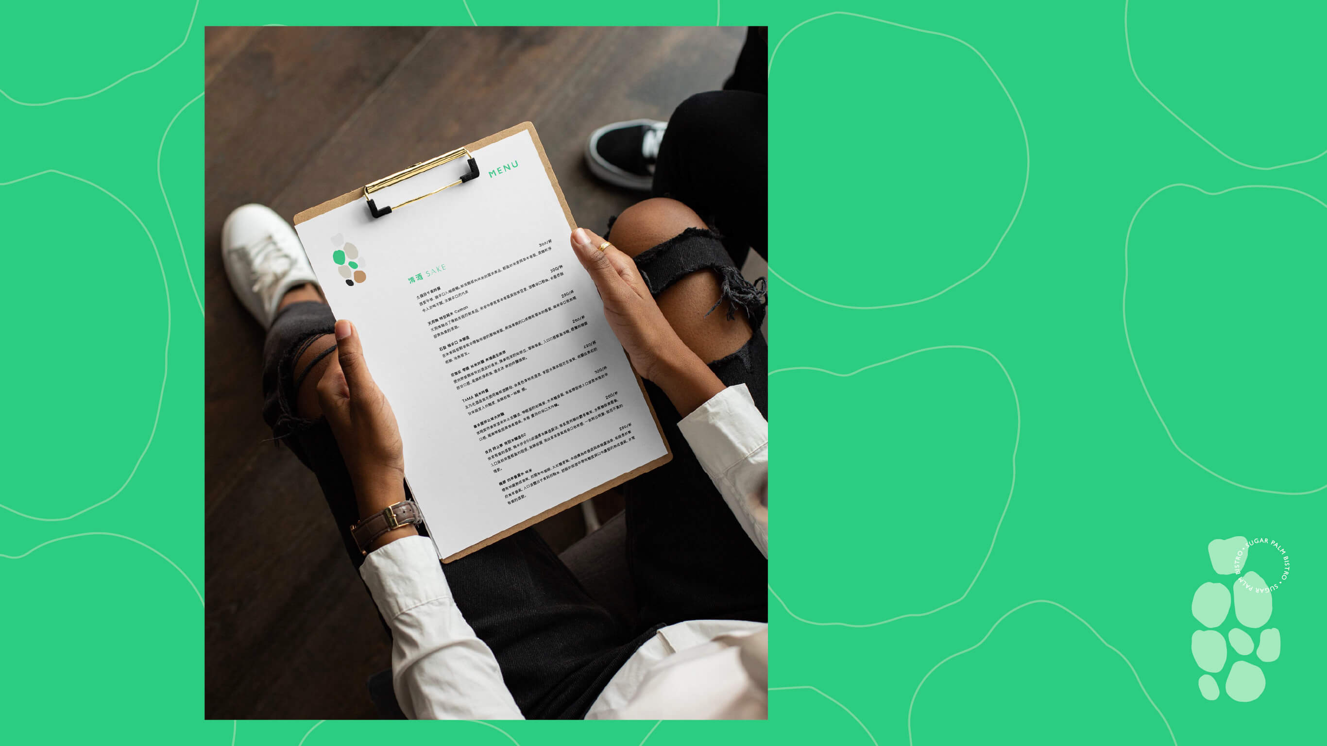
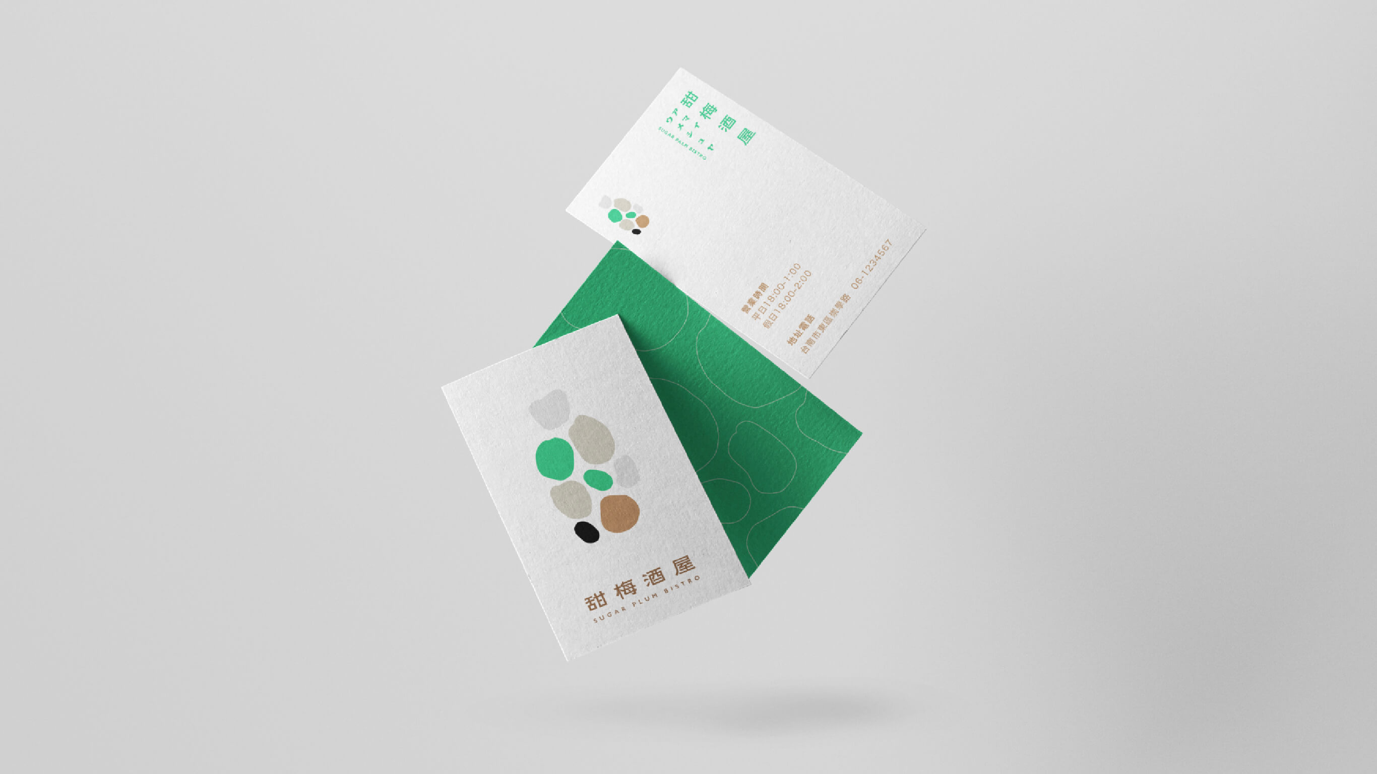
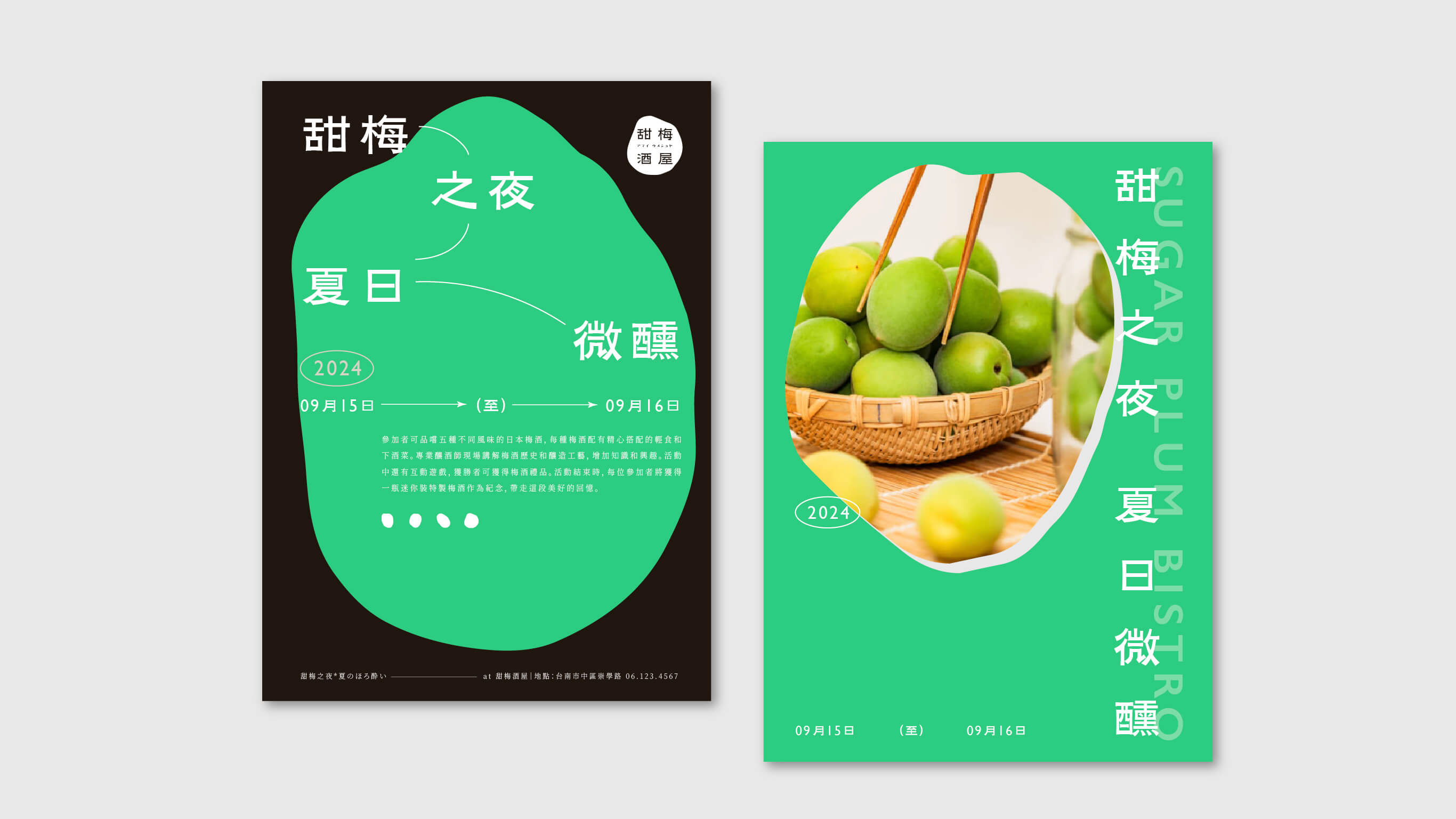
In the extended applications, this visual language stretches across packaging and accompanying objects, so that each piece held in hand feels as though that moment of summer's gentle haze has been quietly bottled and carried away.