Pursuing poetic negative space,
letting the space speak for itself
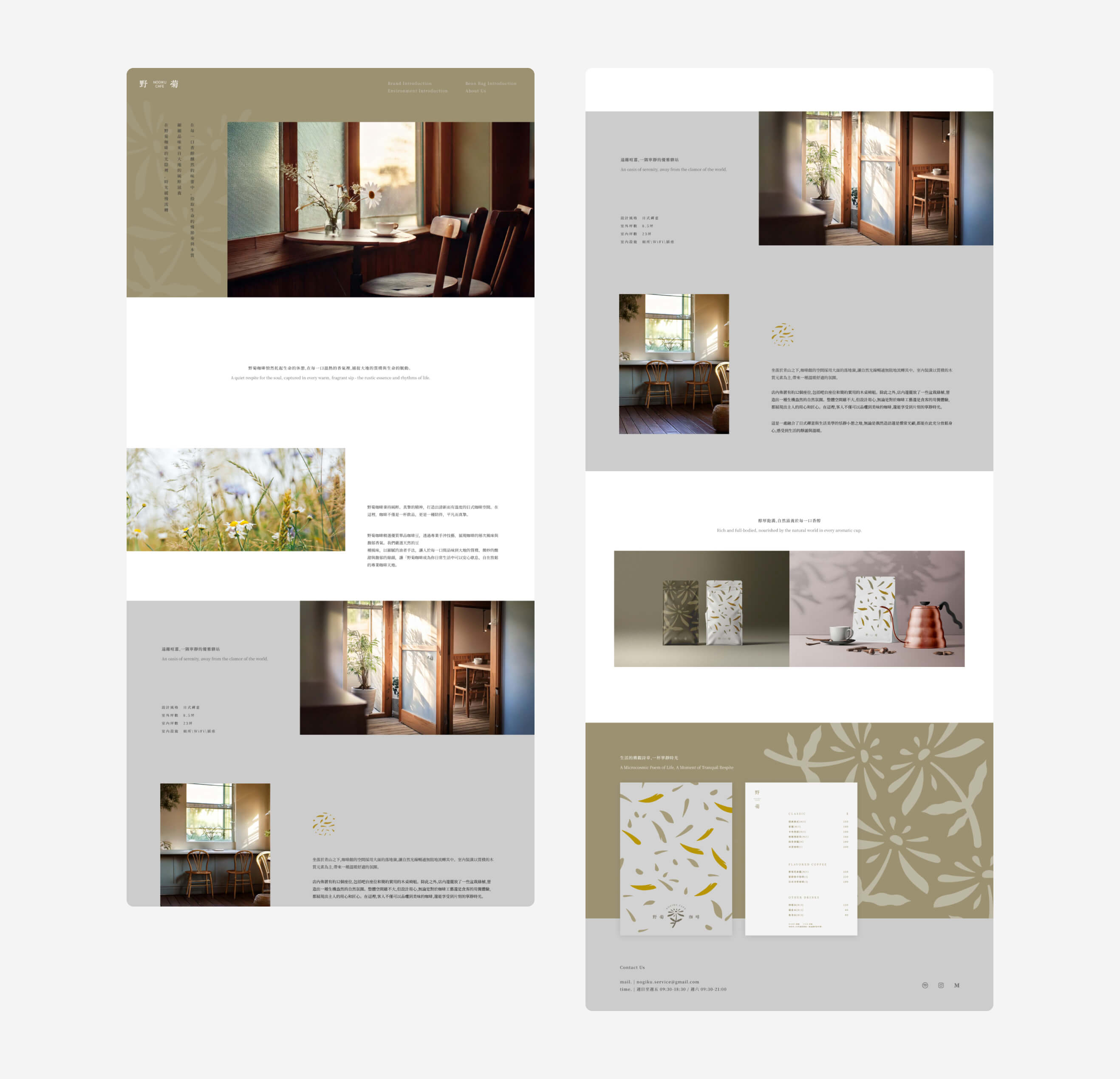
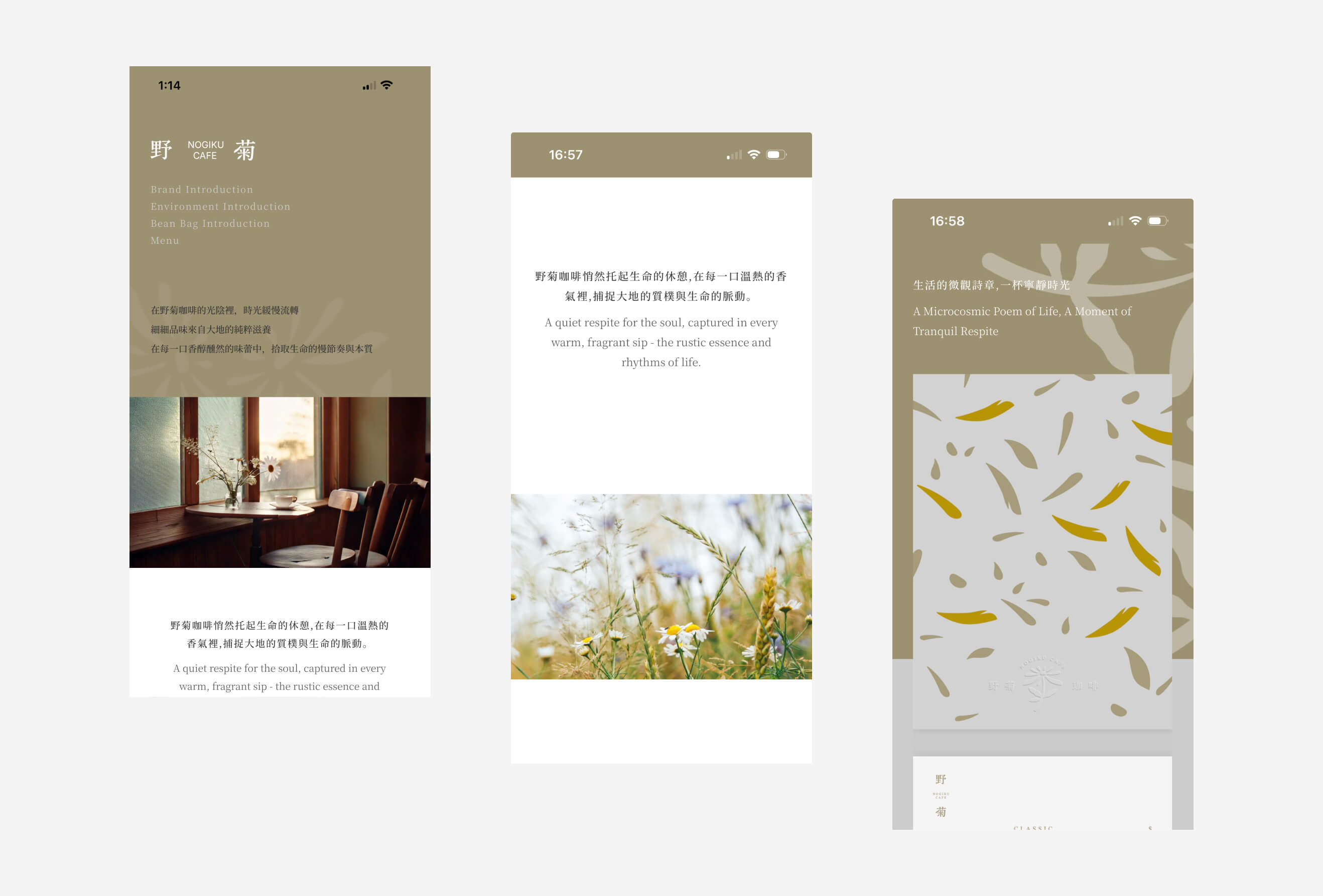
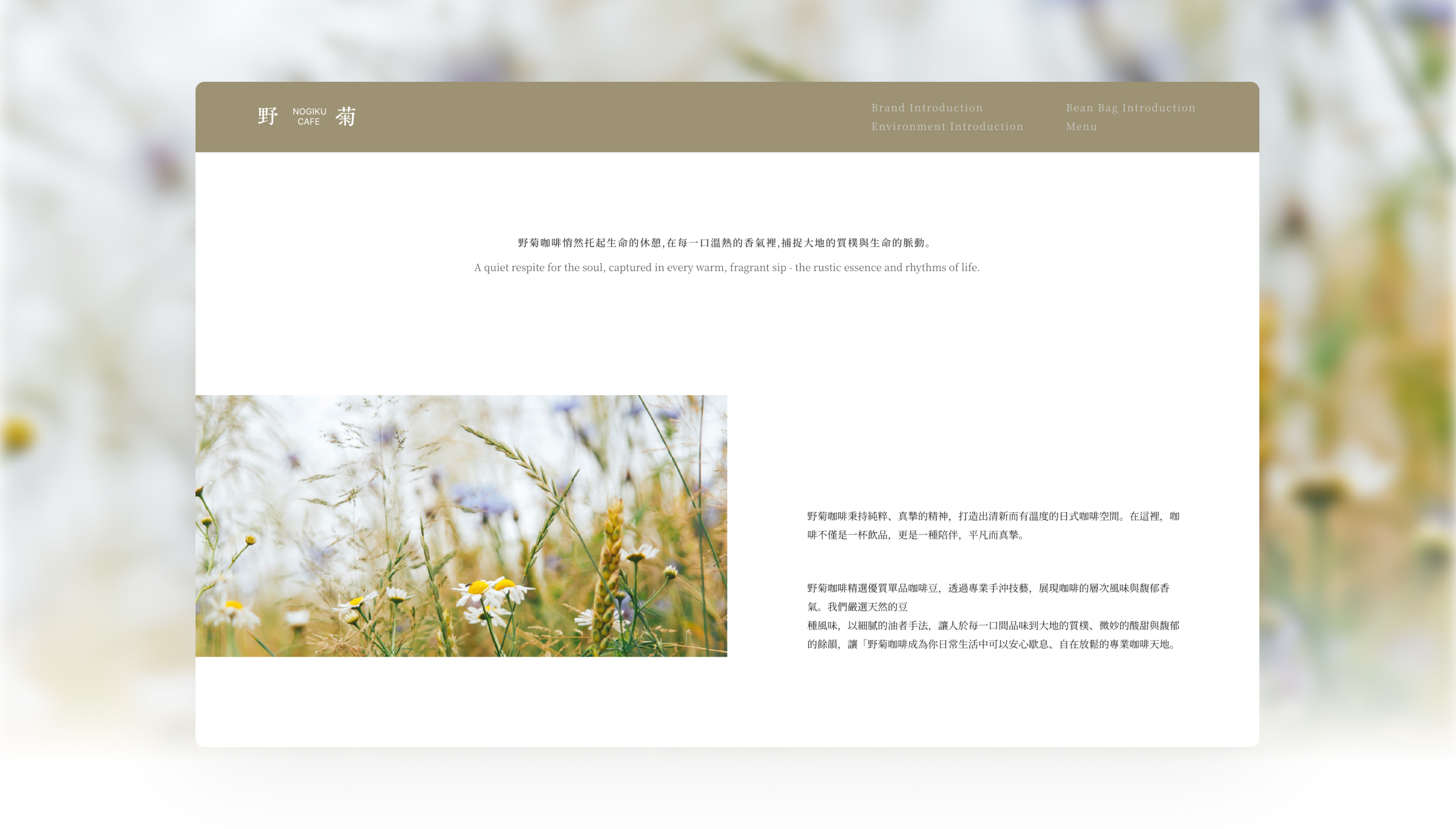
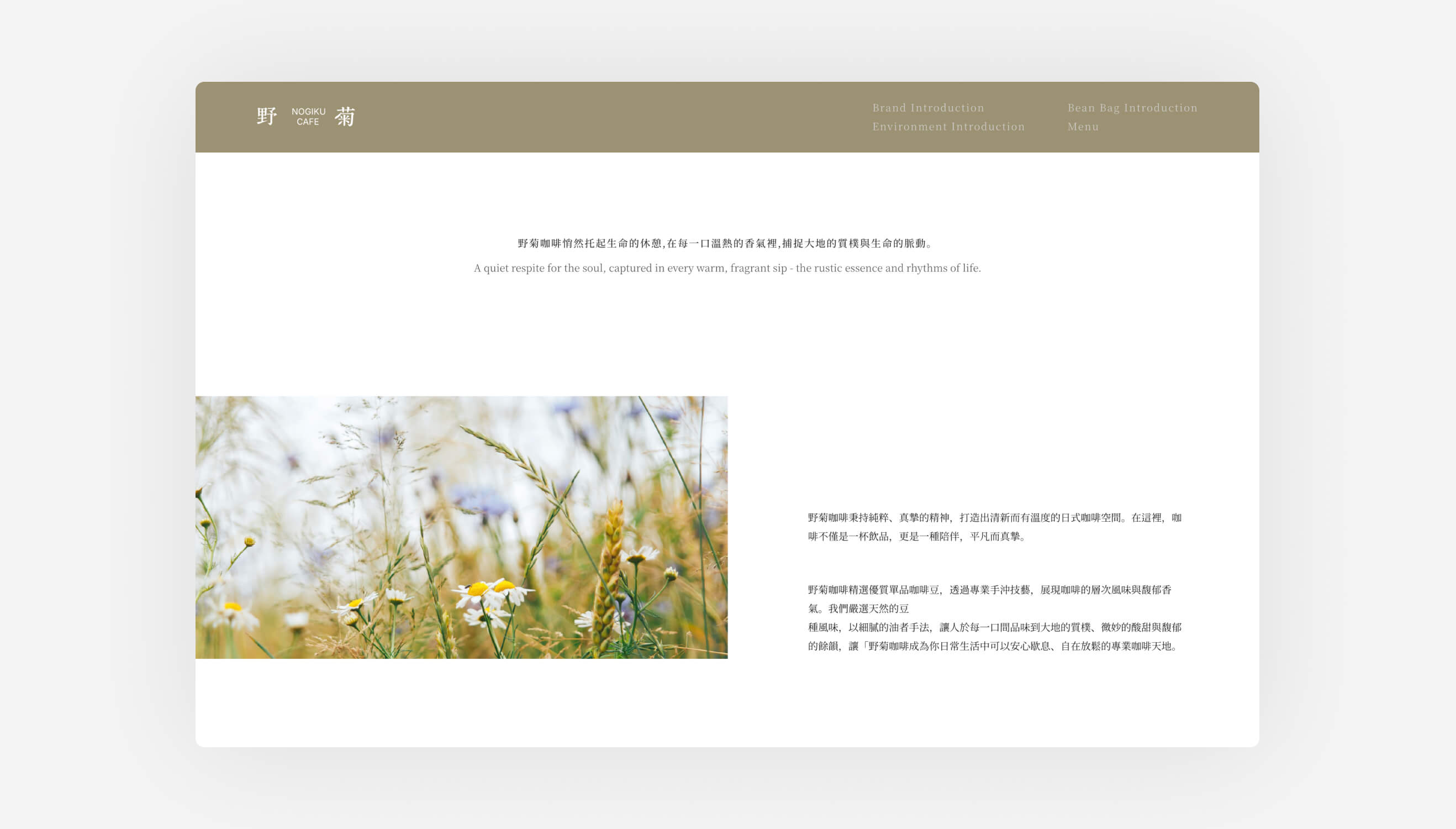
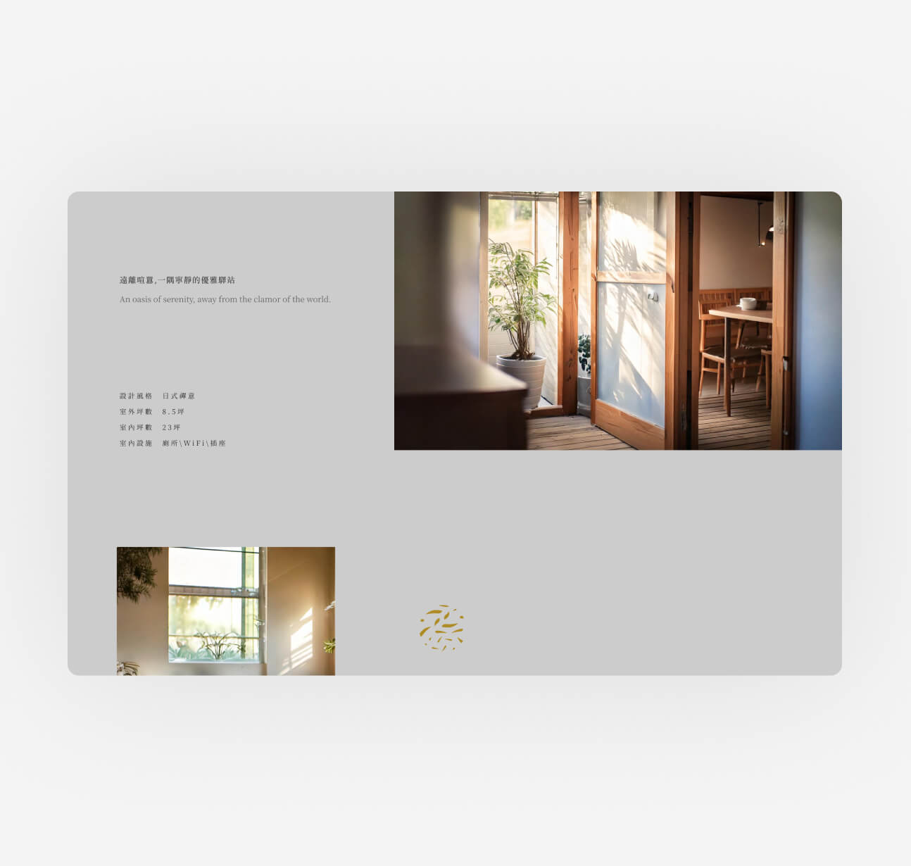
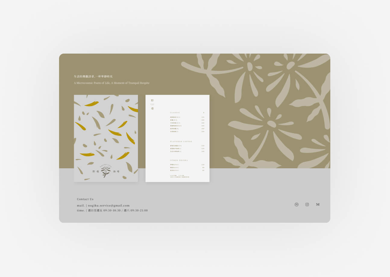
The overall layout takes a clean, simple approach, using abundant white space in place of dense text and information blocks, giving every space photo and every line of copy room to breathe. The pace at which visitors scroll through the site is deliberately slowed — like turning the pages of a poetry collection, not browsing a shop description.
The color palette also follows the natural texture of Daisy Café itself: earthy tones, wood tones, and soft greens appear in alternation, accented by hand-drawn-style wildflower illustrations woven throughout, making the whole website feel like an extension of the physical space. The intent is that visitors would already have been caught by that sense of serenity before they ever step through the door.