The pace has to be fast enough
to match the attitude of "move when you feel it"
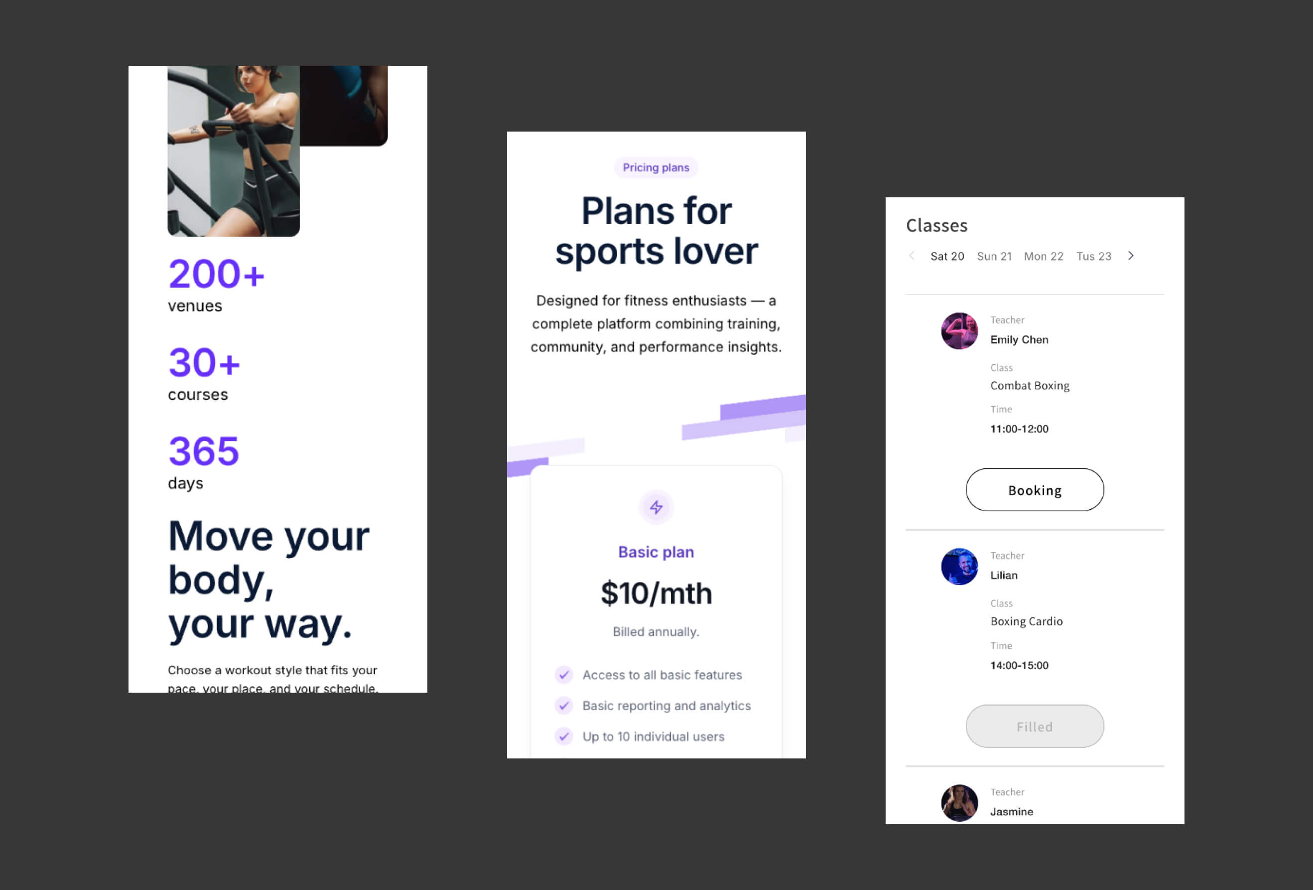
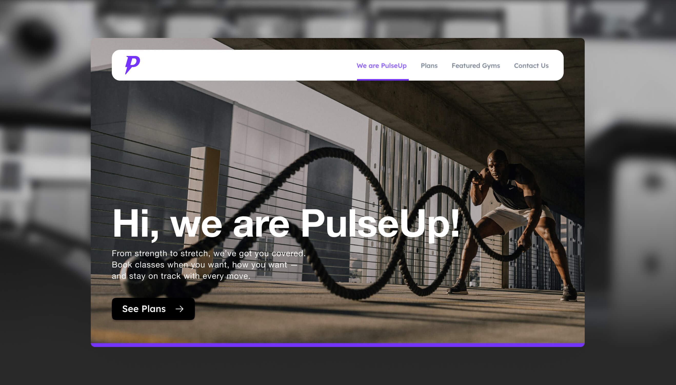
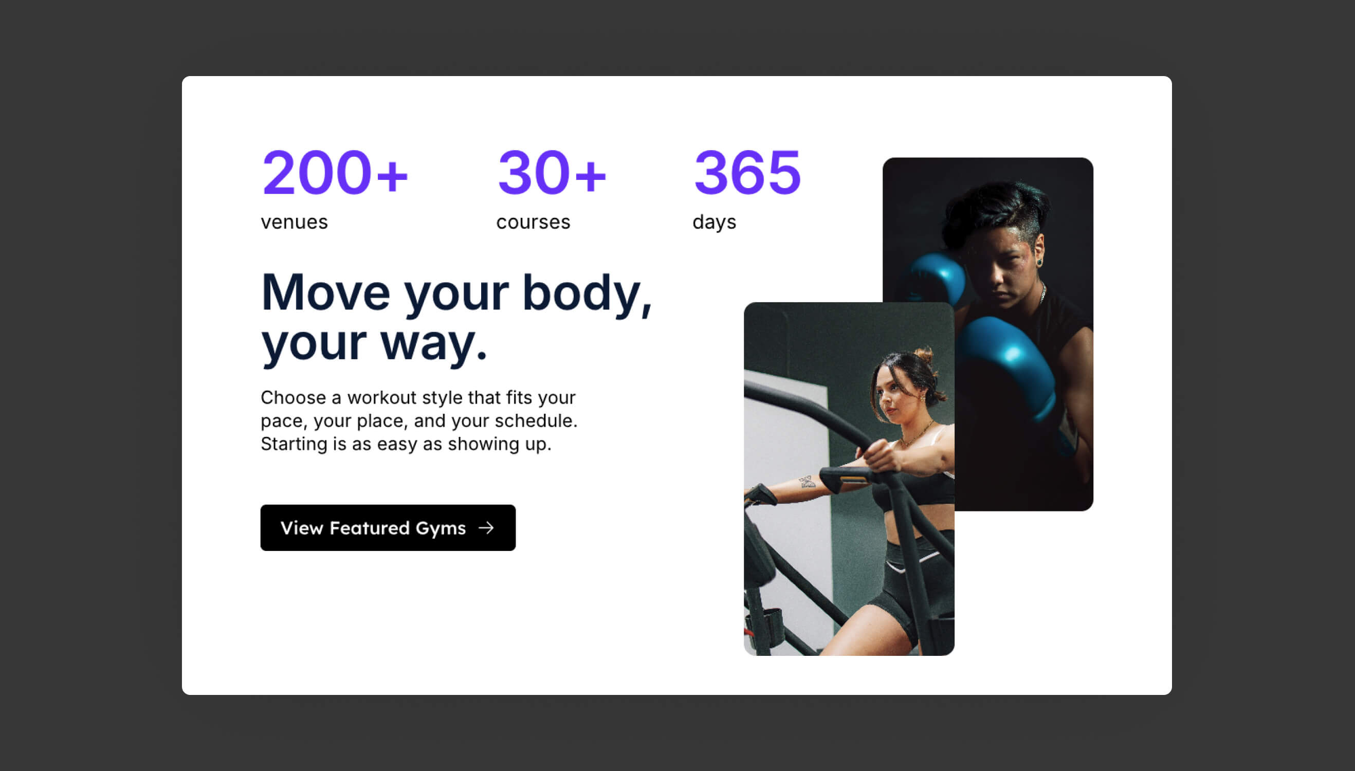
The overall aesthetic takes a modern, functional direction that creates the sense of energy a sports brand calls for. Data cards (number of partner venues, number of classes, usable days) are placed prominently at the front, using the most intuitive layout to let visitors confirm all the core features at a glance.
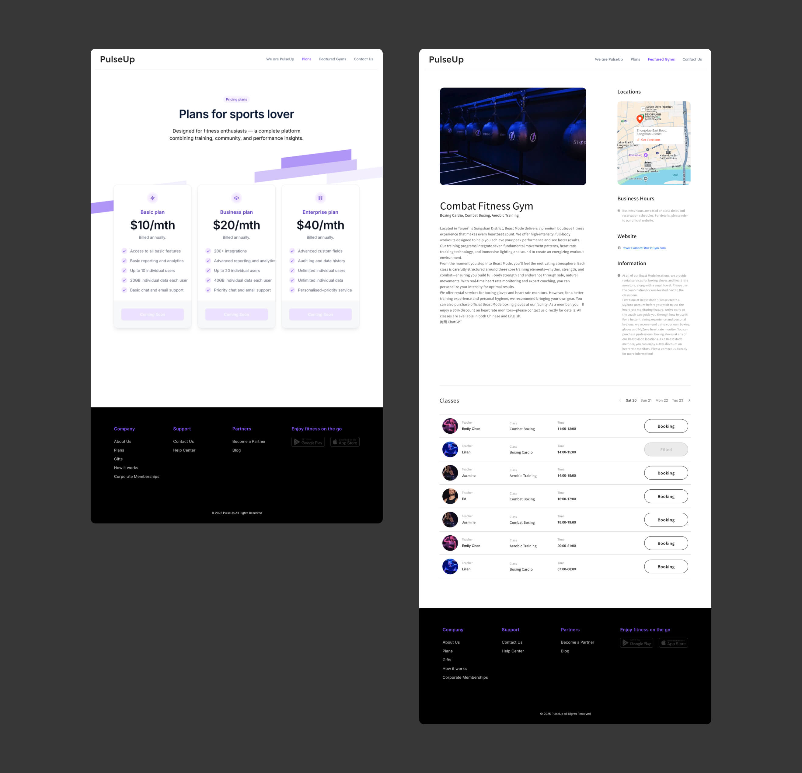
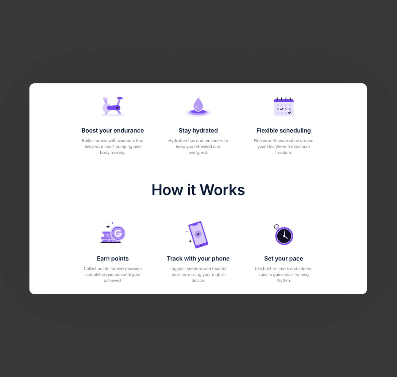
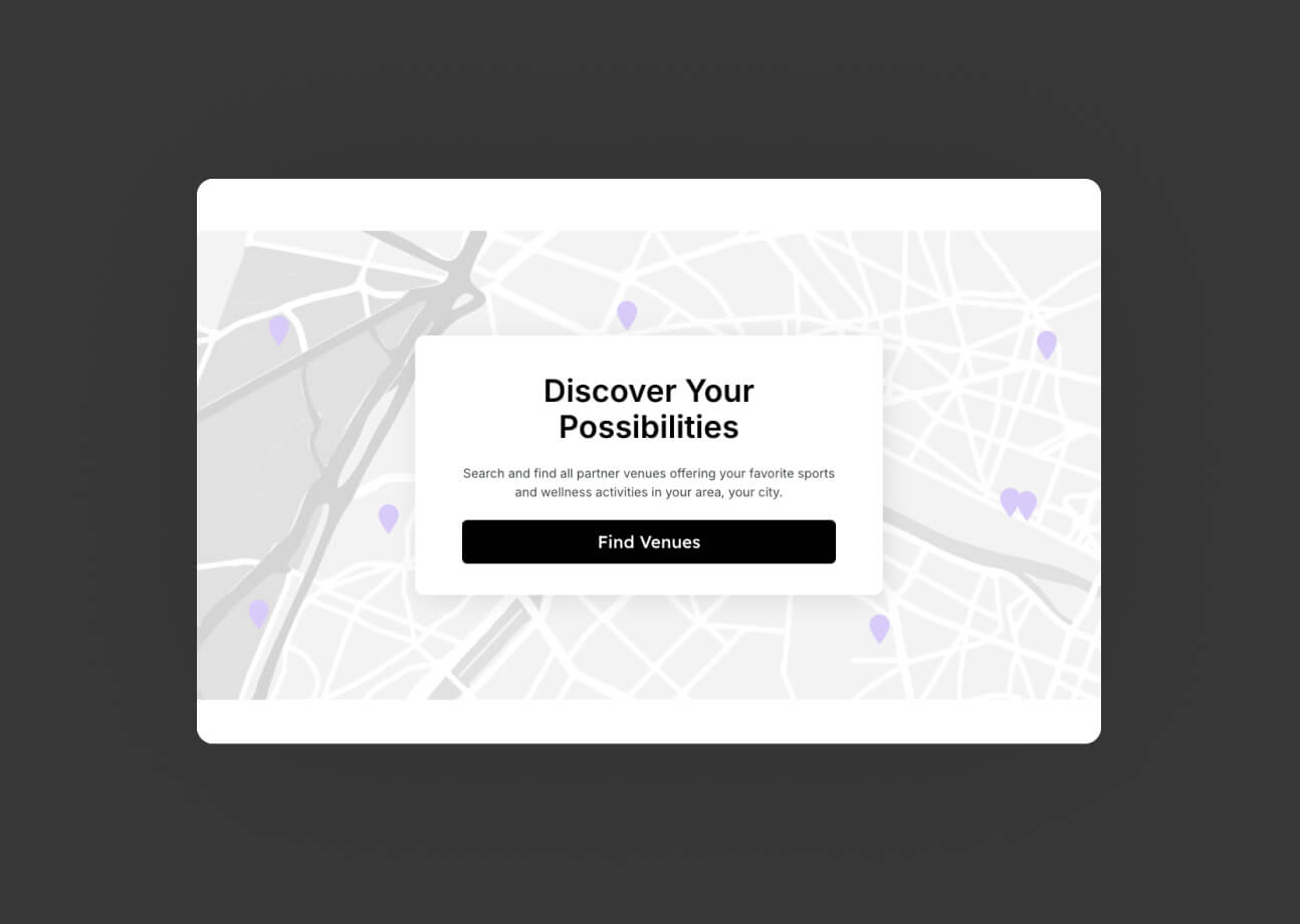
The core flow is also deliberately simplified into three clear steps: find a venue, choose a class, start moving — with map search as the primary entry point, lowering the cognitive threshold for users. The overall rhythm is fast and crisp, matching the attitude that sport itself should have: no fuss, just move when you're ready.