Embedding the warmth of craft
into every rounded corner
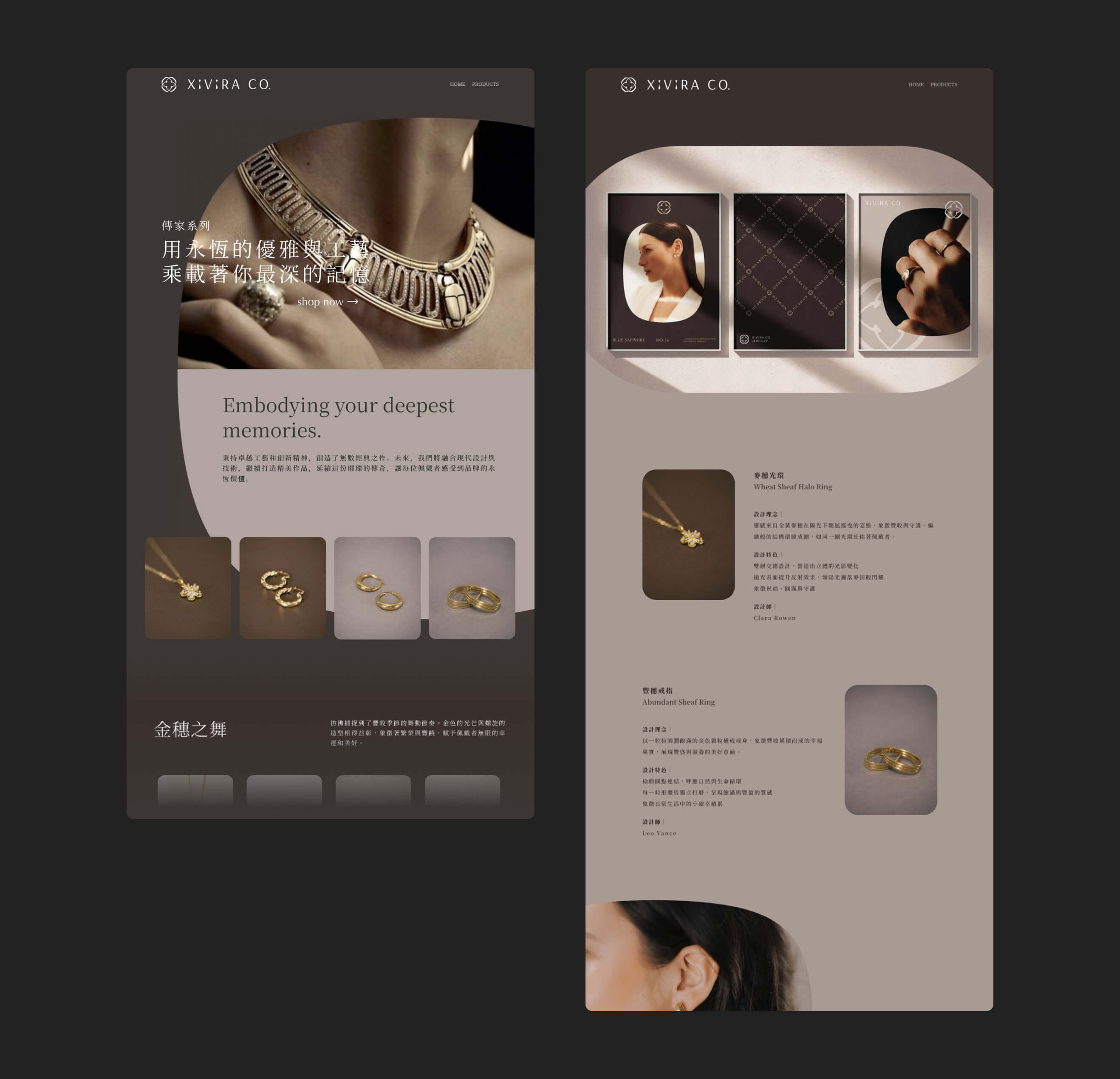
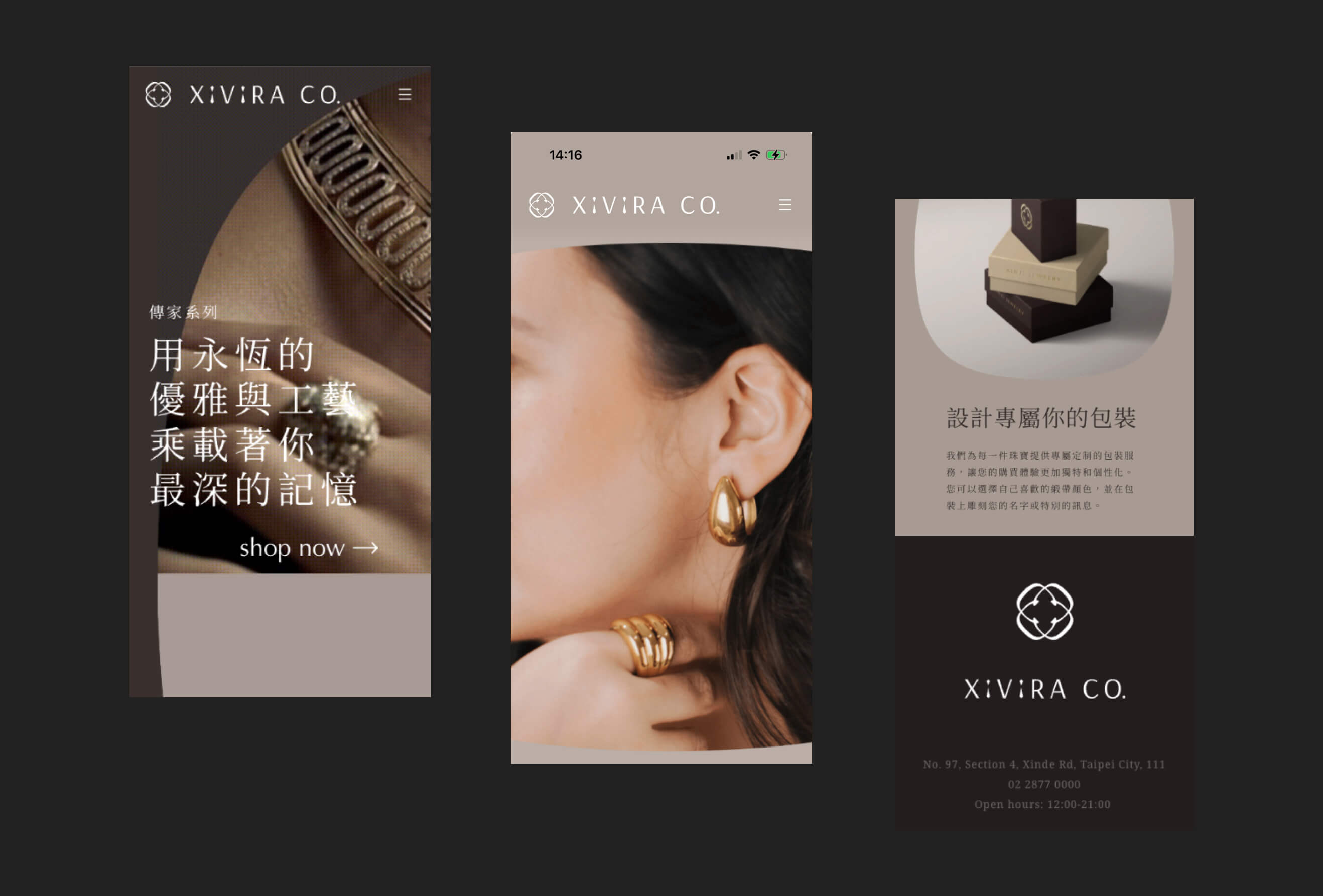
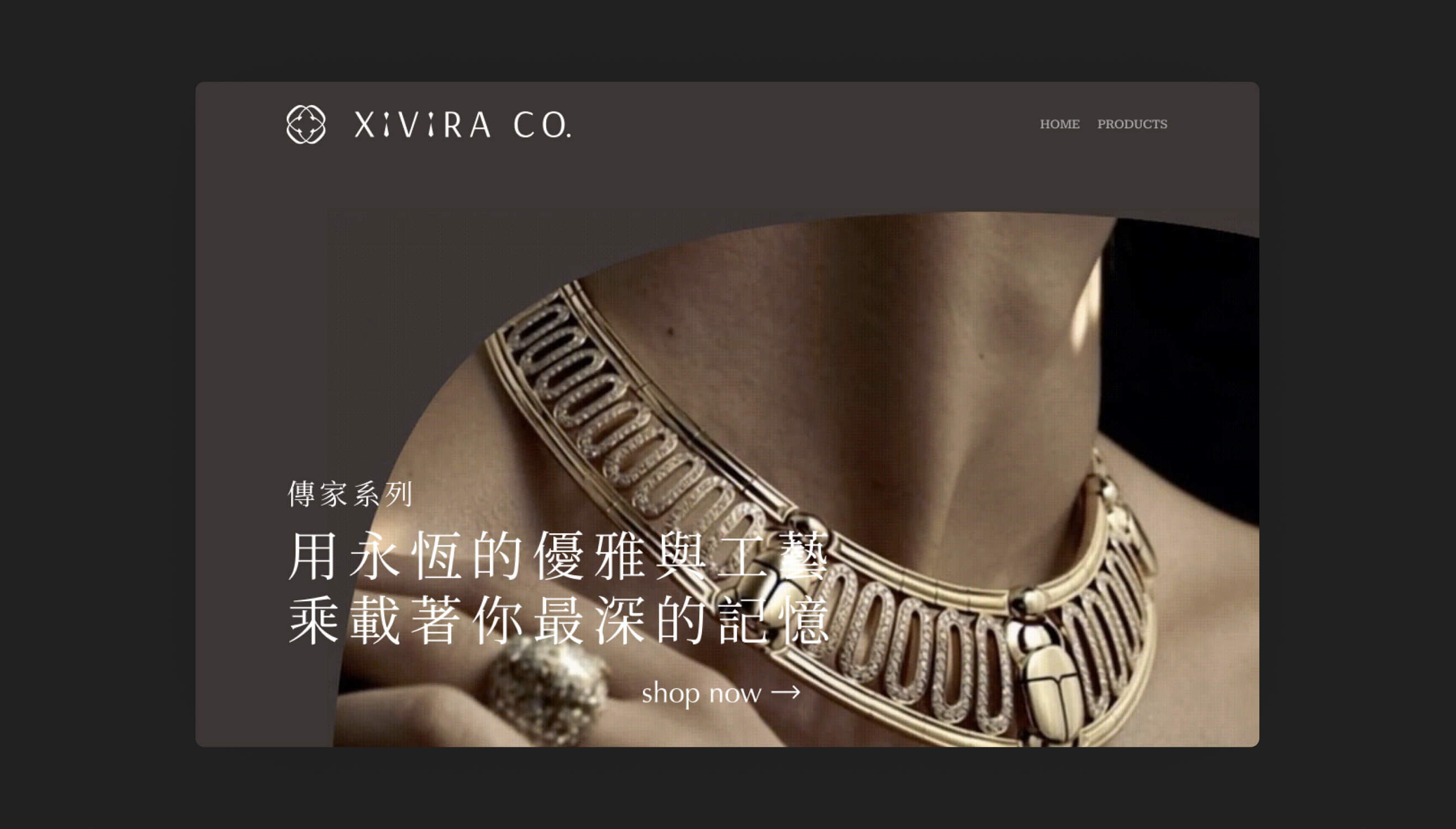
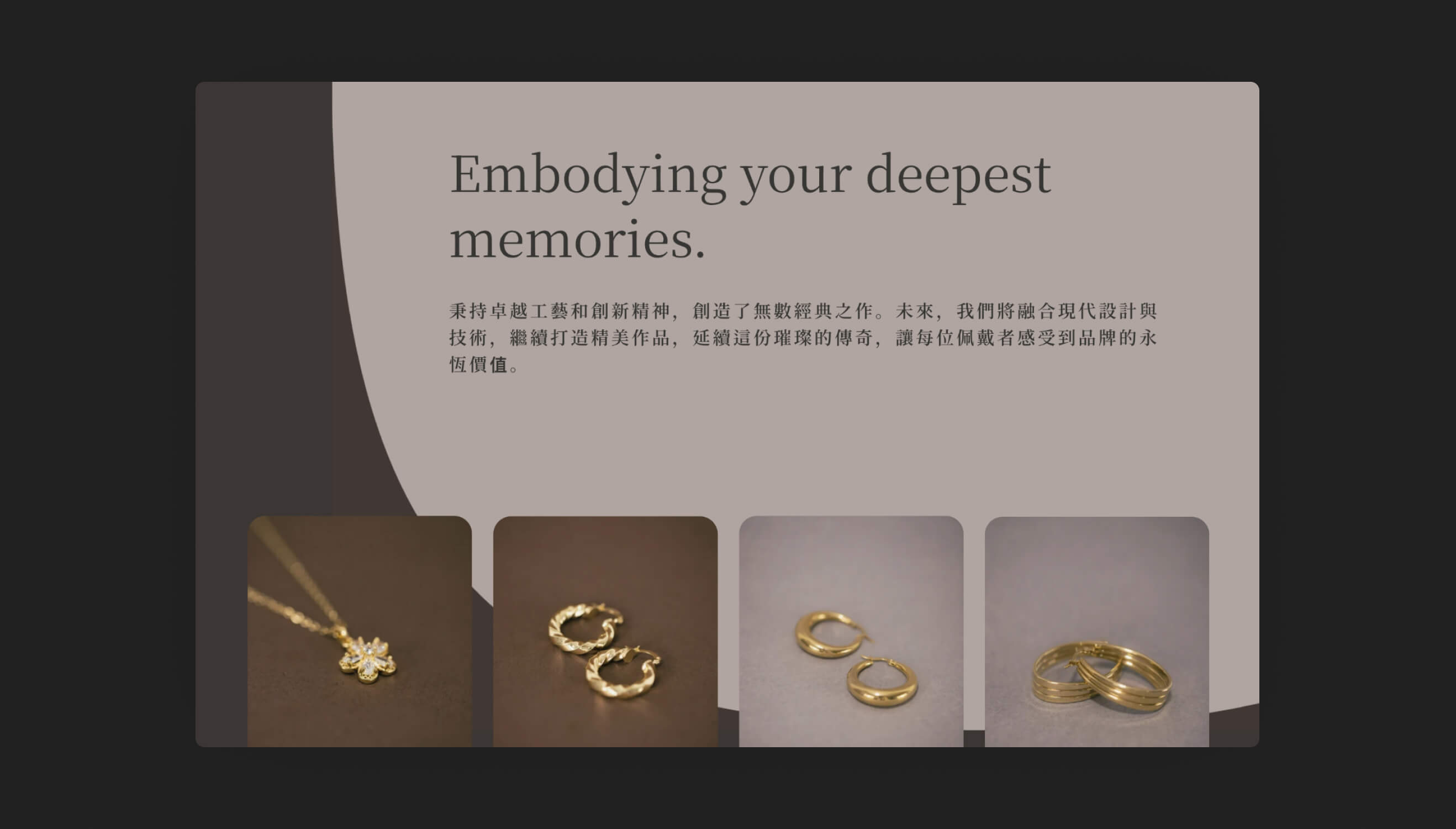
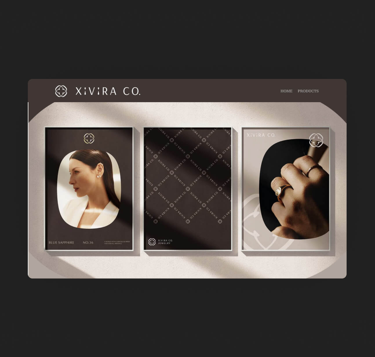
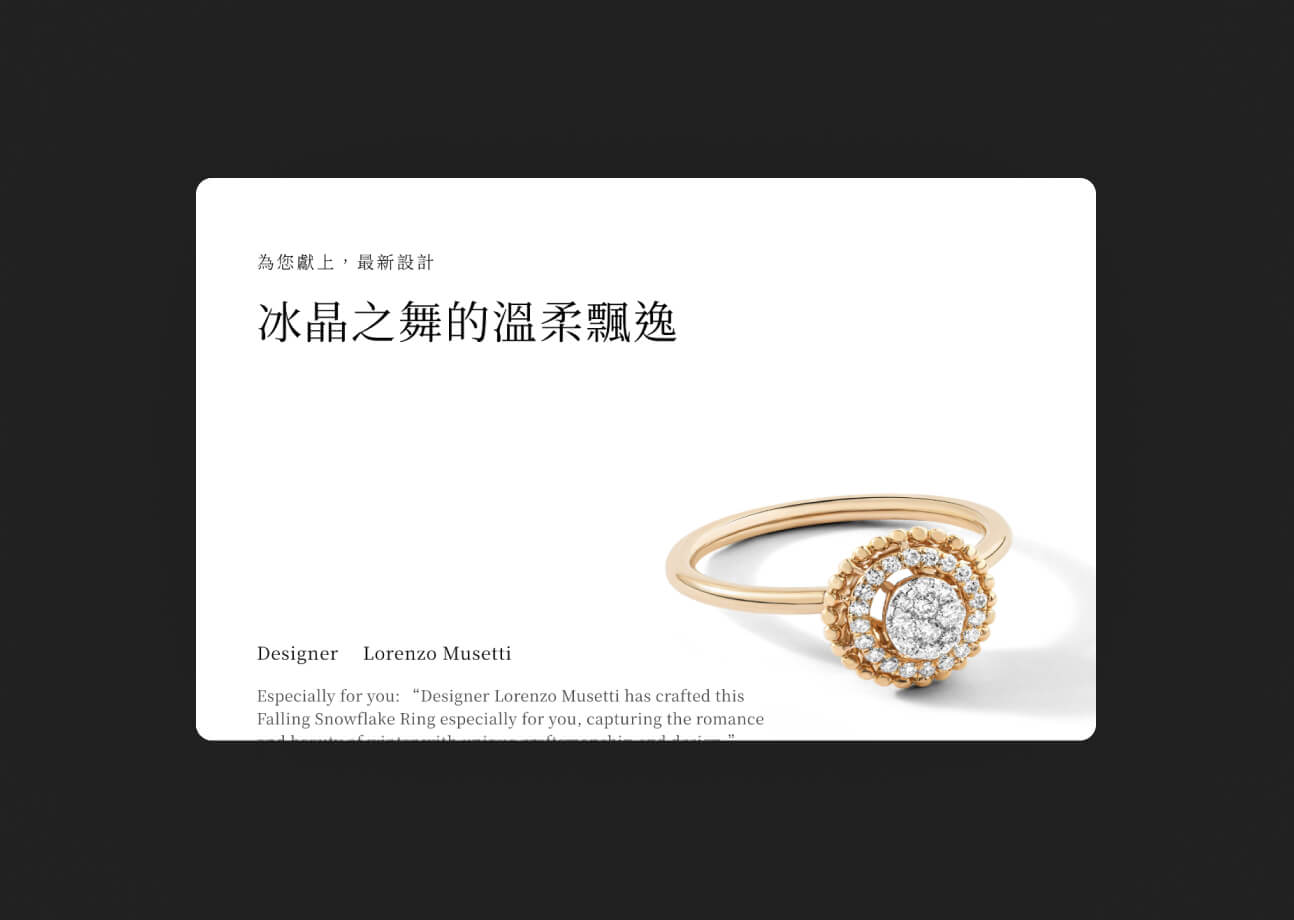
The overall visual direction uses a warm brown palette as the primary tone, paired with soft curved lines and generous white space — echoing the warm, delicate, handcrafted quality of the jewelry itself, rather than the cold hardness of a typical luxury boutique aesthetic. Product photography is presented in large format, giving each piece's luster and detail enough room to breathe, which naturally slows the pace at which visitors scroll through the site — as if carefully examining a piece of craftsmanship rather than rapidly skimming a shopping list.
Color palette, typeface, and spacing were refined through repeated iteration, ensuring the overall feel is elegant without losing a contemporary edge, so that the XIVIRA website itself becomes the brand's first work of refinement.