Fine Pasta
大稻埕的色彩語境,復古與溫暖並存
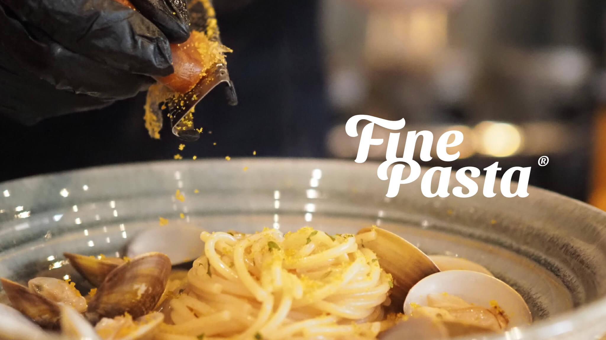
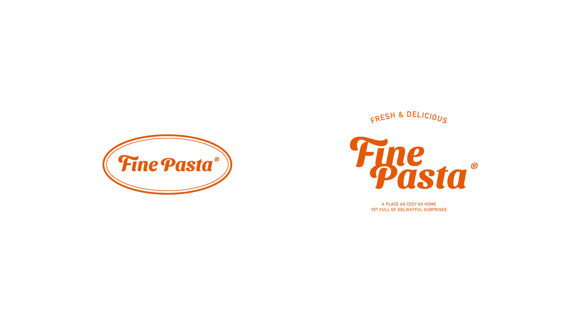
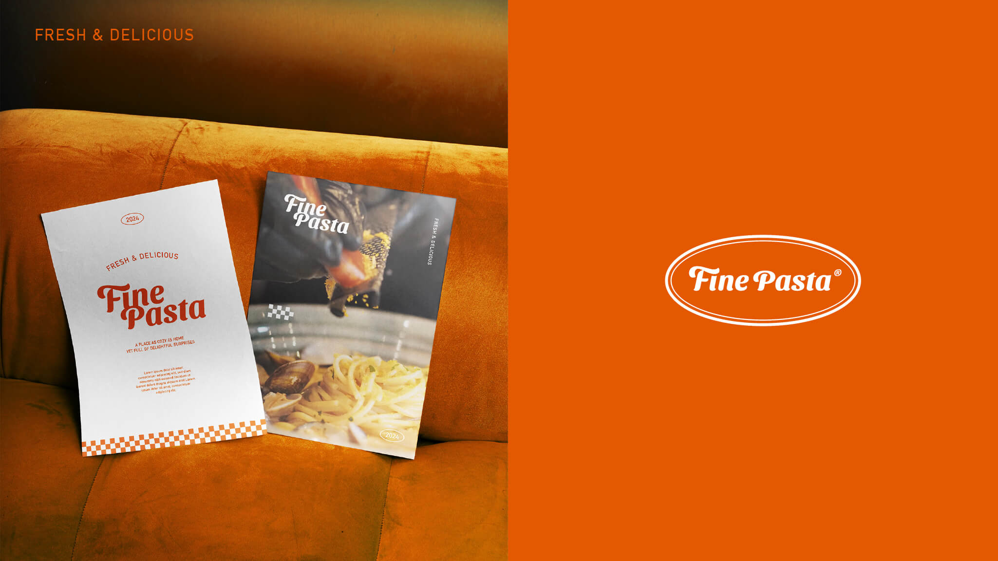
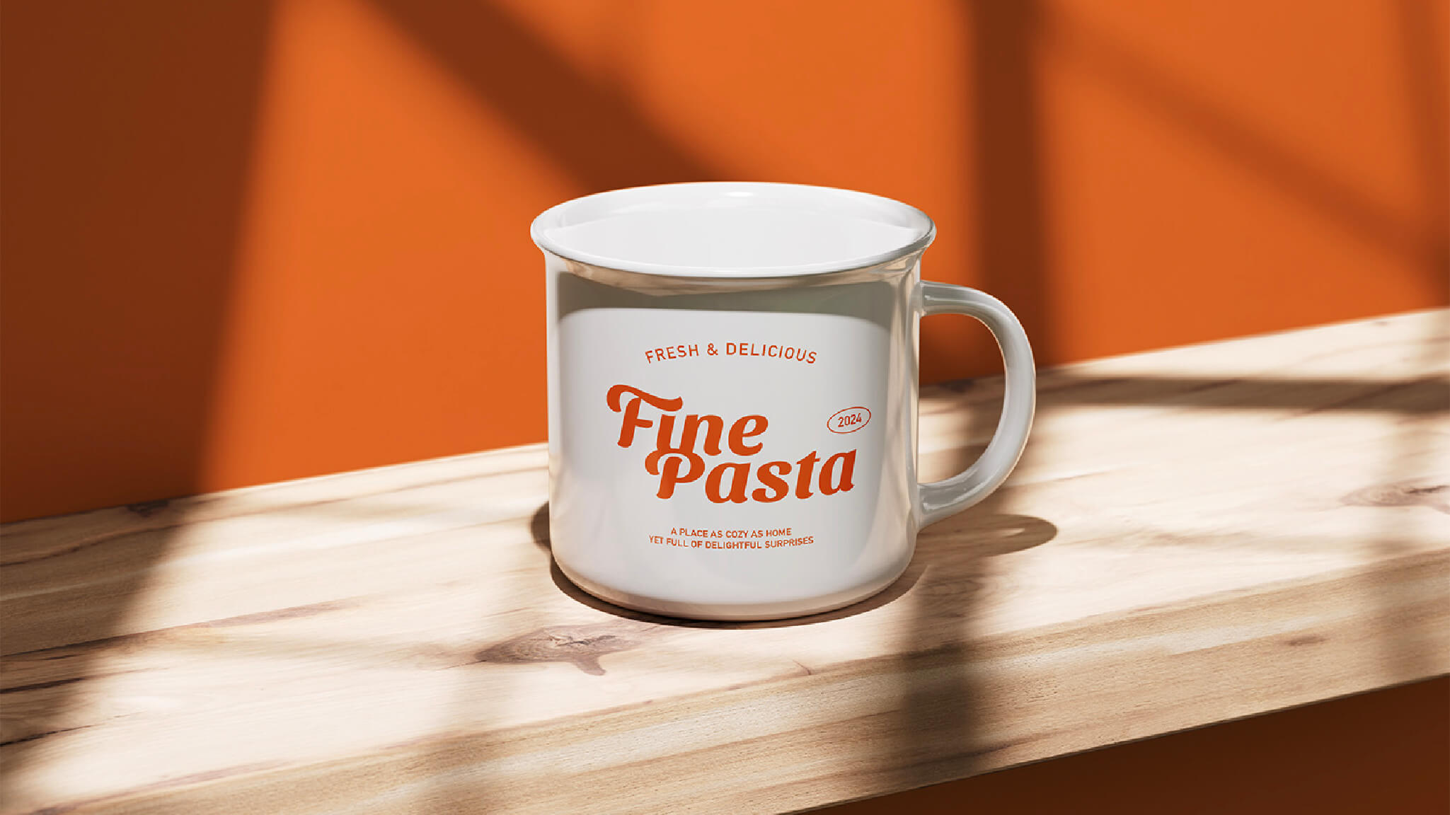
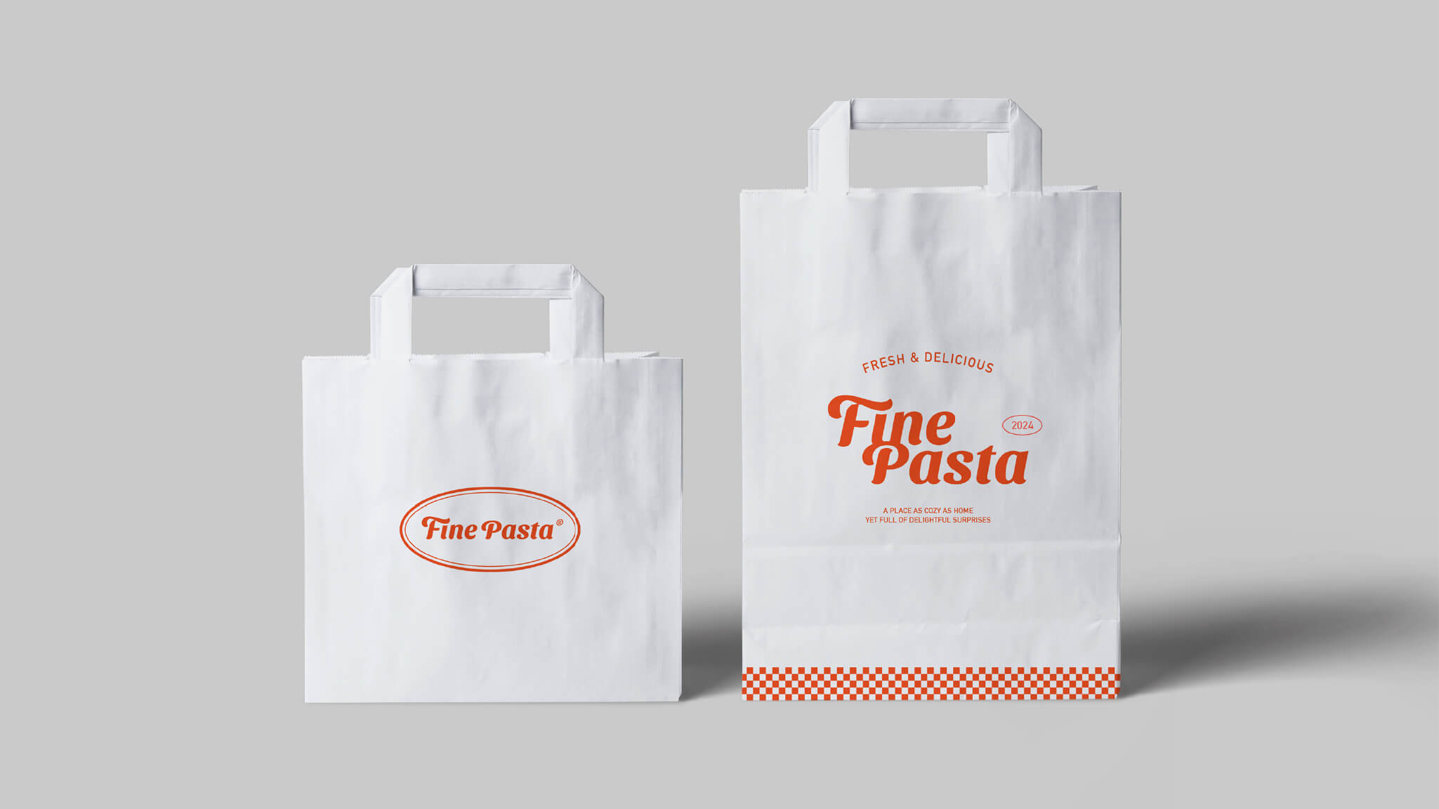
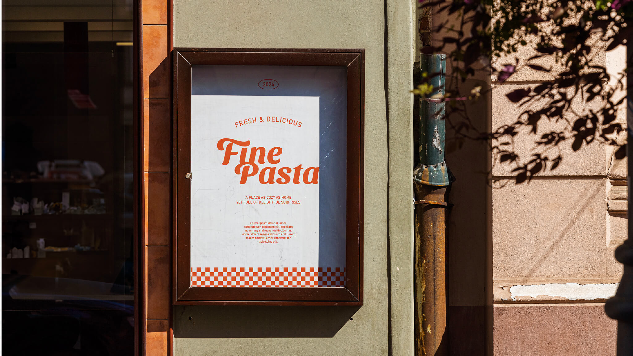
標誌以柔和的曲線字體呈現,帶出義式麵條的流動感與手作的溫度。圓潤的筆畫呼應了料理的親切氛圍,而輕微傾斜的結構則傳達出品牌「隨性卻細膩」的精神。字體間的節奏感讓人聯想到料理的過程——從揉麵、煮沸到上桌,每一步都蘊藏著生活的細節與驚喜。
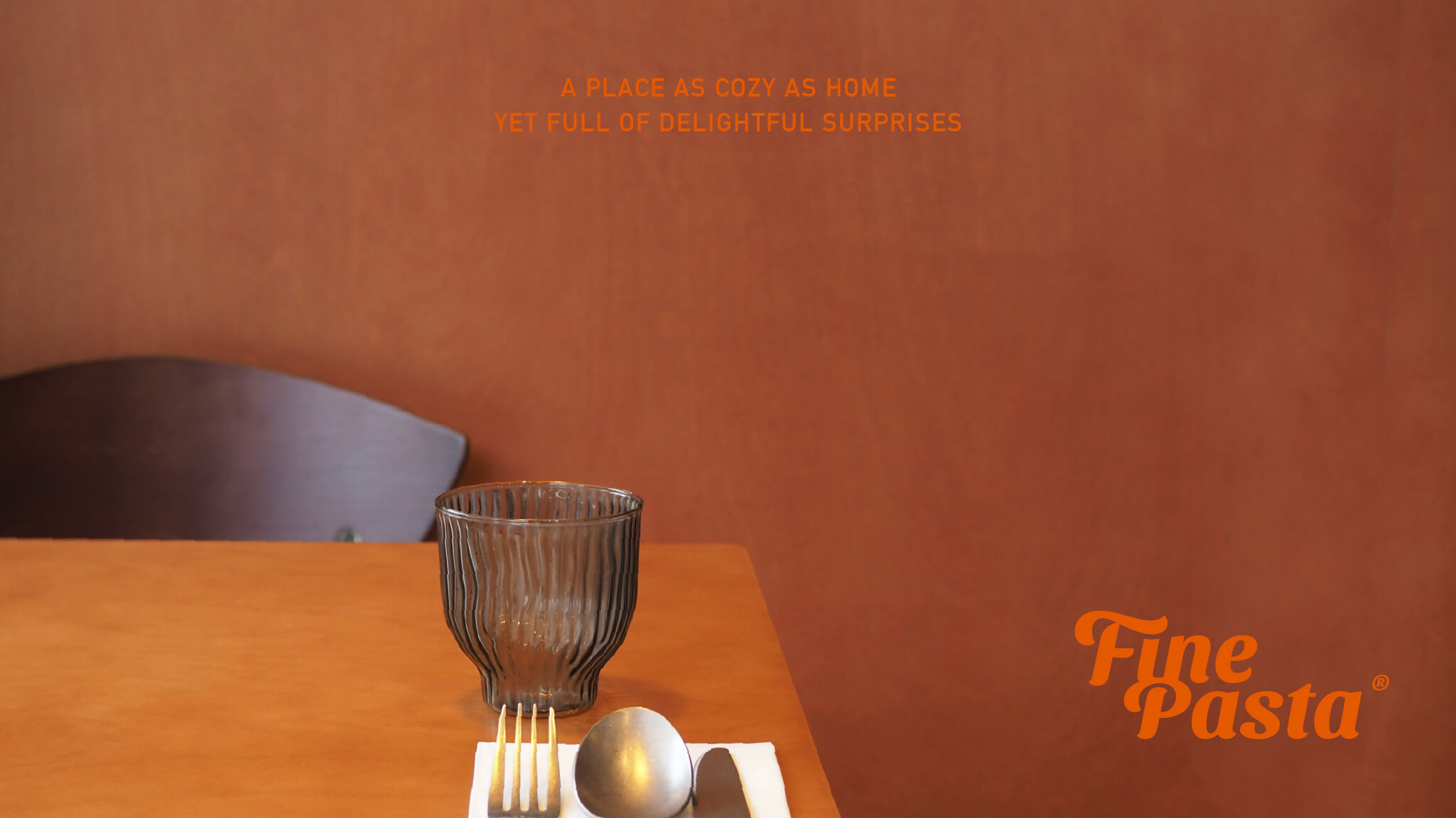
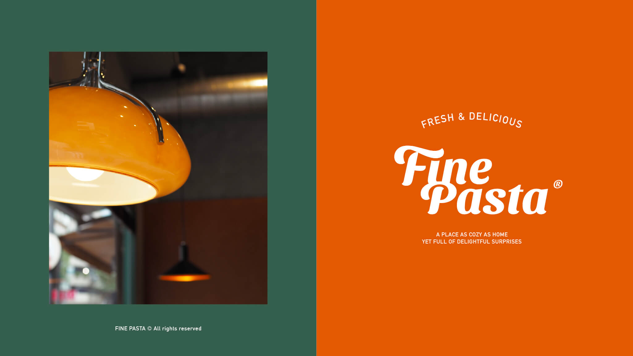
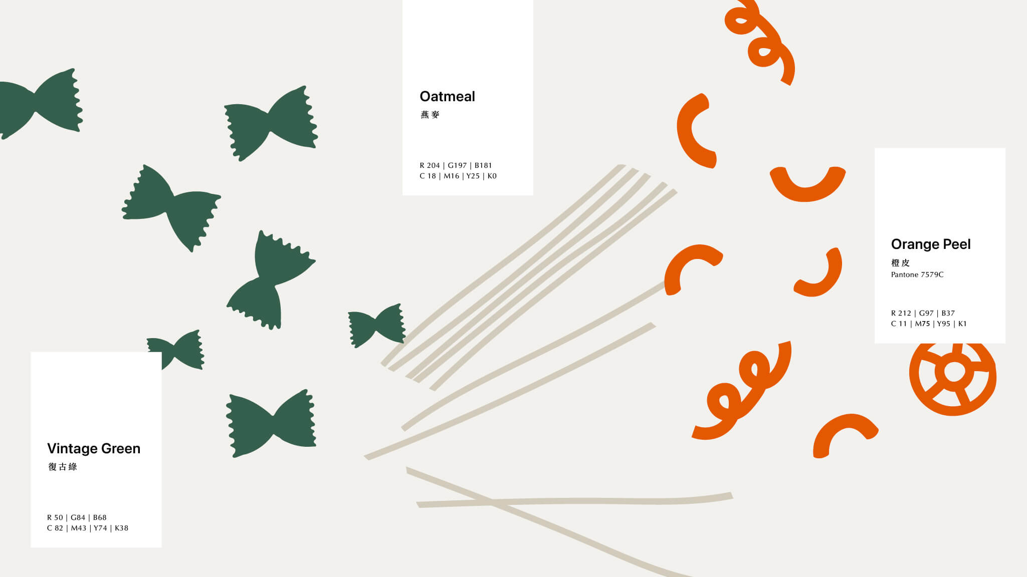
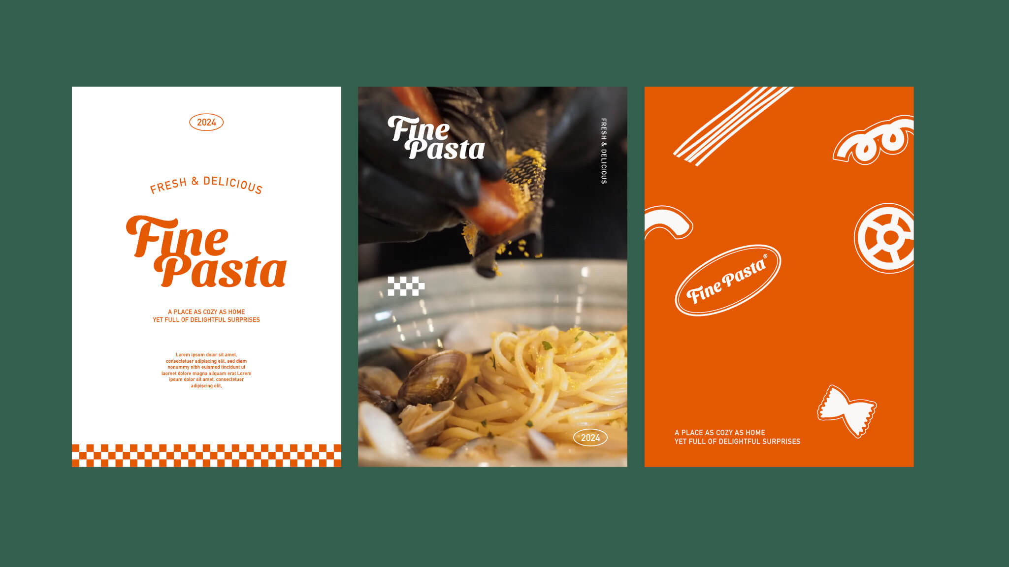
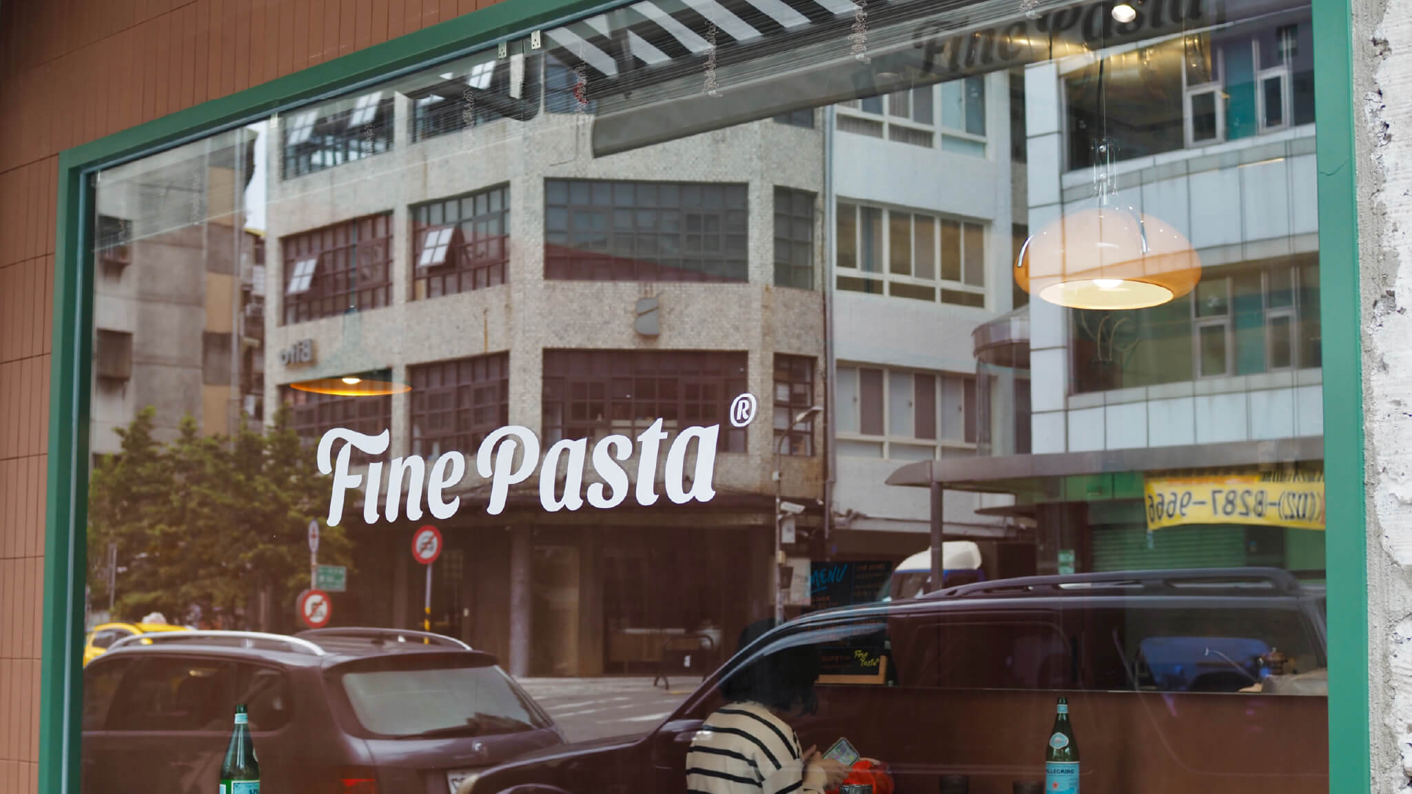
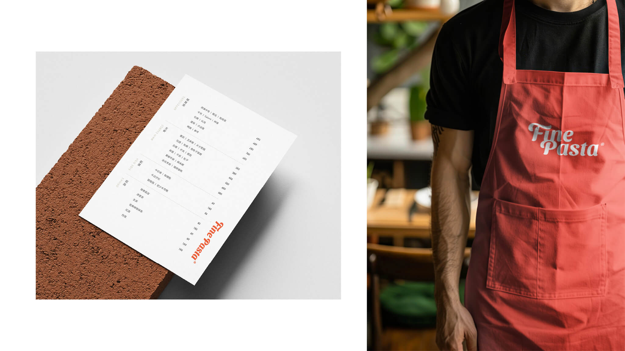
色彩以鮮明的義式橘紅為主調,搭配奶油白和深綠,呈現溫暖又內斂的義式氛圍,讓整體視覺既充滿活力又不失沉穩。這樣的配色策略讓 Fine Pasta 的品牌氣息在街區中脫穎而出,同時保留了一份細膩、耐看的日常感。

大稻埕的色彩語境,復古與溫暖並存
標誌以柔和的曲線字體呈現,帶出義式麵條的流動感與手作的溫度。圓潤的筆畫呼應了料理的親切氛圍,而輕微傾斜的結構則傳達出品牌「隨性卻細膩」的精神。字體間的節奏感讓人聯想到料理的過程——從揉麵、煮沸到上桌,每一步都蘊藏著生活的細節與驚喜。
色彩以鮮明的義式橘紅為主調,搭配奶油白和深綠,呈現溫暖又內斂的義式氛圍,讓整體視覺既充滿活力又不失沉穩。這樣的配色策略讓 Fine Pasta 的品牌氣息在街區中脫穎而出,同時保留了一份細膩、耐看的日常感。
yushidesignstudio@gmail.com
品牌設計 Brand Identity Design
醫療與診所品牌
Healthcare & Clinic Branding
教育與知識品牌
Education & Knowledge Branding
餐廳品牌識別
Restaurant Brand Identity
茶品牌識別
Tea Brand Identity
咖啡品牌識別
Coffee Brand Identity
新創與科技品牌
Startup & Tech Branding
文化創意品牌
Culture & Creative Branding
網頁設計 Web Design
網頁設計流程
Web Design Process
Webflow 客製化設計
Webflow Custom Design
WIX 客製化設計
WIX Custom Design
Framer 客製化設計
Framer Custom Design
其他
訂閱方案
Plans
文章觀點
Articles