2026.07.01
When a Brand Isn't a Logo,
But a River—What Amazônia's Identity System Taught Me
I came across a project recently that genuinely impressed me—I went back and looked at it several times.
Not because it's beautiful, though it is—but because it re-taught me something about branding I thought I already understood.
This is the Brazilian Amazon's brand identity, released earlier this year, created by FutureBrand's São Paulo studio—a consultancy focused on place and national brand strategy. At first glance you might think: another "nature-themed" rebrand. But once you actually look closely, you realize it's doing something entirely different.
🌊 Why a river, not plants and animals?
The brand's challenge was unusual: the Amazon spans nine Brazilian states, and creating an identity that all 28 million residents would recognize as "this is us" was never going to be easy.
Visual material for the Amazon is everywhere—rainforest, exotic birds, vividly colored flowers. These elements are highly recognizable, but there's a problem: they represent an ecological landscape, not a way of life shared by residents across nine states. It's hard to use one specific bird or flower to capture what people in Acre and people in Pará actually share, and where they differ.
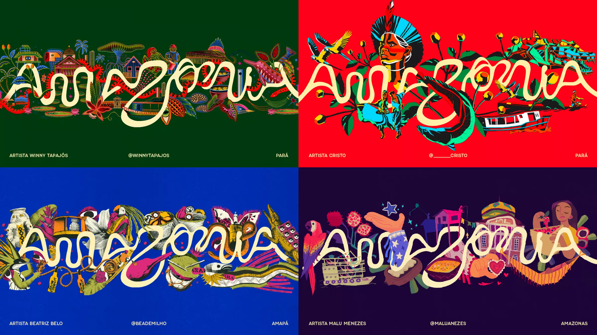
FutureBrand chose the river instead. They pulled the actual curved coordinates of the Amazon River and its tributaries from satellite imagery, then derived letterforms from those curves to build a complete custom typeface.
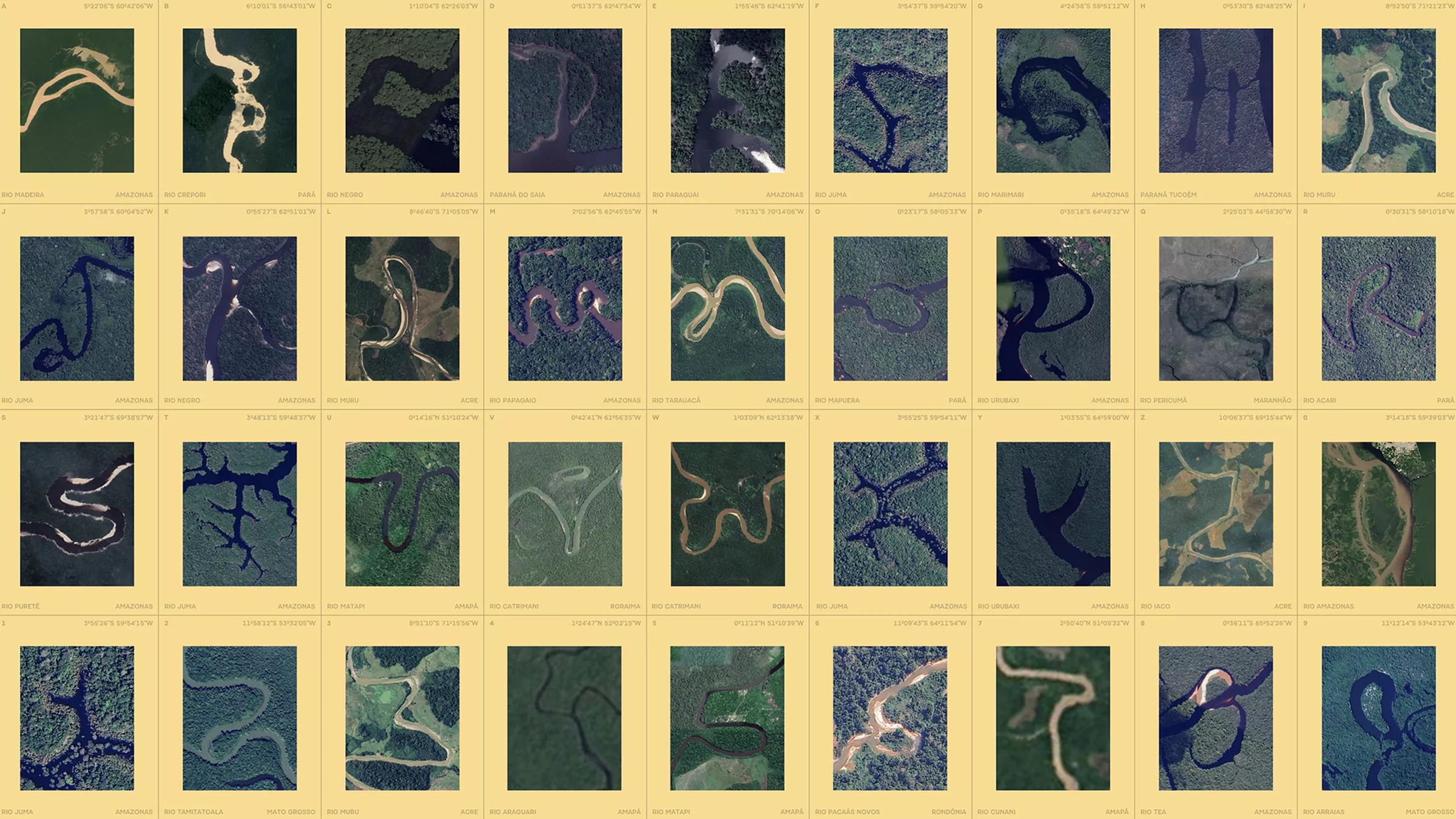
The insight behind this decision runs deep, even though the concept itself is simple and memorable: for local residents, the river isn't scenery—it's a navigation system. It's the route out, the channel of trade, the backbone of daily life. It crosses all nine states and connects everyone. Plants and animals are how outsiders see the Amazon; the river is how people who live there actually experience it.
That gap between the two determines whose perspective the identity starts from.
🏷️ Turning the identity into a real business tool
What I find most interesting is a certification mark called Feito de Amazônia (Made of Amazon).
Any locally made product that meets the standard can carry this mark. It sounds simple, but consider what it actually does: it shifts the brand from being a "tourism board's image system" into a "commercial credential for local producers." A small farmer selling handmade soap can use this mark to tell the world: this comes from the Amazon, and that's a certified fact, not a marketing claim. It gives producers a real way to be recognized in the marketplace.
This is what a brand looks like when it's actually put into practice—not something disconnected from daily business, but a tool that helps people build market trust.
What is a brand's function, really? Promotion? Image? Or can—and should—it become a kind of infrastructure?
🧬 Nine states, one family: how a brand "comes alive"
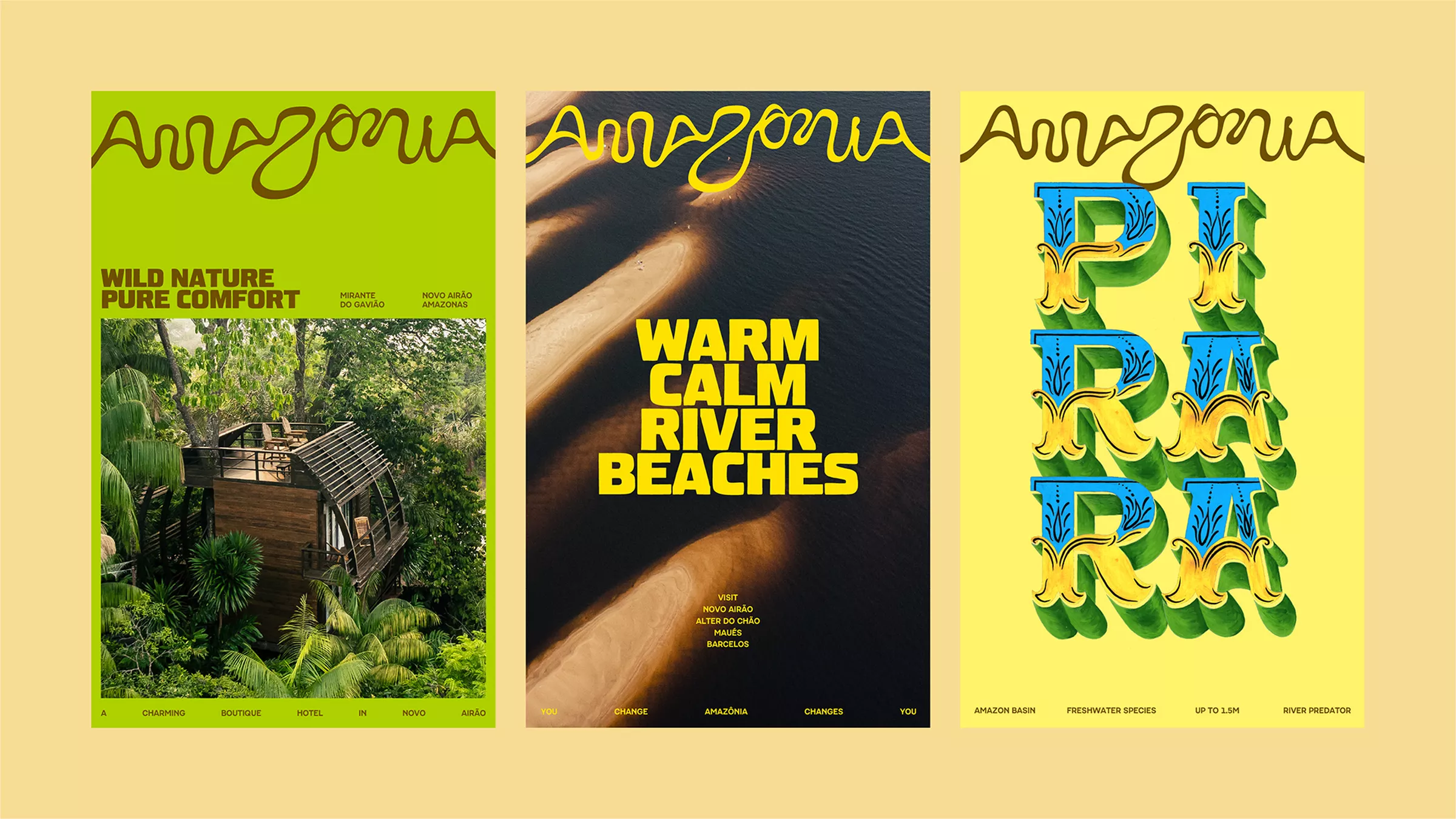
This project is described as a living brand, and my first reaction was: probably some kind of animated logo. Isn't "alive" just visuals that move?
But that's not it.
What makes it "alive" is a framework that lets each state's distinct character keep growing over time. There's a shared foundational vocabulary—core typeface, graphic language, identity structure—but colors and graphic elements have preset flexible variants depending on the state and context. Not unlimited freedom, but flexibility with rules.
This structure is actually very hard to pull off. Total freedom is easy, total uniformity is easy too—the hard part is the middle ground: defining what's core and what can vary, then designing that flexible space clearly enough that different users can express their own character within the rules. Acre and Amazonas can look visually different, yet you can tell at a glance they belong to the same family.
That sense of being "non-uniform yet cohesive" is exactly where the design difficulty lies.
💡 The question this project left me with
When many clients come to a designer, the first thing they say is: "I need a new logo." That's completely normal. But before any visuals appear, there's a question worth thinking through first: who does this brand exist for? How do you identify the elements that are non-negotiable at its core? What does it need to show the outside world?
The Amazon project answered this question first, before design even began.
I think that order is probably the right one.
If you're thinking through your own brand, or you're curious about how to make an identity system actually useful, feel free to reach out and talk it through. You don't need to have anything ready to act on right away—just working through the question clearly is often valuable in itself.