How Is Brand Identity Designed? The Key to Building "Deep Brand Thinking”
#Rebranding#Design Thinking
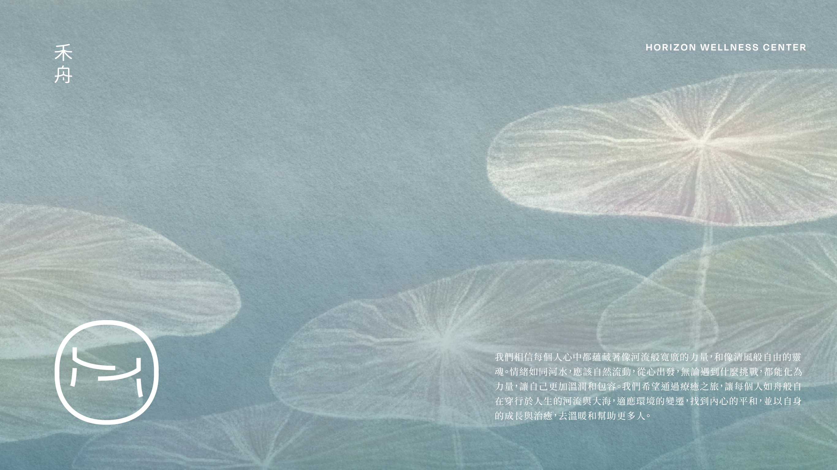
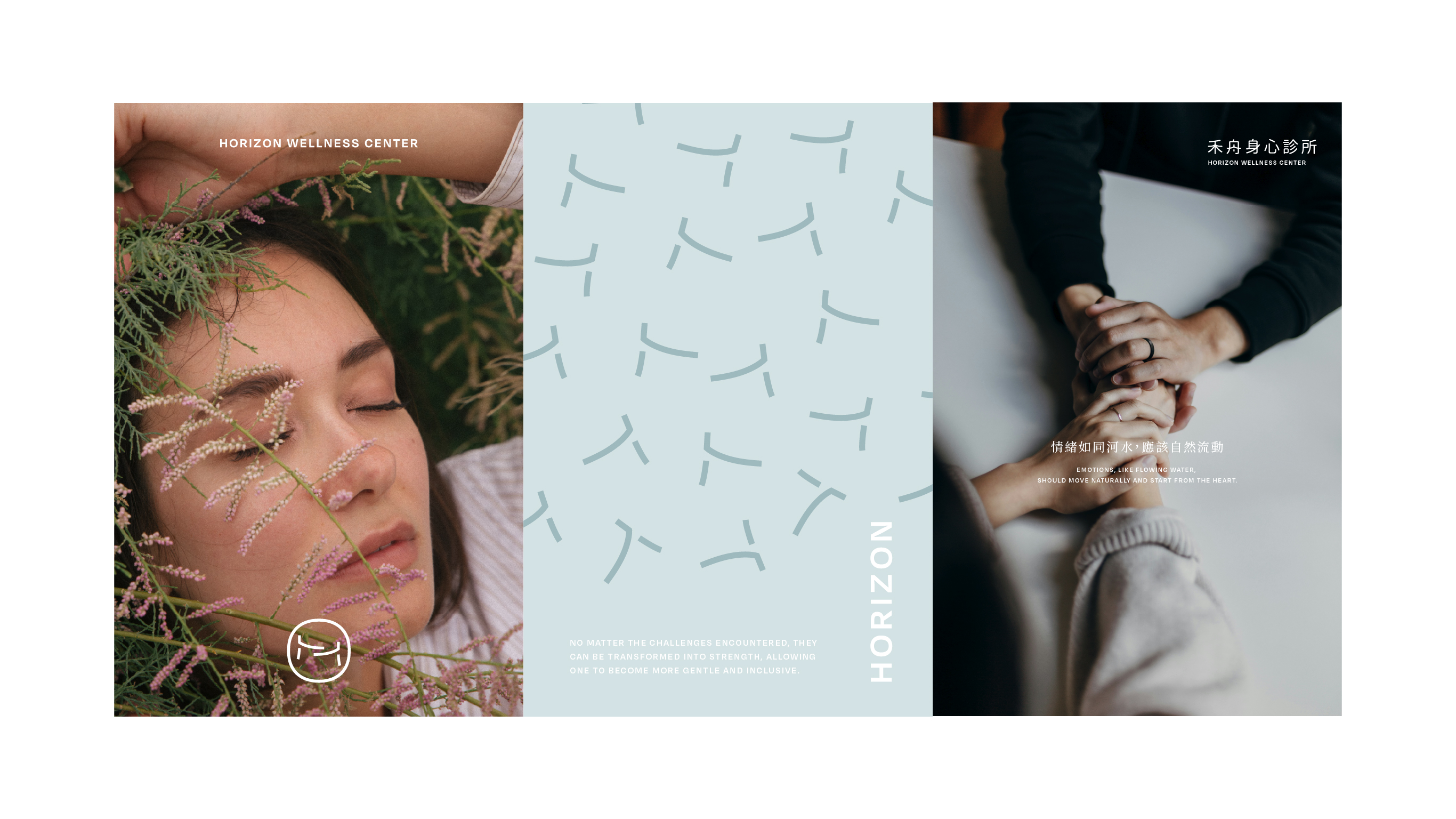
YUSHI Design Studio Work - Hozhou Mind & Body Clinic
🤔 What Is an Identity Actually Communicating?
There's a feeling about identity design that's genuinely hard to put into words.It looks great, but you can't quite say what value or feeling the brand is actually trying to convey. Truthfully,a beautiful visual might just be the baseline — what actually lets a brand speak is the deeper brand design thinking behind the visuals.
A lot of business owners we meet for the first time ask us how these concepts and the message they carry are even arrived at — does it just come from a sudden flash of inspiration?
We thought this would be a good chance to walk through the thinking process hidden behind the visuals when we help clients work through their brand.
🌪️ Brand Design Is More Like a Funnel — Visuals Come Last
Picture cooking a meal — an omakase-style, no-menu dining experience! What finally reaches the guest is the visual: the distilled essence of the season, the ingredients, the creativity, and the aesthetics all in one. Before that can happen, you first have to understand the season's ingredients and know how to balance the flavors — the order can't be reversed.
Brand design works much the same way — it narrows down layer by layer, rather than opening a design tool and starting to draw from the very beginning.
YUSHI Design - Tea Stack
Layer One 🫥: first getting clear on "who am I."
This sounds a bit abstract, so here's an example — if you're building the brand for a psychological counseling practice, you can't just settle for "it's a counseling space." Instead, you need to ask: how do I want the clients who come here to feel about who I am?
Like a teacher who holds dignity and authority, or a facilitator who helps them notice things for themselves? These two positionings lead to completely different outcomes down the line. We work through this positioning together with the business owner — understanding why they wanted to start this brand, what they've been through, and what problem they've noticed in the market that they want to address, and from there we sharpen the positioning further.
Layer Two 🔬: distilling that one key feeling.
When the audience encounters this brand, what's the one feeling you want to surface in them? A sense of safety, a sense of empowerment from reclaiming control, or the calm of finally being able to breathe?
There's no imagery at this layer yet — it's purely about feeling. I think this step gets skipped a lot, because everyone's eager to see the visuals too soon. Without this layer of exploration, your design ends up scattered, with no core spirit holding it together.
YUSHI Design - Red Makeup
Layer Three 💫: this is where visual translation comes in — figuring out how to use visuals to evoke that feeling from before.
In terms of design approach, we can draw out that feeling in the audience through concrete objects or abstract concepts.
If you want to give people a sense of unpressured breathing room, you can use generous white space or symbols of calm objects; if you want to convey professionalism and reassurance, the linework should lean clean and steady, avoiding hand-drawn or unsteady, drifting forms.
🔍 Colors Aren't Chosen by Feel — There's Research Behind Them
Every detail chosen in an identity is backed by solid groundwork. You can start by thinking: what's the audience's genuine psychological state in that particular situation?
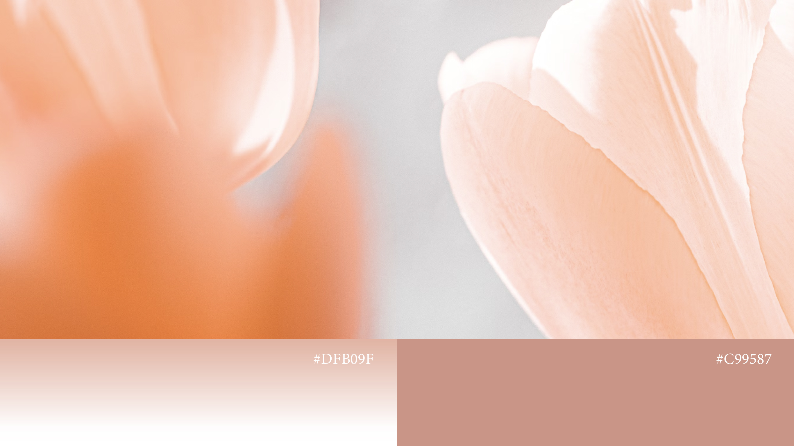
For example, people coming to a counseling practice tend to feel more anxious and tense — so if the visuals are full of bold, high-contrast colors, that just adds another layer of pressure.
We also look into the historical development of the industry or academic field, and where it currently stands in the market — understanding the logic behind the profession is what makes it possible to translate it into brand language that ordinary people can understand.
🛠️ Set the Standard First, Then Check the Visuals Against It
YUSHI Design - Hozhou Mind & Body Clinic
I'm personally not a fan of "drawing as you think," since that tends to produce a pile of good-looking drafts with no real connection to each other — which just makes it harder for the client to choose.
The approach we prefer is pulling out the brand's skeleton before we ever start drawing.
We work through essence, values, personality, and experience, then sort the keywords into categories. Only once the brand's soul is settled do we start designing — and whenever we hit a snag during or after the design, we go back and check whether it's drifted from the keywords we originally set.For instance, a counseling practice needs to feel steady and safe, but if it leans too hard into elegance, it ends up looking like a medical aesthetics clinic instead.
🤝 This Is Really Something We Build Together
After all this, what we really want you to take away is that brand identity design is a practical, grounded process that also takes repeated refinement.
The designer's role is closer to that of a translator — turning what you want to express but can't quite put into words into a visual language people can understand and feel, which also becomes the face your business can't do without.
If you're currently building a new brand, or feel like your existing brand is stuck somewhere, feel free to reach out — we'd love to explore solutions together!