2026.11.19
Redesigning Your Website: What Should the Homepage Say First?
Lessons from a London Museum’s Wayfinding
When you redesign your website, the first thing your homepage should say isn’t “look how good we are.” It should let first-time visitors know: this is relevant to you, and here’s where you can go next. Answer the question in their mind first, and they’ll be ready to hear what you want to say.
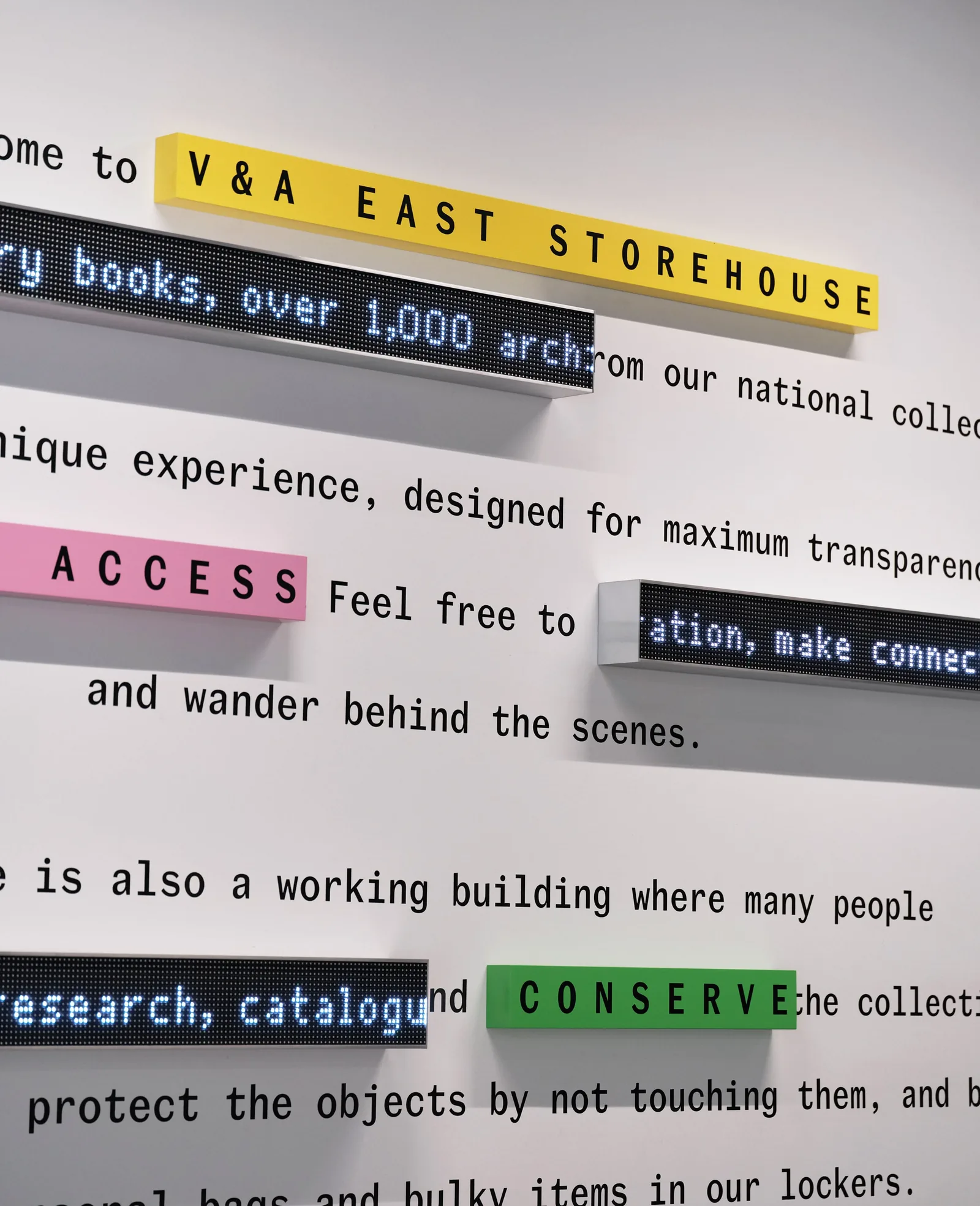
Design: Fieldwork Facility|Image: via Dezeen〈Gen Z apps inform approachable wayfinding for V&A East Storehouse〉 (2026.11.13)
London has a rather special museum called V&A East Storehouse. It’s the collection store of the Victoria and Albert Museum (V&A), designed by architecture studio Diller Scofidio + Renfro, and for the first time it opens around 250,000 art, craft and design objects to the public.
Fieldwork Facility, the London studio behind its wayfinding, was asked to help people find their way among so many objects, especially younger visitors who don’t usually feel museums are meant for them. In an interview with Dezeen, founder Robin Howie said that far too many people walk into a museum or gallery and feel a quiet unease: “this isn’t really for me.”
Why Do Visitors Leave Your Website Before They Even Scroll?
Visitors often leave not because there isn’t enough content, but because the first glance didn’t tell them: this place is for you.
Fieldwork Facility’s answer is a fascinating one. They studied apps young people use every day, like TikTok, and designed the whole wayfinding system as an “operating system.” As soon as visitors walk in, they read a short piece of “onboarding” text, like the quick orientation you get when you open an app for the first time, telling you what this place is and how to explore it. Yellow marks the viewing galleries, green the restoration labs open to view, and pink the Study Centre. You meet the three colors at the door, and recognize them all the way through the building.
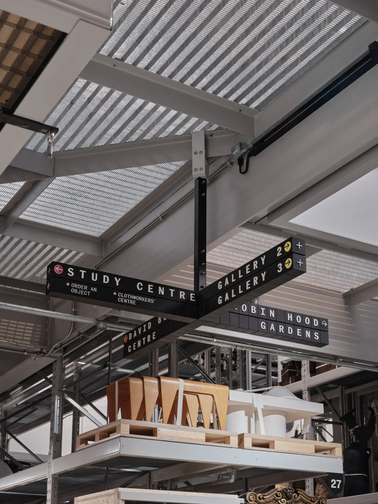
Design: Fieldwork Facility|Image: via Dezeen〈Gen Z apps inform approachable wayfinding for V&A East Storehouse〉 (2026.11.13)
We love this approach, because a website is an entrance too. Many websites open with a company history and a long list of services. The information is all correct, yet it doesn’t answer the one thing visitors care about most: am I in the right place?
Should the First Screen Introduce You, or Ask About Them?
On the first screen of a homepage, asking about the visitor’s situation often keeps people around better than introducing yourself.
When we redesigned the website for cold-chain temperature monitoring company Gocochain, we ran into a very similar challenge. Gocochain has two products with similar names: CoTag, which travels with goods to monitor temperature in transit, and CoTag Connect, which is installed in warehouses to monitor storage temperature. The names are alike but the uses are completely different, and what the client worried about most from the start was visitors mixing them up.
So the homepage doesn’t rush to introduce features. It first uses two scene images to ask the question clearly: are you in transit, or in a warehouse? CoTag Connect also involves several layers of architecture, from devices to a gateway to a cloud dashboard, so we broke the process into a few steps, “install, connect, view data,” and walked through them with simple icons, so people sense first: this should be easy to use.
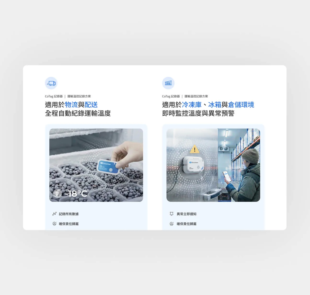
YUSHI Design Studio work|Gocochain Web Design
The specifications are all still there; they’ve just moved further back. At the very front of the whole site is always: what’s your situation, and how can we help?
What Can You Do Before Redesigning Your Website?
The first step of a website redesign isn’t changing the screens. It’s walking through your homepage from the entrance, through the eyes of a first-time visitor.
If you’re preparing a website redesign, try standing at the door and asking yourself: what does a first-time visitor most want to know? Where will they hesitate? If you’d like to understand more about how users feel in the moment, read “How Designers Cultivate the Soil for Good Judgment”; or book an online chat with us. Bring your homepage along, and we’ll look at it from the entrance together.


