2026.11.16
Does Rebranding Mean Changing Your Logo?
What Nubank Kept When It Refreshed Its Brand
Rebranding doesn’t necessarily mean replacing your logo. The question to answer first is this: what has already found a home in your customers’ minds and deserves to stay, and what can no longer keep up with who you are now and needs to grow anew? Whether the logo changes is a result of that answer, not the starting point.
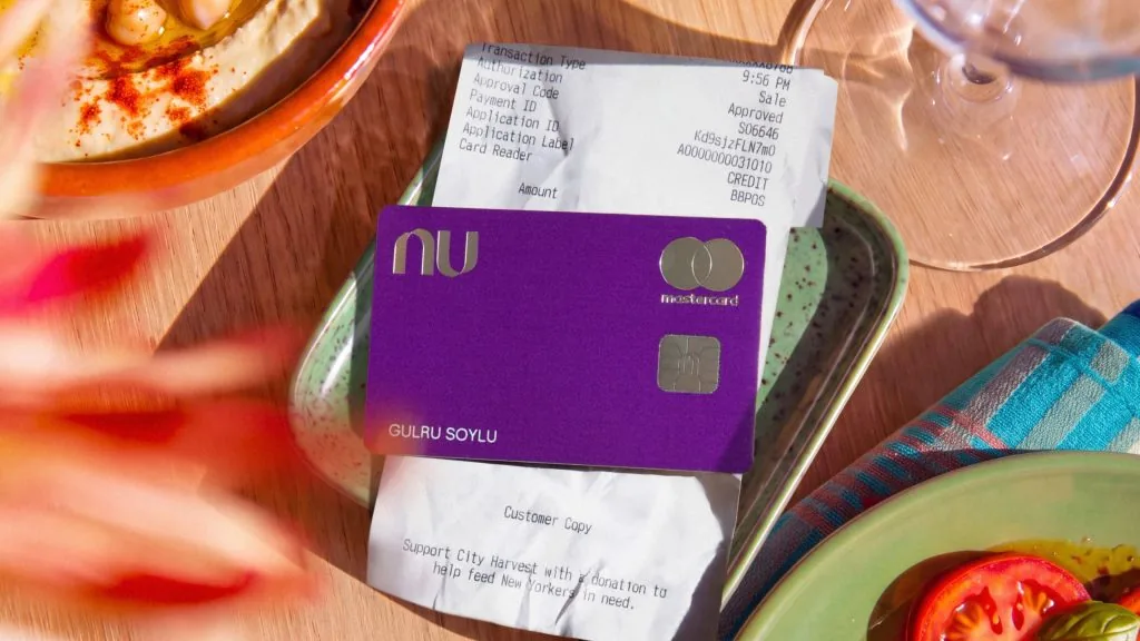
Image: Koto|via Design Week〈Nubank unveils global brand refresh by Koto ahead of US launch〉 (2026.11.03)
Nubank, the digital bank founded in São Paulo in 2013, now serves more than 140 million customers across Brazil, Mexico and Colombia. According to a November 2026 report in Design Week, ahead of its US launch Nubank worked with brand consultancy Koto to refresh its brand system, yet kept its original logo, wordmark and signature purple.
As co-founder and Nu US CEO Cristina Junqueira put it: “The challenge was never just to refresh how we look. It was to build a brand system that can hold very different expressions under one roof, each with its own personality, and all of them unmistakably Nu.”
If the Logo Stays, What Does a Rebrand Actually Change?
What a rebrand changes is often not the logo, but the whole system around it that makes people recognize you.
This time, Nubank recalibrated its purple within a larger palette, and added two proprietary typefaces, its first global photography library, and illustration and motion that can go straight into the app. Even the tone of voice for its conversational interfaces and AI banking assistant was defined, and the website was redesigned as well.
Video: Koto|Koto〈Nubank〉case study · Watch on Vimeo
The system also has to hold up two very different sub-brands in Brazil: Ultravioleta, more refined and understated, for customers with more sophisticated financial needs; and Croma, more colorful, built for customers who have grown with Nubank. In other words, one brand has to speak in different voices without ever becoming unrecognizable.
Arthur Foliard, executive creative director at Koto, said that the biggest temptation for a brand at this scale is to keep adding: more rules, more assets. They did the opposite, keeping only what carried real equity, then getting type, color, motion, photography and illustration to all move in the same direction.
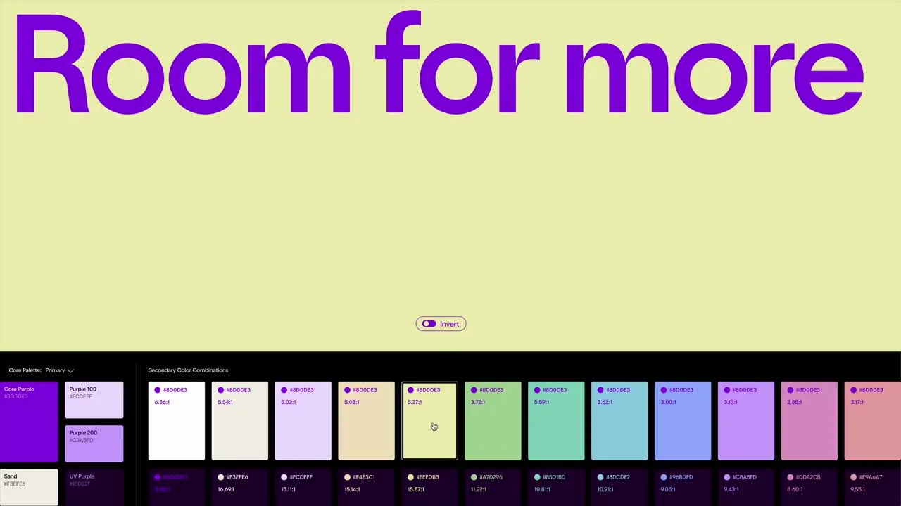
Video: Koto|via Design Week (2026.11.03) · Watch the video on Design Week

Image: Koto|via Design Week (2026.11.03)
Katie Hughes, senior strategy director at Koto, said: “Growth usually brings complexity. The whole goal with Nubank is that customers never feel it.” We love that line. Customers don’t get to know you by reading your brand guidelines. What they remember is the tone of a prompt in the app, the first screen of your website, the light in a photograph. The logo stayed because it was already recognized; it’s when all the details around it change their tone together that a brand truly moves forward.
How Do You Decide What a Brand Should Keep?
What you keep is what customers already recognize and what still represents you. Everything else is what the rebrand needs to work on.
We’re not fond of figuring things out while we draw. In a rebrand, we look inward first, then outward. Looking inward means talking with the team: why they started, and which commitments have never changed. Looking outward means studying competitors and listening to how longtime customers feel about the brand.
When we created the brand identity for TOVA Exploration Education, we began with internal interviews and competitor analysis, then moved on to brand positioning and the identity system. Through conversation after conversation, we worked with the team to articulate its core value: “child-centered, exploration-based learning.” It wasn’t just a visual upgrade; it was a fresh look at the brand’s positioning.
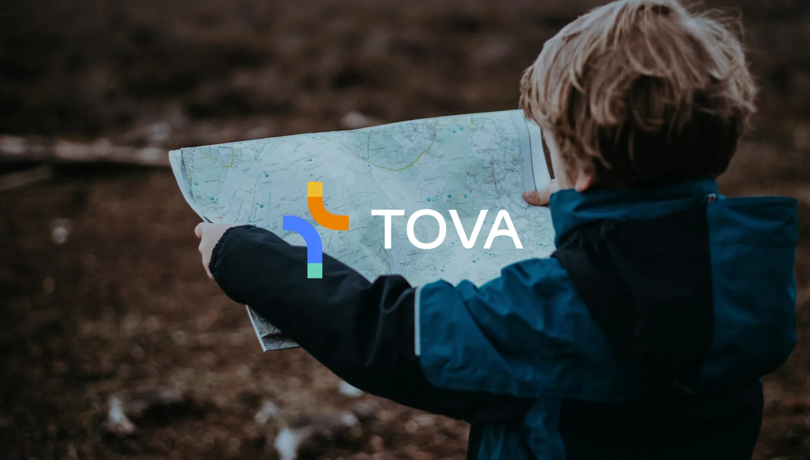
YUSHI Design Studio work|TOVA Exploration Education Platform Brand Identity
Whatever the brand, finding the things that mustn’t move is what gives change its direction. If you’re considering a rebrand too, read “When a Brand Isn’t a Logo, But a River—What Amazônia’s Identity System Taught Me” to see how one identity sets rules between what changes and what doesn’t; or book an online chat with us, and let’s look together at what in your brand is worth holding on to.


